beVisioneers

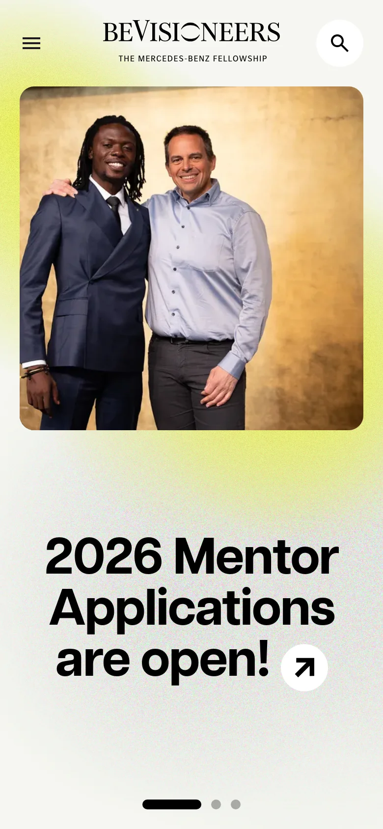
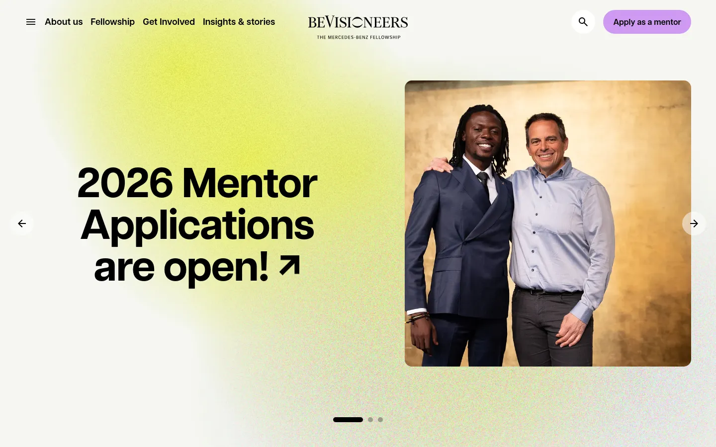
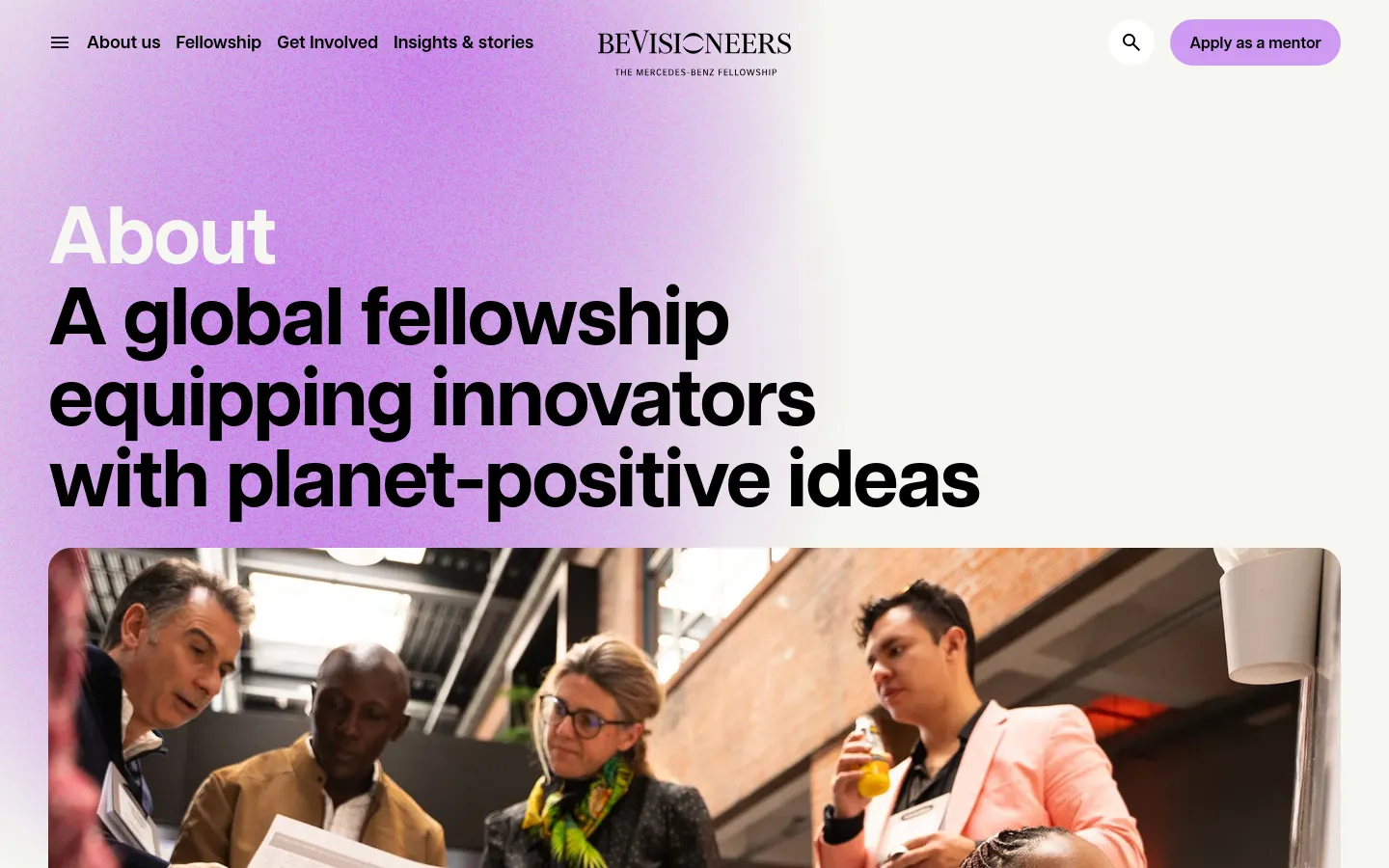
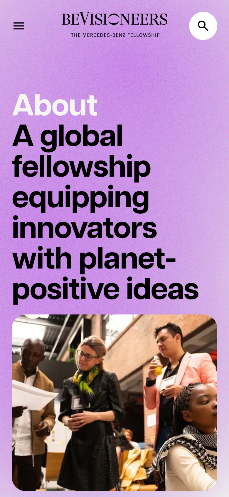
beVisioneers uses a high-energy, optimistic visual language to connect young eco-innovators with global mentorship. The site moves away from the typical somber tones of environmentalism, instead utilizing a bright, citrus-inspired palette and expansive photography to signal opportunity and momentum. By placing large-scale portraiture alongside bold, urgent headlines, the platform establishes a sense of human-centric leadership and community purpose. Oversized, heavy typography dominates the layout, creating a clear hierarchy that guides the eye through the fellowship's narrative. The use of grainy, textured gradients adds a tactile quality to the digital space, breaking up the flat color blocks with organic depth. Large-scale imagery is paired with generous white space and a clean, structured grid that keeps the information density low and the focus high. The decision to use massive, sans-serif type for primary calls to action ensures the mission remains unavoidable and impactful.
- Studio Cronica — designer
- UPCLOSE — developer
Design

About UsAbout us
Blog / ArticleInsights
ContactGet in touch
404 ErrorNot found
Technology
- Cloudflare
- jsDelivr
- HTTP/3


