Cards Against Humanity for Her
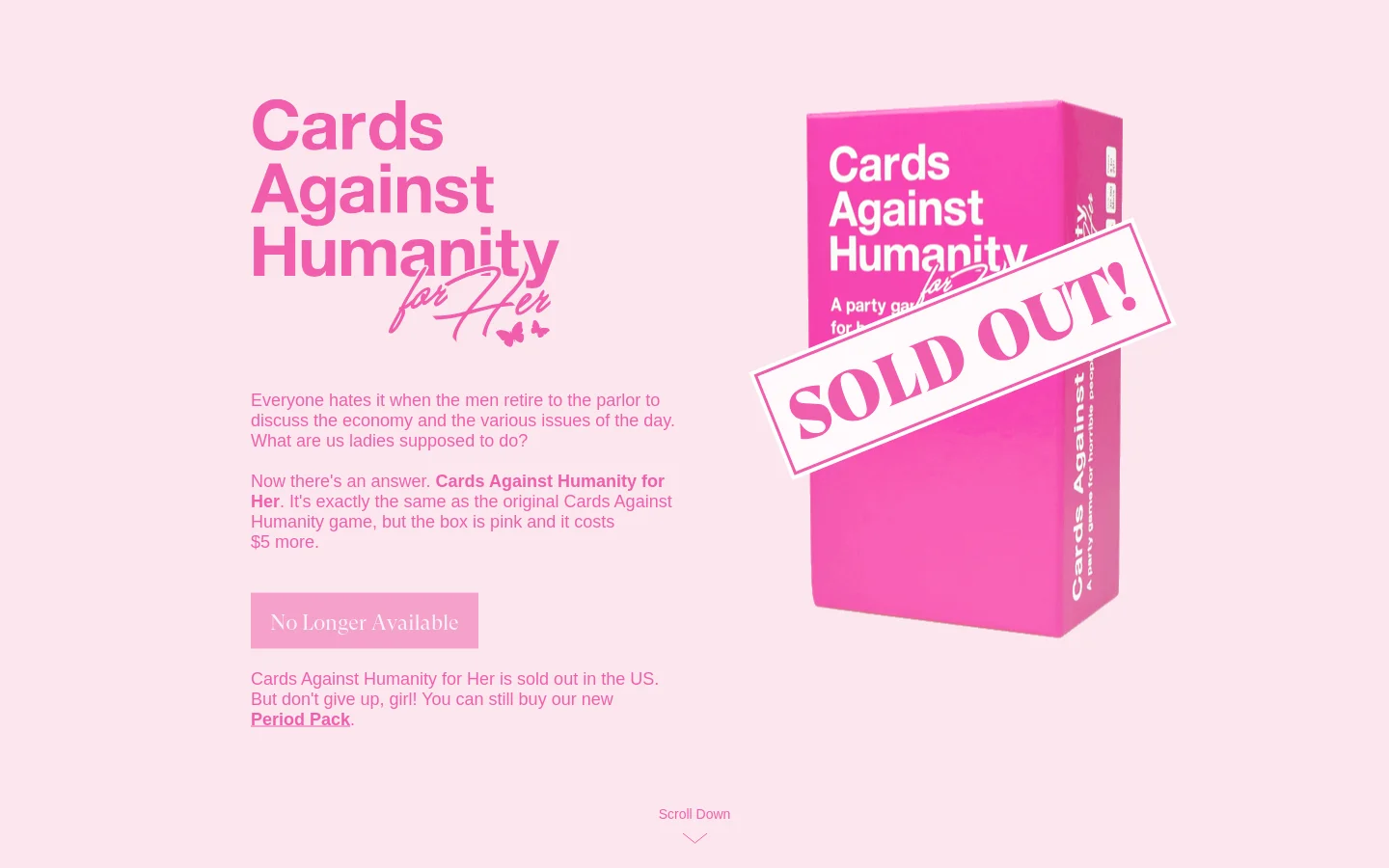
Cards Against Humanity for Her is a satirical, parody brand that mocks gendered marketing tropes through a tongue-in-cheek product offering. The website serves as a landing page for a joke edition of the famous party game, leaning heavily into the irony of 'feminizing' a product simply by changing its color and increasing the price. It targets a digitally savvy, humor-driven audience that appreciates social commentary and internet satire. The visual identity is unapologetically hyper-feminine, utilizing a monochromatic palette of various pink hues to lean into the very stereotypes it parodies. The design employs bold, oversized typography and a playful, almost chaotic layout that mirrors the irreverent tone of the brand. Through the use of kitschy imagery—such as butterflies, skincare, and bright lifestyle photography—the site creates a cohesive, satirical aesthetic that is both visually striking and conceptually sharp.
Design
Technology
- Cloudflare Browser Insights
- Cloudflare
- jsDelivr
- HTTP/3
- Cloudflare Browser Insights


