Clarity Concepts
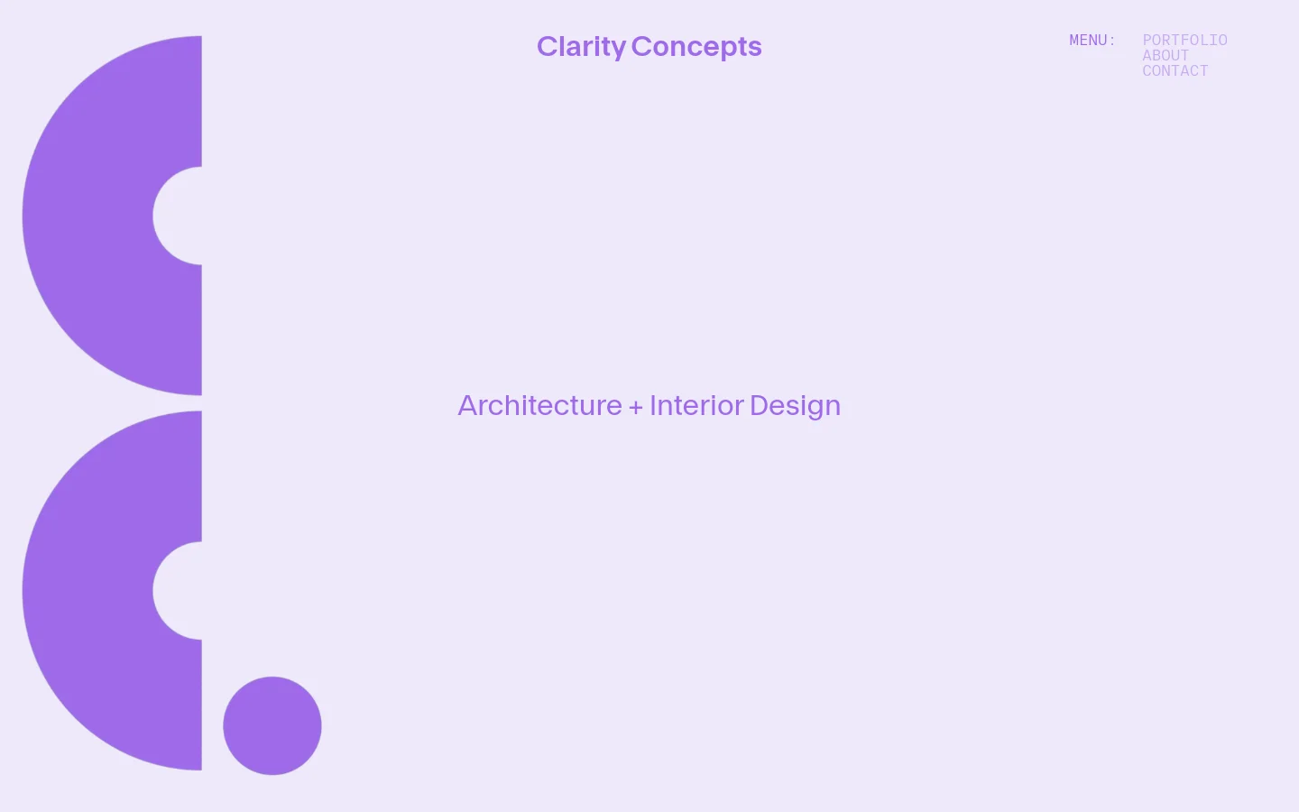

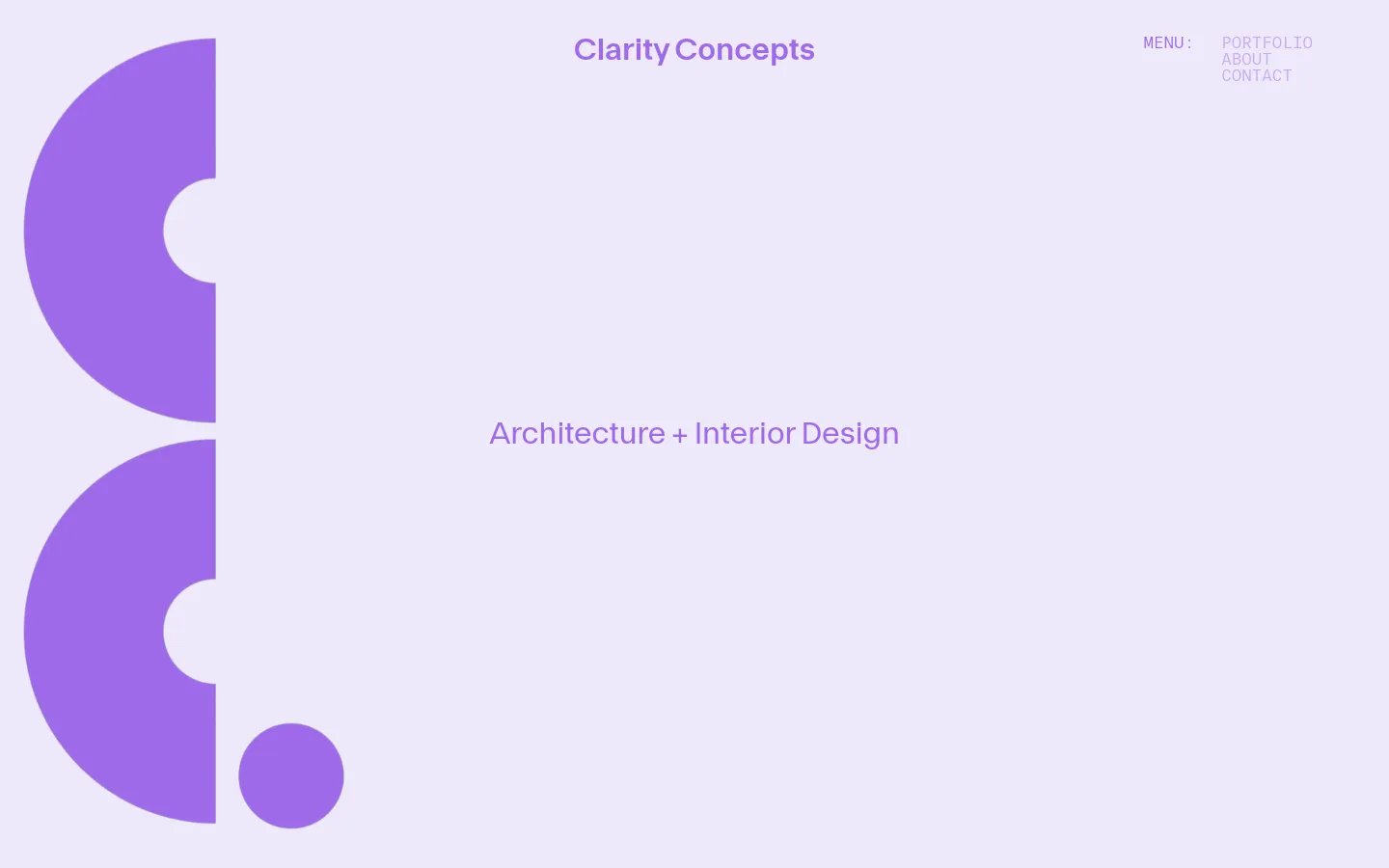
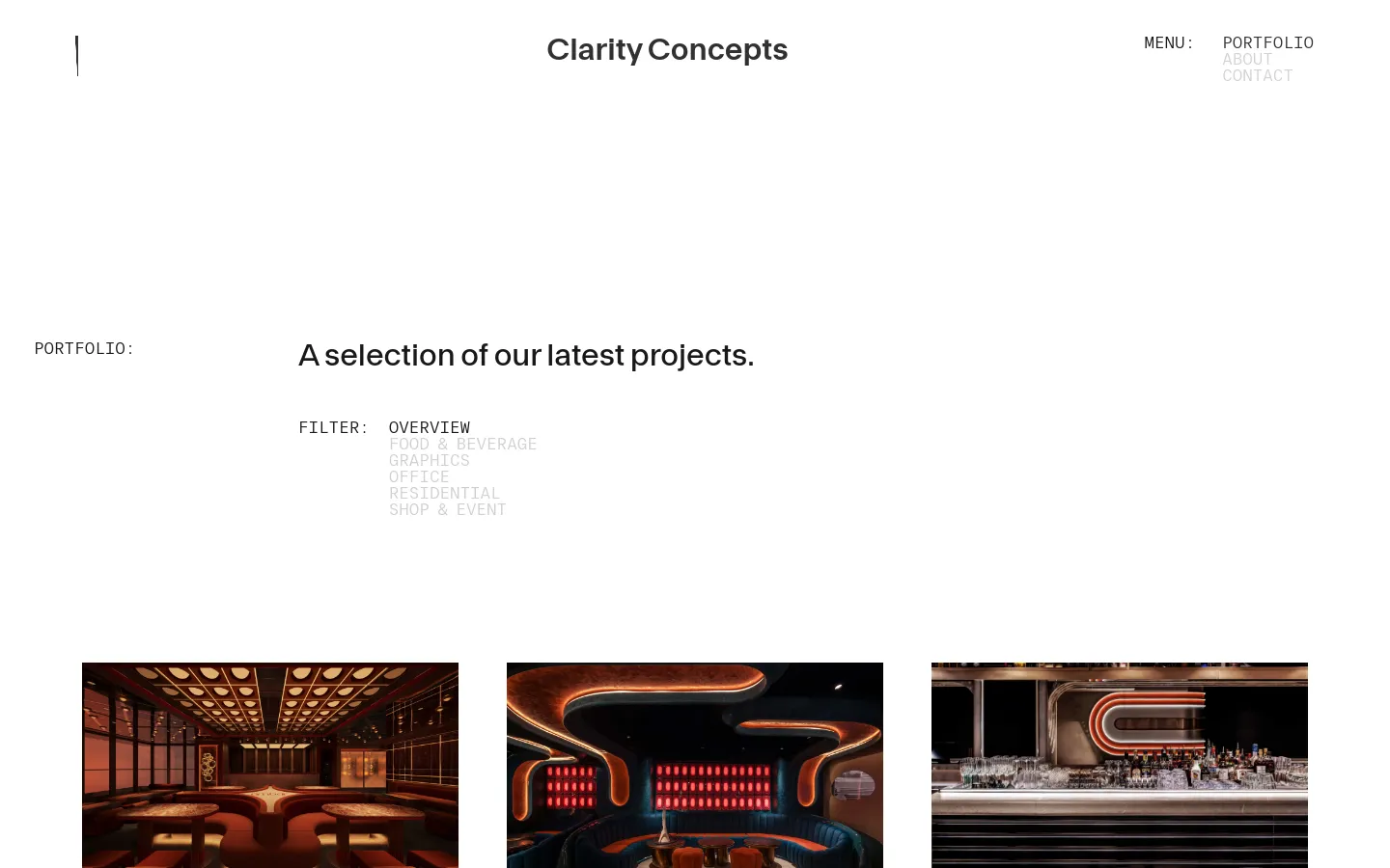
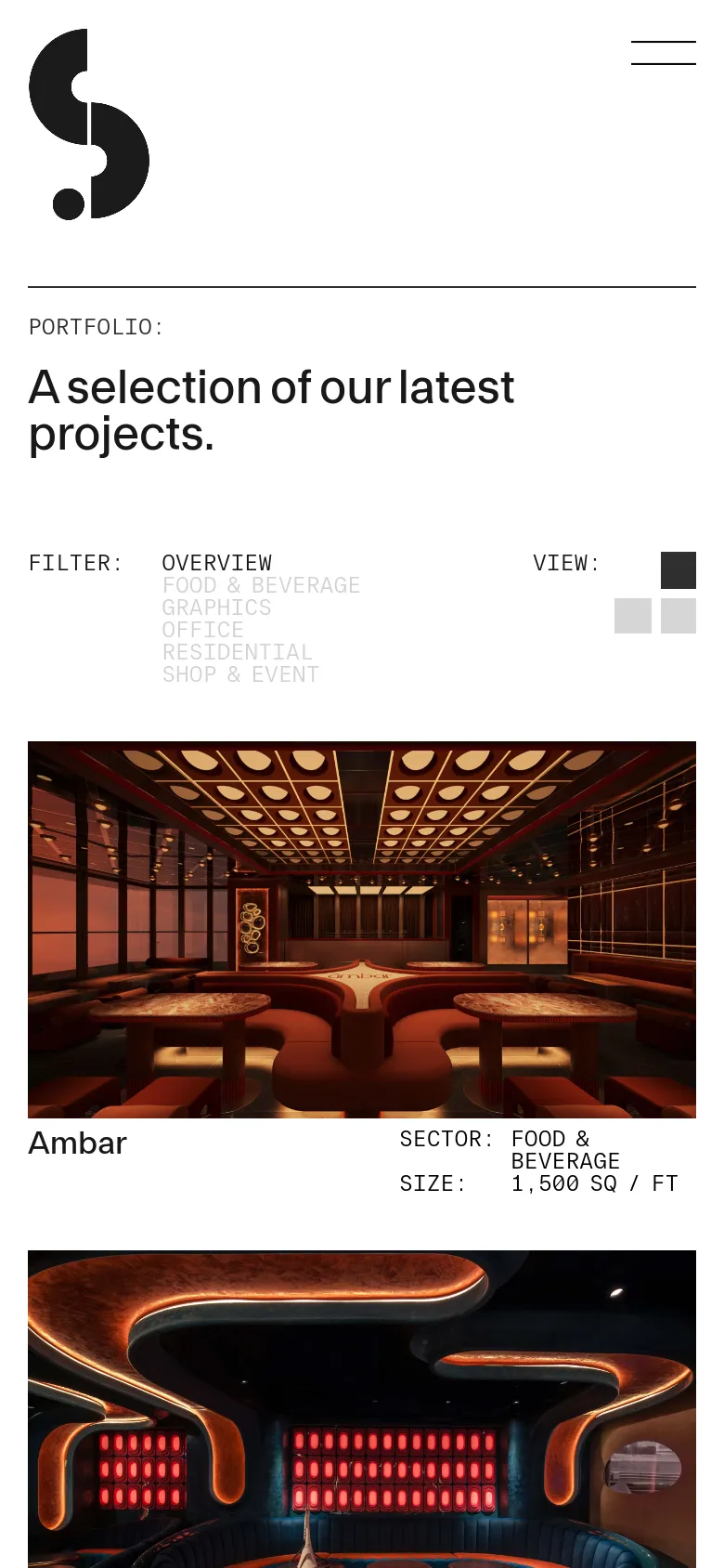
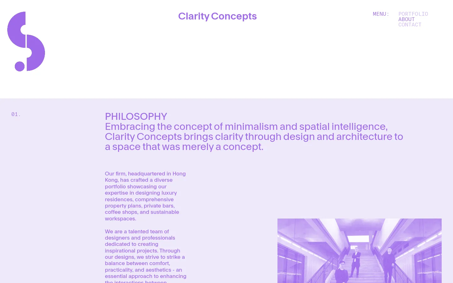
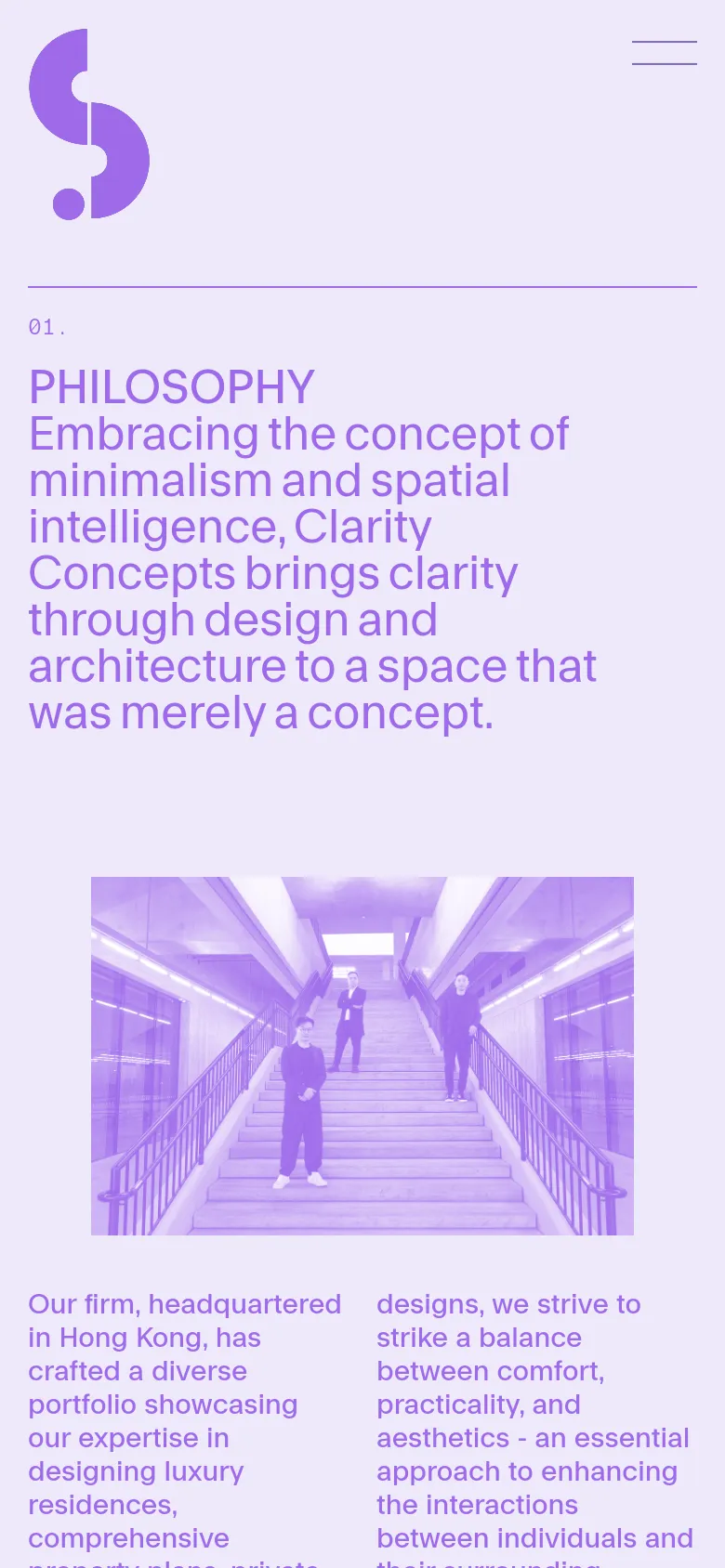
Clarity Concepts uses a high-concept digital presence to mirror the spatial intelligence found in their architectural work. The site functions as a quiet, curated gallery where the brand's philosophy of minimalism is immediately felt through expansive white space and a soft, lavender-tinted palette. Rather than overwhelming the viewer with technical specifications, the landing page rhythm prioritizes atmospheric imagery and large-scale typography that allows the interior design projects to breathe. Large, sans-serif typefaces anchor the layout, creating a clear hierarchy that guides the eye from bold headlines to detailed project showcases. The use of oversized, abstract geometric shapes acts as a recurring visual motif, providing a sense of structural balance across the scroll. A subtle, airy grid structure supports the high-resolution photography, ensuring that the transition between text-heavy philosophy sections and visual portfolio frames feels intentional and rhythmic. The decision to pair soft pastel backgrounds with sharp, dark typography creates a sophisticated, high-end atmosphere.
- Alex Hunting — designer
- Apn — designer
Design


Technology
- Google Hosted Libraries
- jsDelivr
- Unpkg
- MySQL
- Nginx
- Yoast SEO
- Nginx
- Yoast SEO


