Concept Ventures
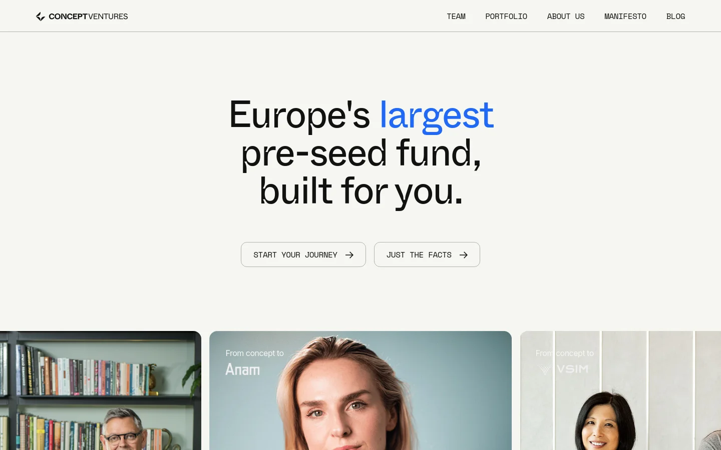

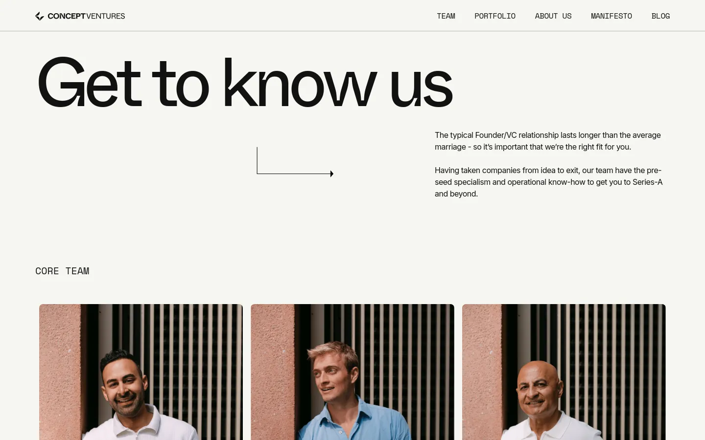
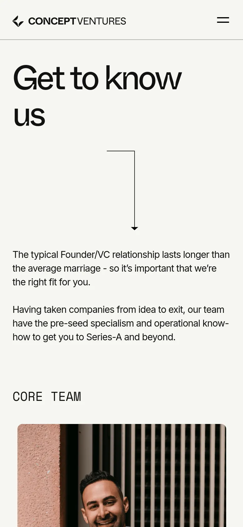
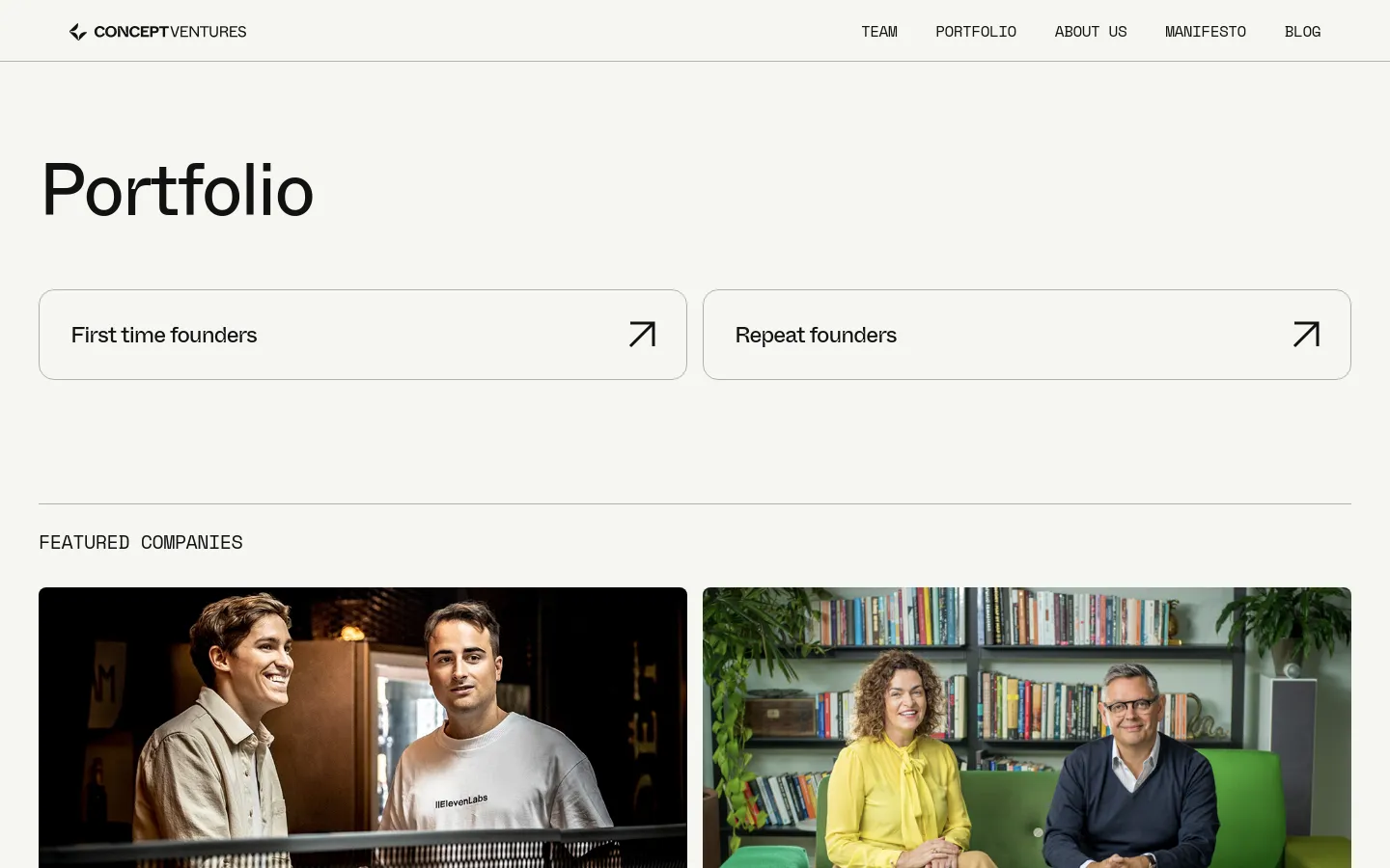
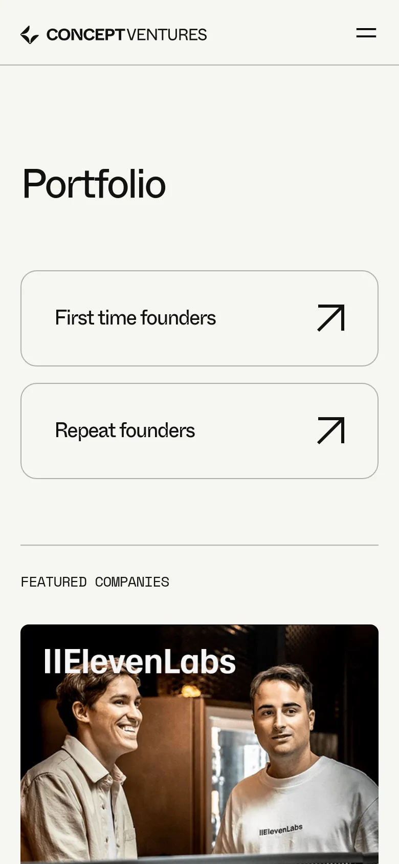
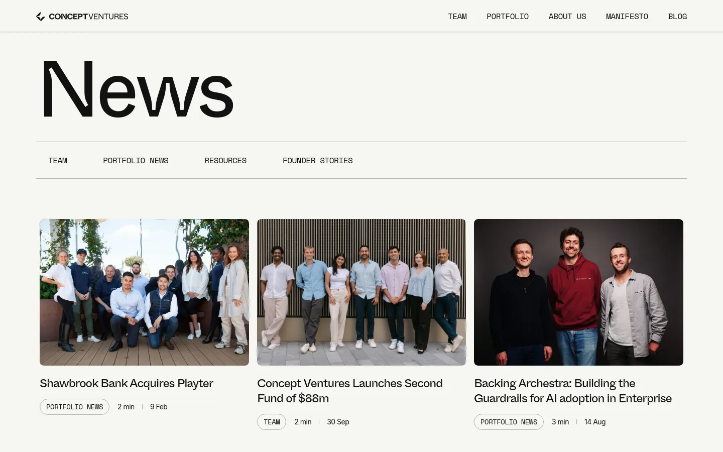
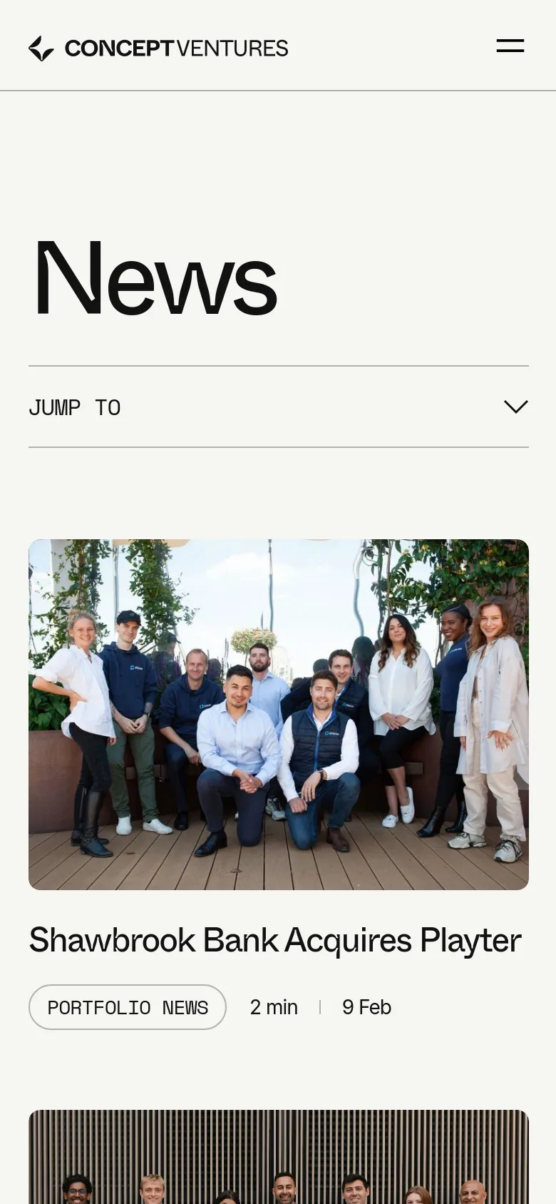
Concept Ventures uses a bold, high-impact layout to signal its dominance as a major player in the European pre-seed venture capital space. The site moves away from the stuffy, overly formal aesthetics of traditional finance, opting instead for a confident, human-centric approach that emphasizes the founders behind the startups. Large-scale photography of people and real-world environments creates an immediate sense of connection and scale, framing the fund as a partner in the entrepreneurial journey rather than a detached institution. Oversized typography dominates the visual hierarchy, using varying weights and a striking blue accent to guide the eye through the narrative. The grid is structured around large, immersive image blocks that act as windows into the portfolio, creating a rhythmic flow as users scroll. A clean, spacious layout allows the heavy type to breathe, while the use of subtle, rounded buttons provides a soft counterpoint to the massive headlines. The decision to lead with human faces rather than abstract data points makes the high-stakes world of venture capital feel accessible and grounded.
- Justified Studio — designer
Design
- Inter
- Space Mono
- Swiper Icons
- Webflow Icons
- Whyte


About UsTeam
PortfolioPortfolio
Blog / ArticleBlog
404 ErrorPage not found


Technology
- Google Analytics
- cdnjs
- Cloudflare
- Google Hosted Libraries
- jsDelivr
- HTTP/3
- HSTS
- Intellimize


