Crane Brothers
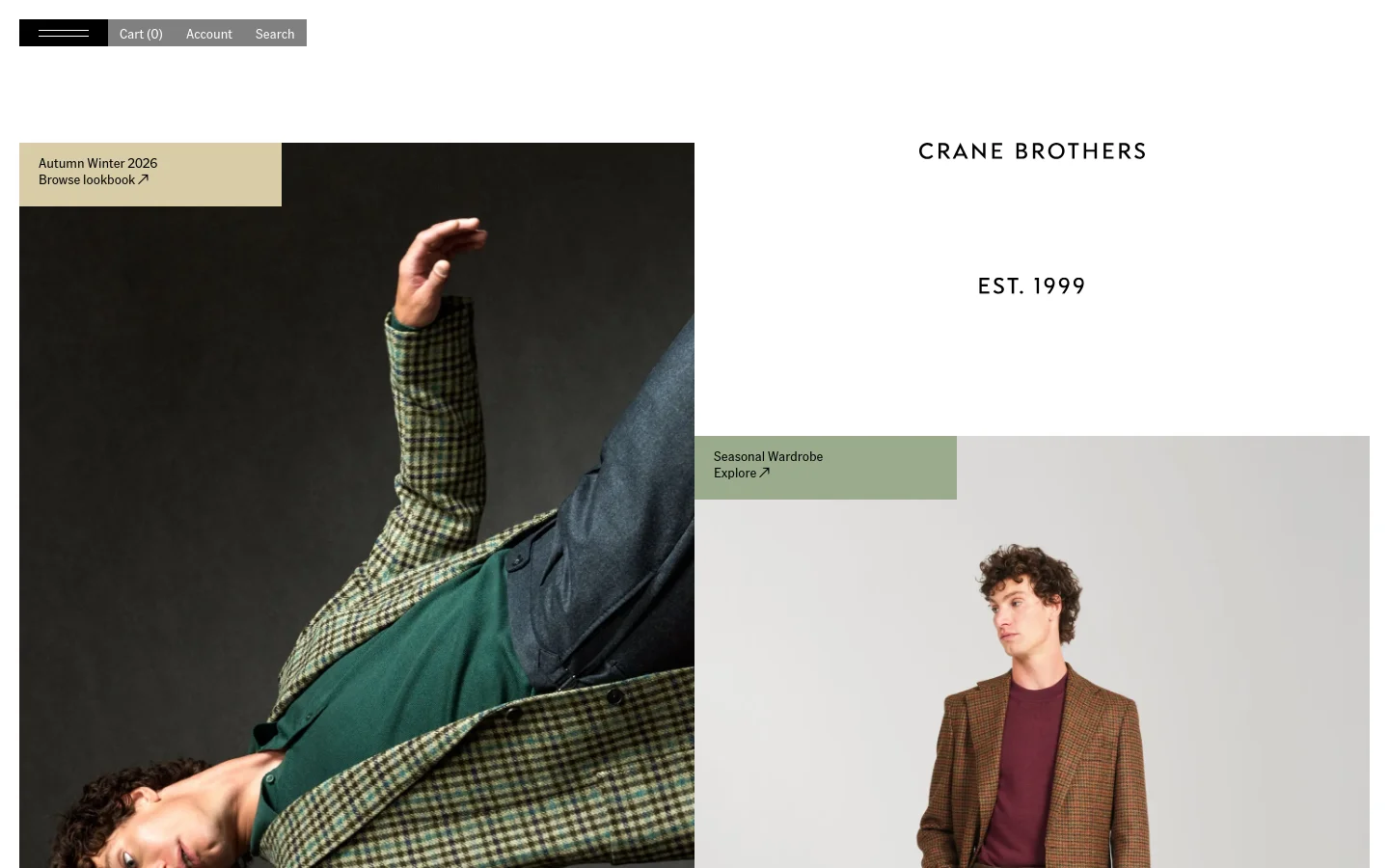
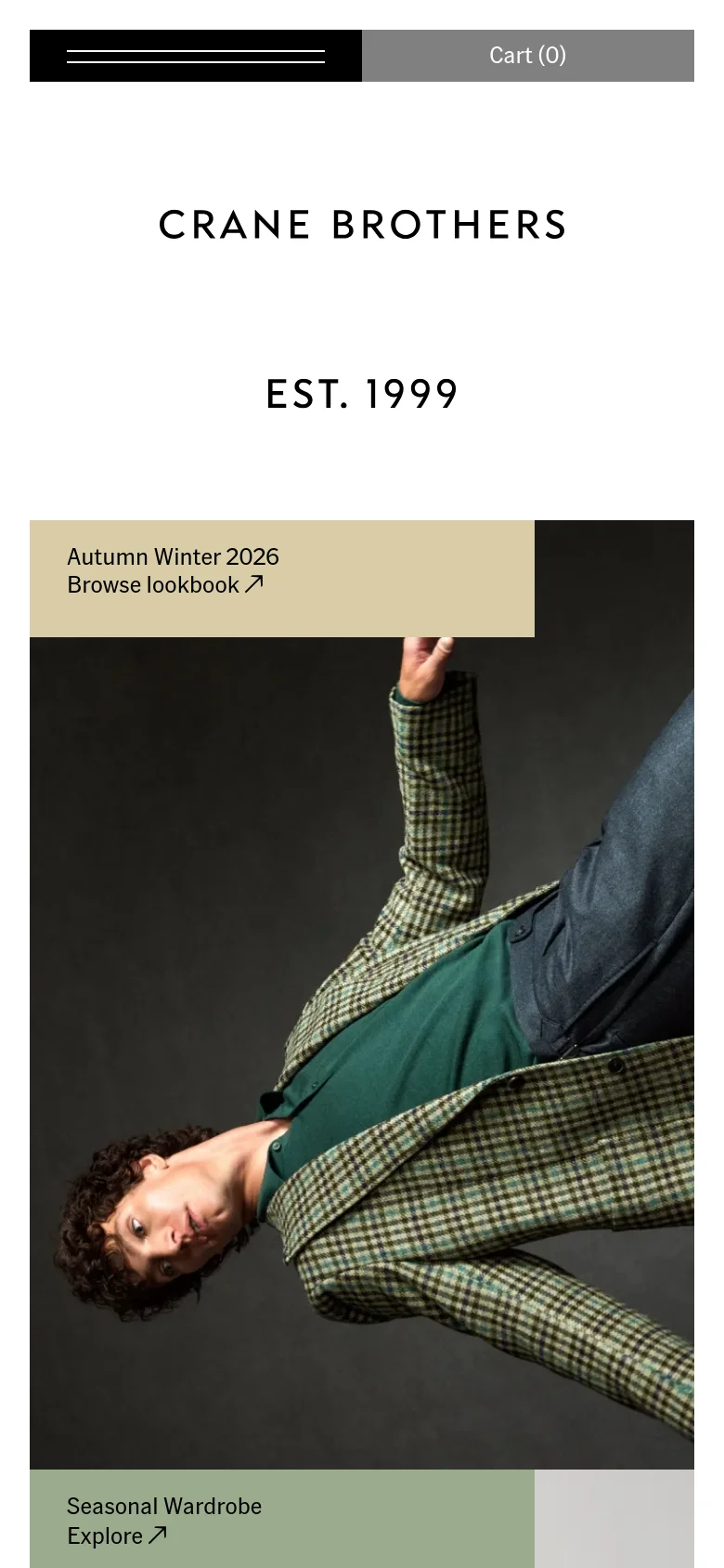
Crane Brothers presents a digital storefront that mirrors the relaxed sophistication of their tailoring. The site functions as a visual editorial, using large-scale photography and generous whitespace to showcase the texture and drape of their garments. By prioritizing high-impact imagery over dense product grids, the design establishes an immediate sense of heritage and quality, framing the brand as a curator of fine lifestyle pieces rather than a mere retailer. Asymmetric layouts and overlapping color blocks drive the visual rhythm, breaking the traditional e-commerce mold. Muted, earthy tones in the call-to-action overlays provide a tactile feel that complements the seasonal collections. The typography is understated and spaced with intention, allowing the heavy-weight serif and sans-serif pairings to anchor the composition without overwhelming the photography. This approach favors a slow, deliberate browsing experience that rewards the viewer's attention to detail.
Design
Technology
- Google Analytics
- Cloudflare
- jsDelivr
- HTTP/3
- Vite
- HSTS
- Google Tag Manager


