Crystal Rainbow
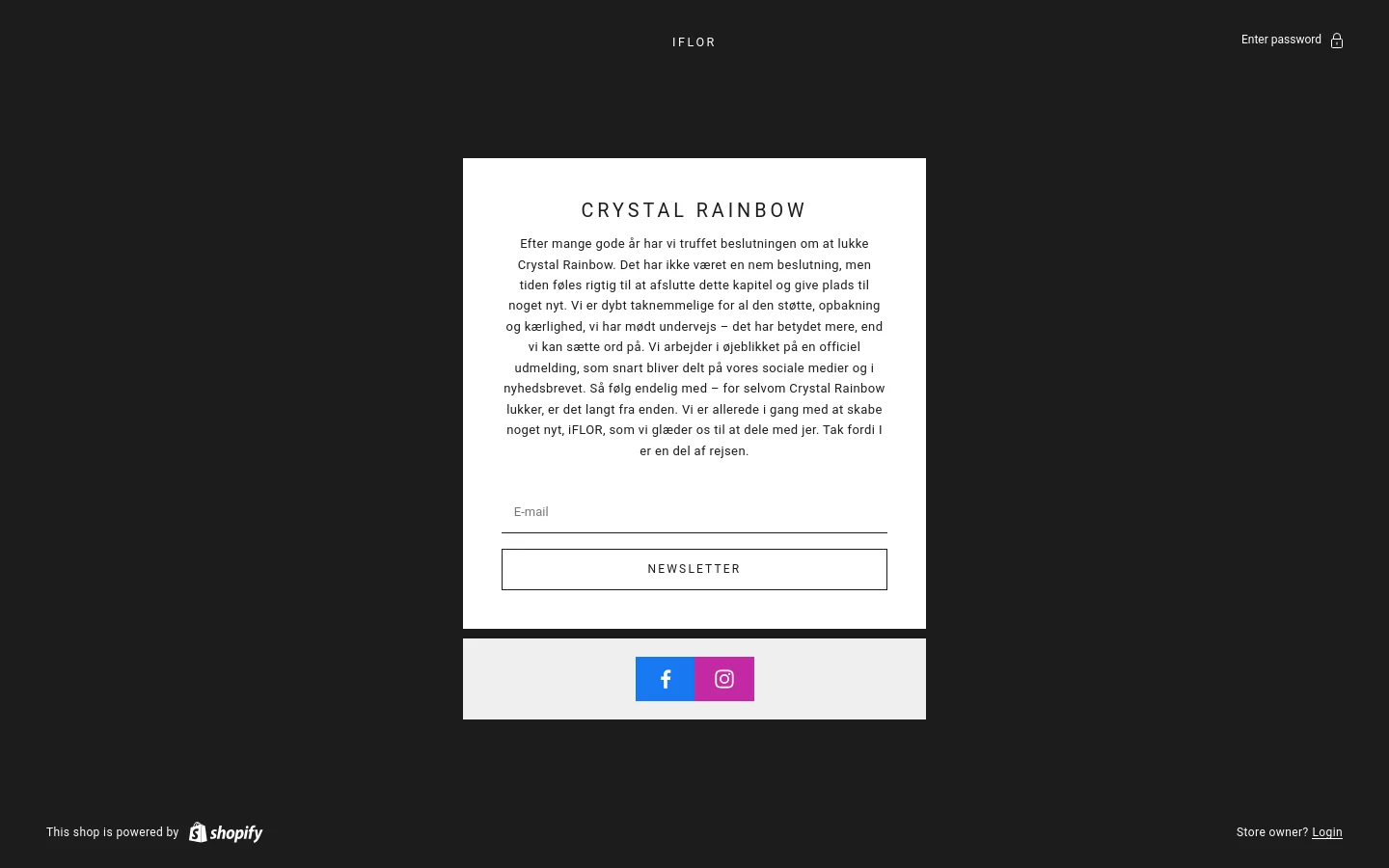
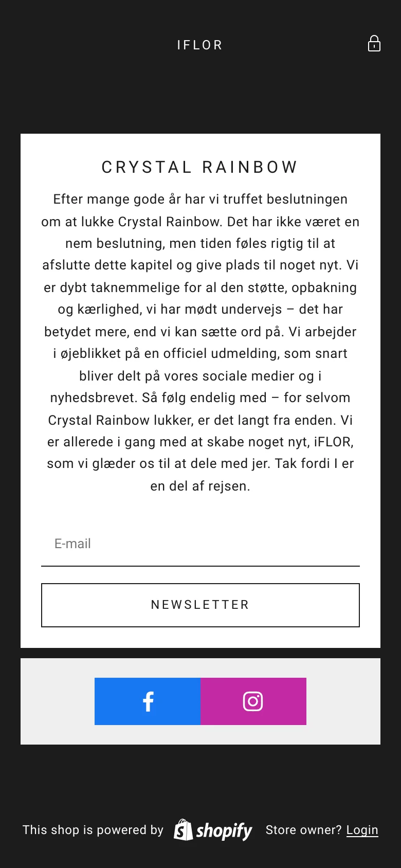
Crystal Rainbow, currently transitioning into the iFLOR brand, presents a minimalist and highly focused digital presence. The website serves as a transitional landing page, communicating a significant brand evolution to its community. Through a stark, high-contrast layout, it manages the closure of one chapter while building anticipation for the next, utilizing a clean, centered composition that directs all attention to its core message. The visual identity is defined by a sophisticated, monochromatic palette punctuated by a single, vibrant pop of color in the social media call-to-action. The use of ample white space within the central card against a deep, dark background creates a sense of premium exclusivity and clarity. It is a design tailored for a loyal, existing audience, prioritizing direct communication and emotional connection during a period of brand metamorphosis.
Design
- Swiper Icons
Technology
- Facebook Pixel
- Google Analytics
- Cloudflare
- jQuery CDN
- jsDelivr
- HTTP/3
- HSTS