ebmerzachhuber.at
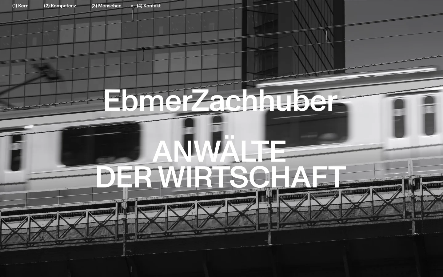
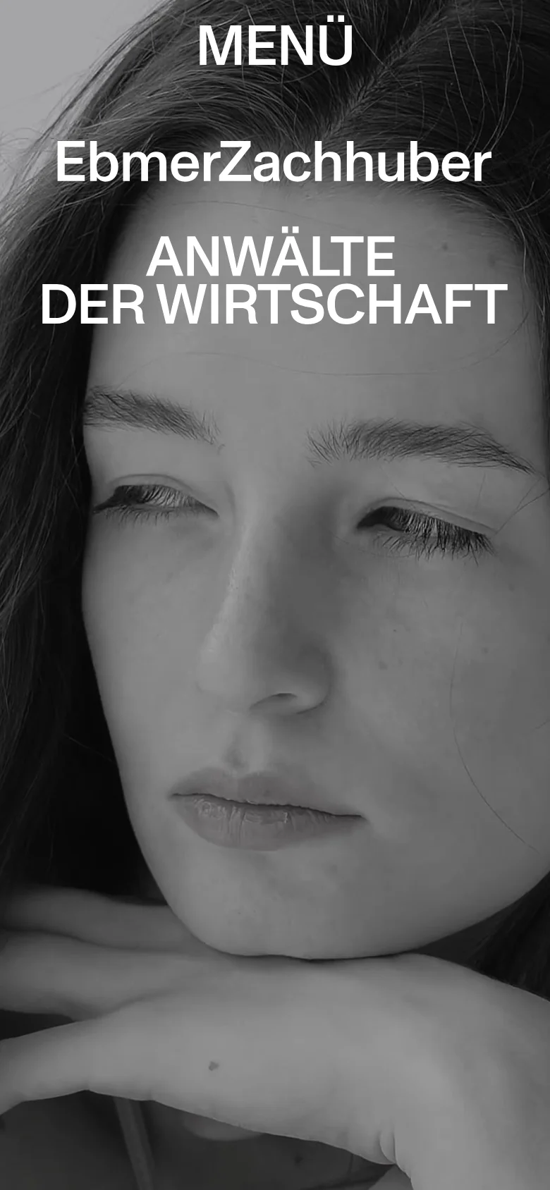
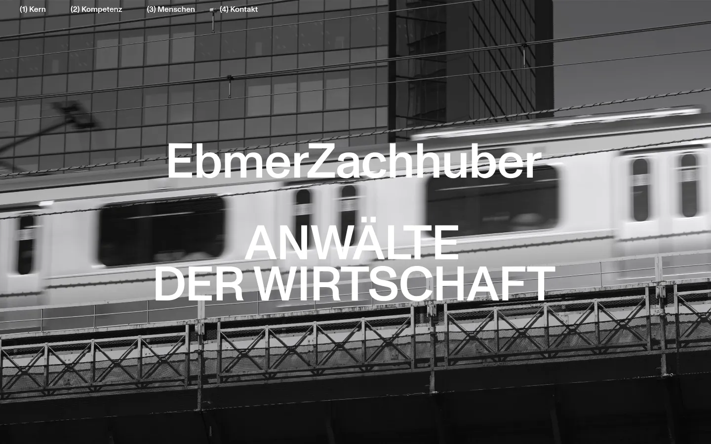
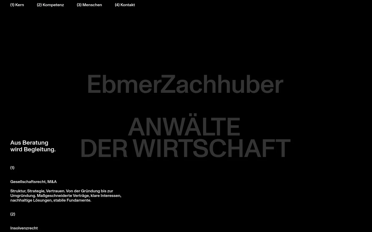
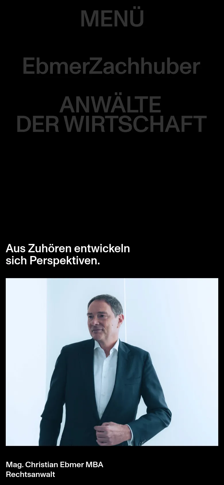
EbmerZachhuber commands authority through a high-contrast, cinematic approach to legal services. By utilizing large-scale, grayscale photography—ranging from motion-blurred urban transit to intimate portraits—the site establishes a sense of momentum and human connection essential for corporate law. The editorial layout moves away from traditional, stuffy legal templates, opting instead for a rhythmic sequence of bold headlines that anchor the user through the firm's expertise in business and insolvency law. Oversized sans-serif typography dominates the visual hierarchy, creating a striking impact against deep black backgrounds and stark white text. The use of a monochrome palette lends a sophisticated, timeless quality to the interface, while the sparse distribution of content allows the imagery to breathe. A notable design choice is the integration of heavy, centered type that overlaps dynamic photographic elements, resulting in a layout that feels more like a premium magazine than a standard professional service site.
- Alexander Roither — designer, developer