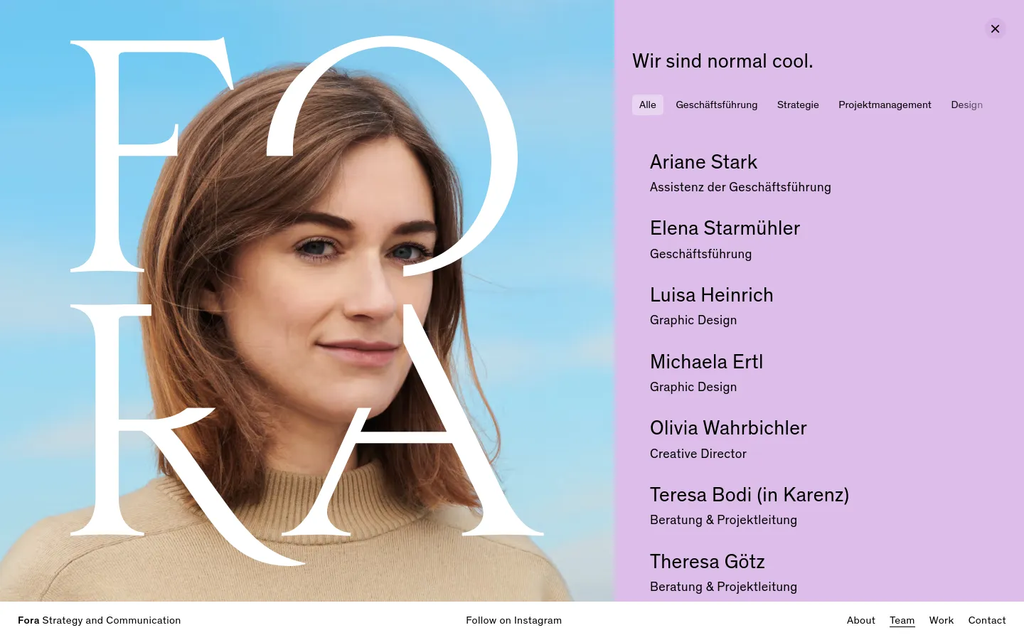
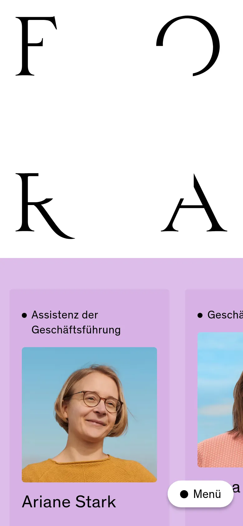
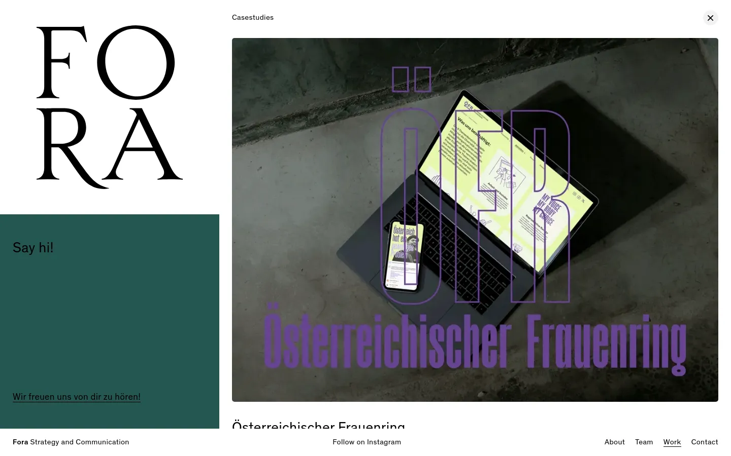
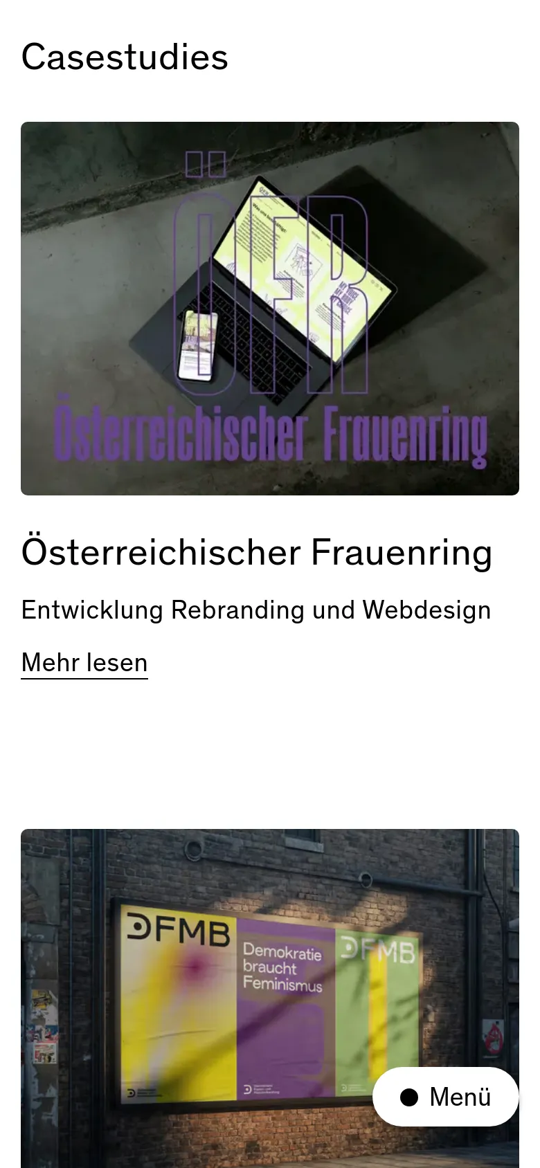
Fora

Fora presents a high-energy approach to strategy and communication through a layout that feels more like a lifestyle magazine than a traditional agency site. The design uses large-scale serif typography and a rhythmic, block-based structure to communicate a sense of purpose and personality. By blending professional service descriptions with expressive, colorful sections, the site establishes an editorial tone that suggests their work is as much about creative storytelling as it is about organizational structure. Color blocks in terracotta, lavender, and sky blue define the page rhythm, creating a modular grid that guides the eye through different service offerings and team introductions. The use of oversized, high-contrast serif typefaces provides a strong structural anchor against the soft, pastel backgrounds. A distinctive choice is the way the brand name is treated as a massive graphic element, breaking the traditional boundaries of a header to become a central part of the visual experience.
- Anna Ehrnsperger — designer
- Studio Leichtfried — designer
Design

Technology
- jsDelivr
- Netlify
- Netlify
- HSTS


