Freitag
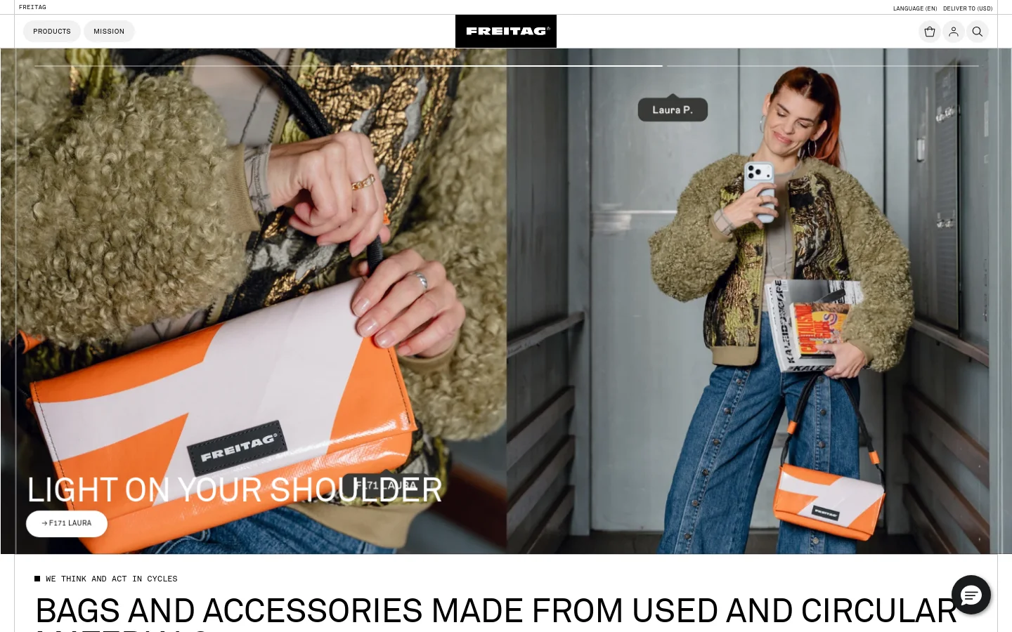
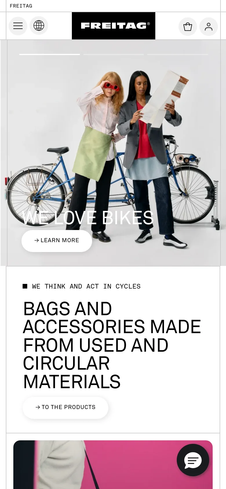
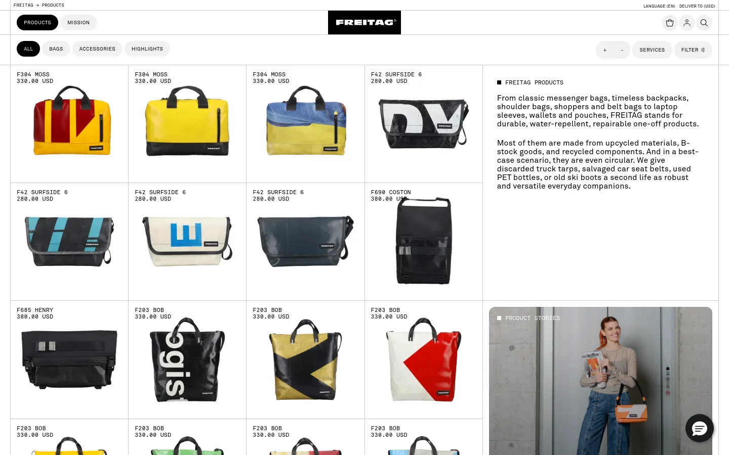
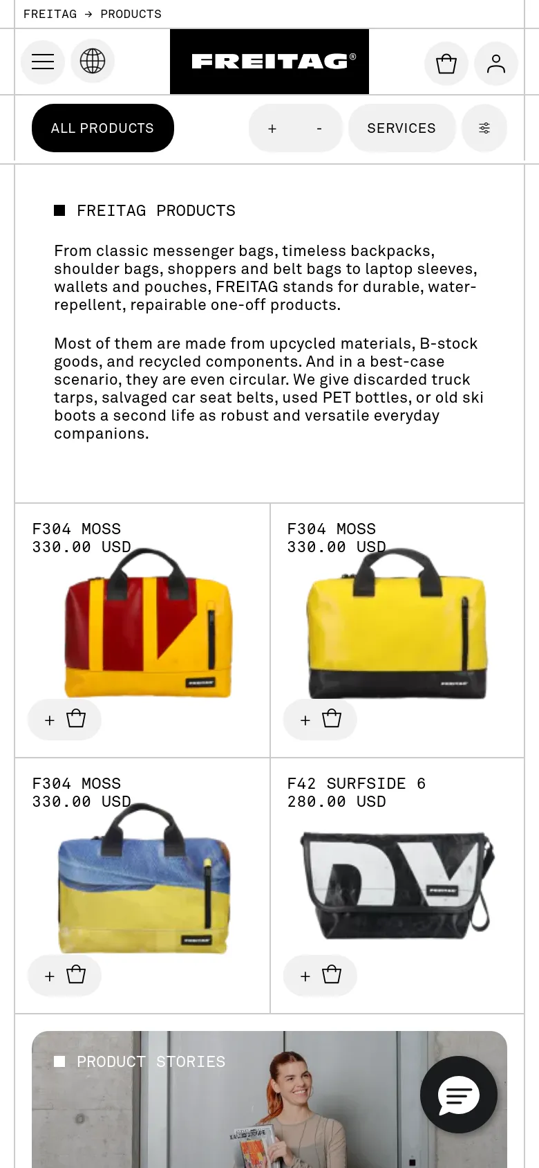
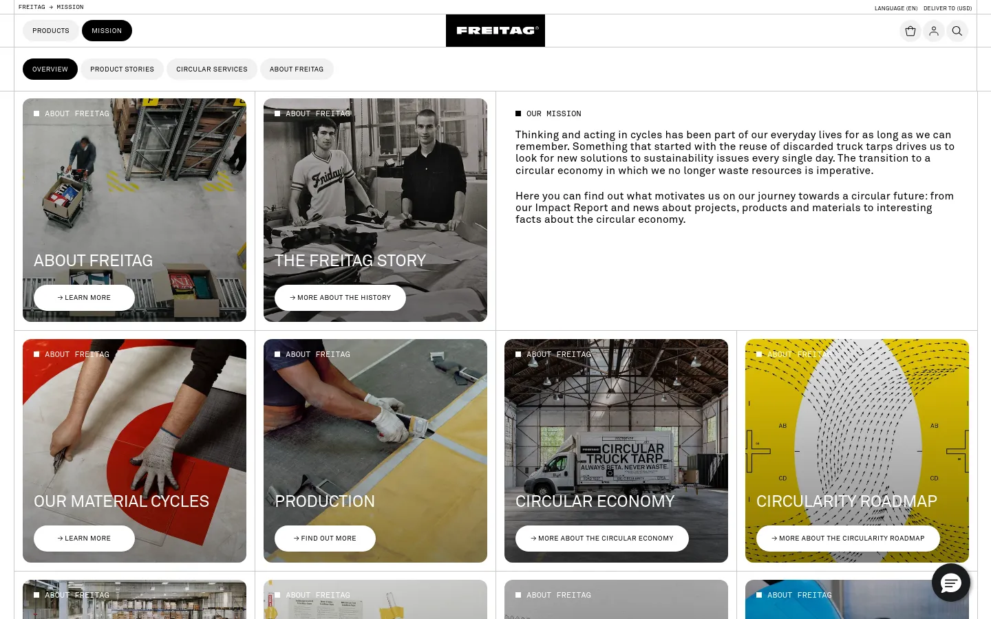
Freitag uses a raw, documentary-style visual language to ground its circular mission in reality. The site avoids polished commercialism, opting instead for candid, high-contrast photography that highlights the tactile, weathered nature of upcycled truck tarps. By leading with large-scale imagery of people in motion, the design connects the product to an active, urban lifestyle, making the sustainability narrative feel lived-in rather than lectured. Large, heavy sans-serif typography anchors the layout, creating a structured grid that organizes a diverse array of product patterns. The product gallery utilizes a clean, repetitive grid that allows the chaotic, one-of-a-kind colors and textures of each bag to stand out without visual competition. A stark black and white interface provides a neutral backdrop for the vibrant, salvaged materials, ensuring the product remains the primary focus of the user journey.
- HelloMe — designer
- Conversation Taking Place. Taking Place. Place. — designer
Design
- Akkurat
- Akkurat Mono
- DM Sans
- Open Sans
- Swiper Icons
Home / LandingFreitag Home


Shop / CatalogProducts
About UsMission
404 ErrorNot found
Technology
- Google Analytics
- jsDelivr
- Netlify
- OneTrust
- Webpack
- Netlify
- HSTS
- Google Tag Manager
- Flowbox


