Goodnight
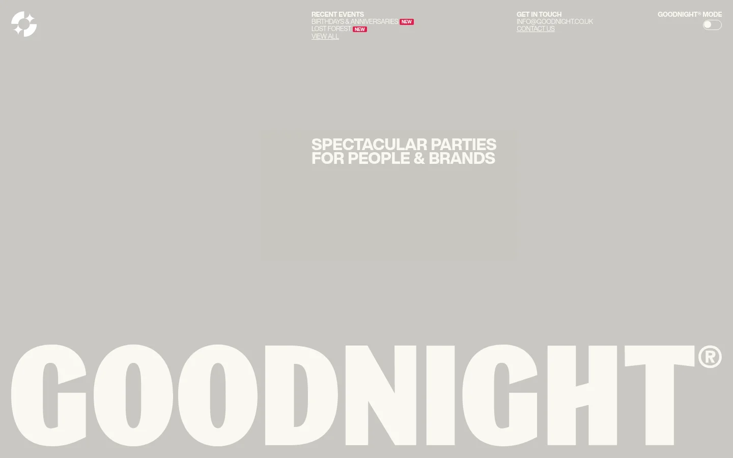

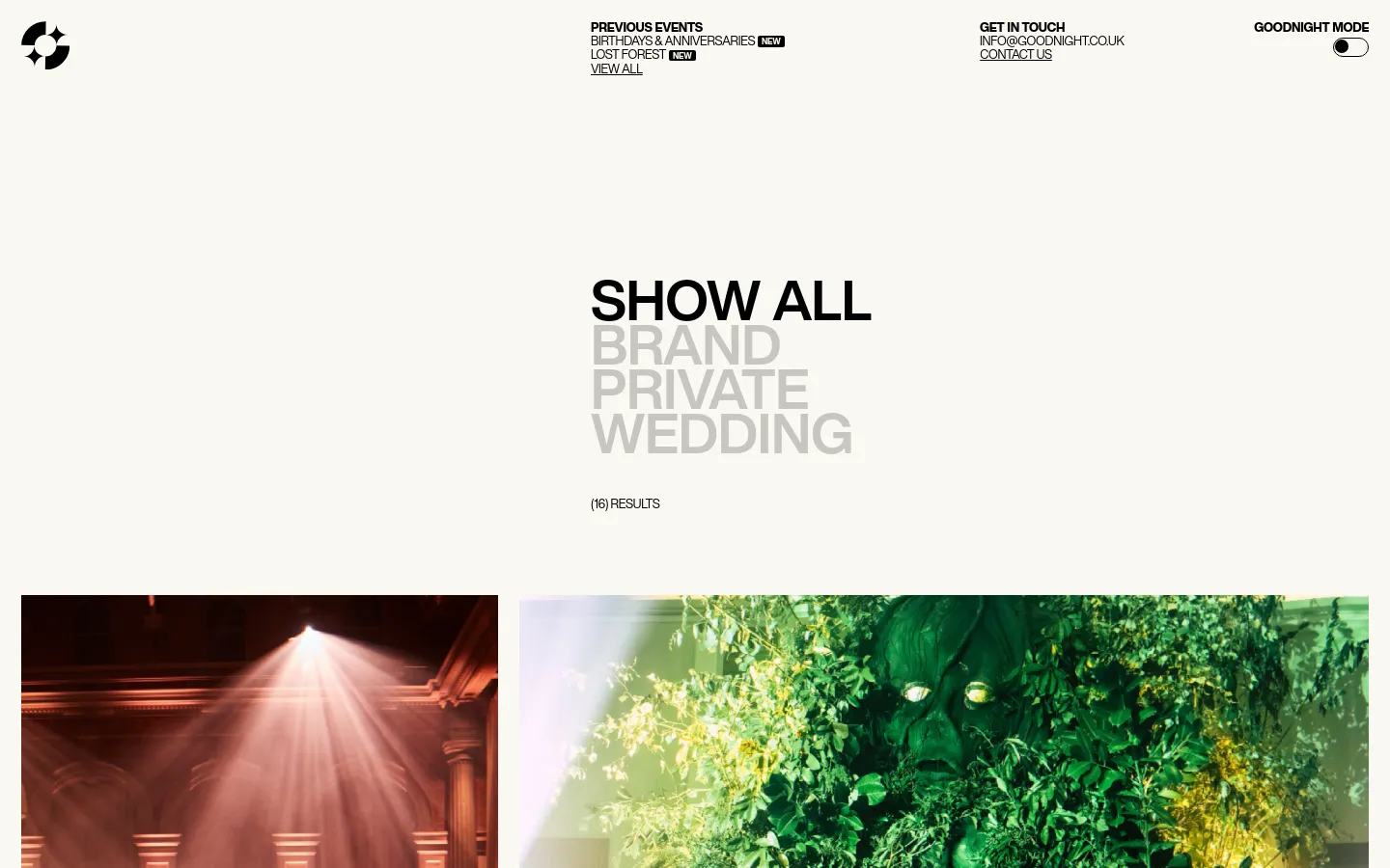
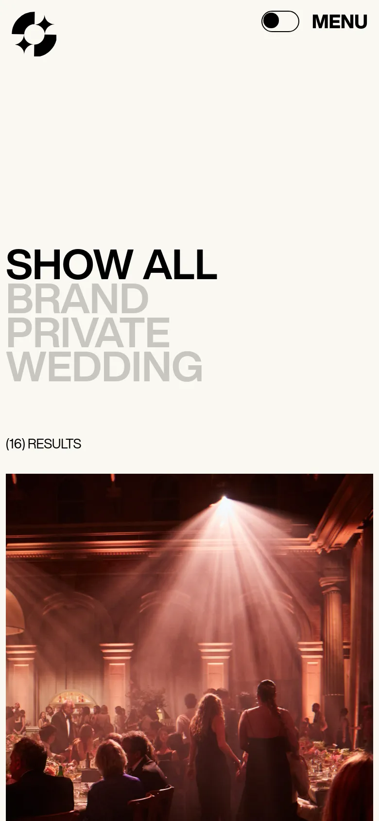
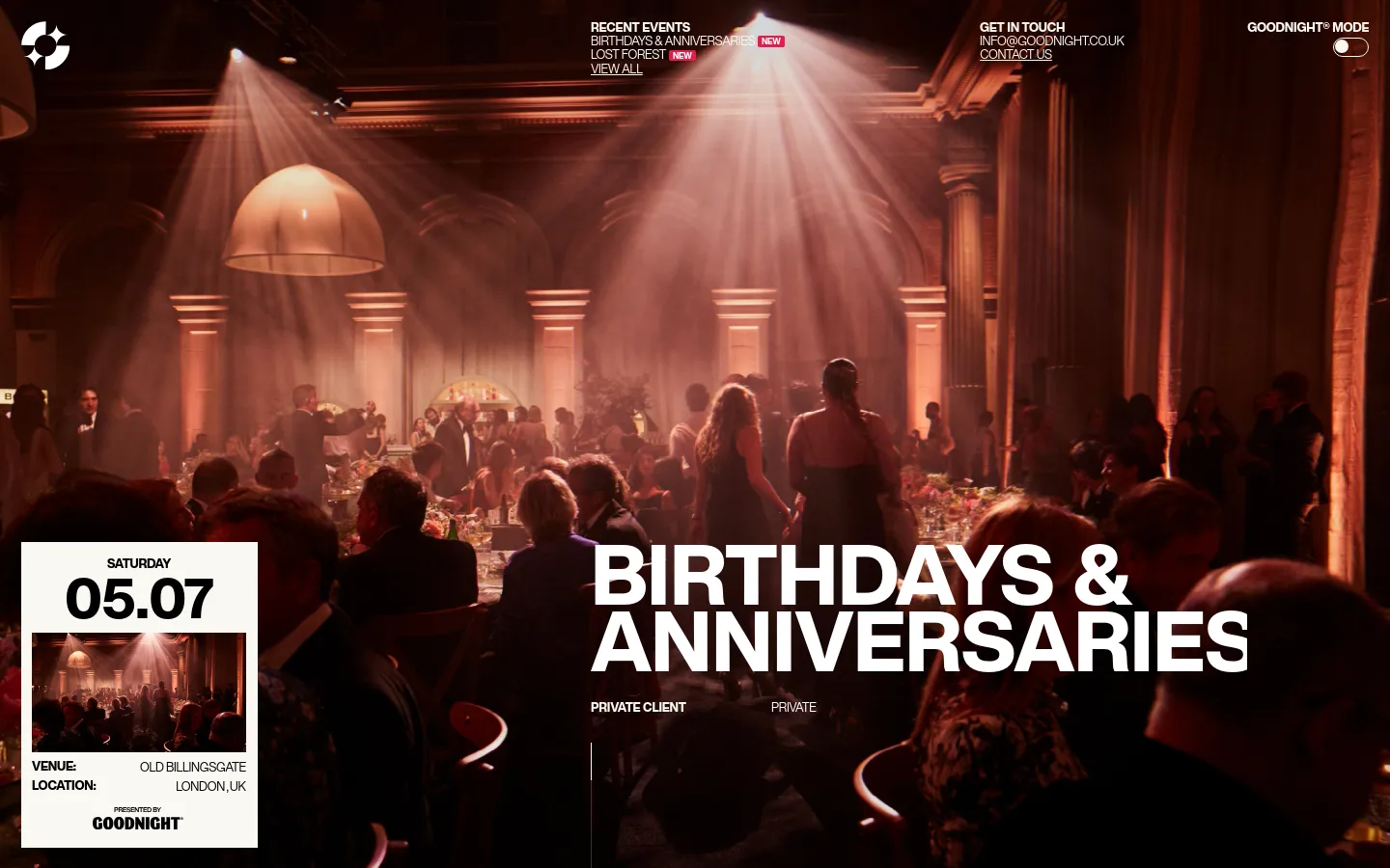
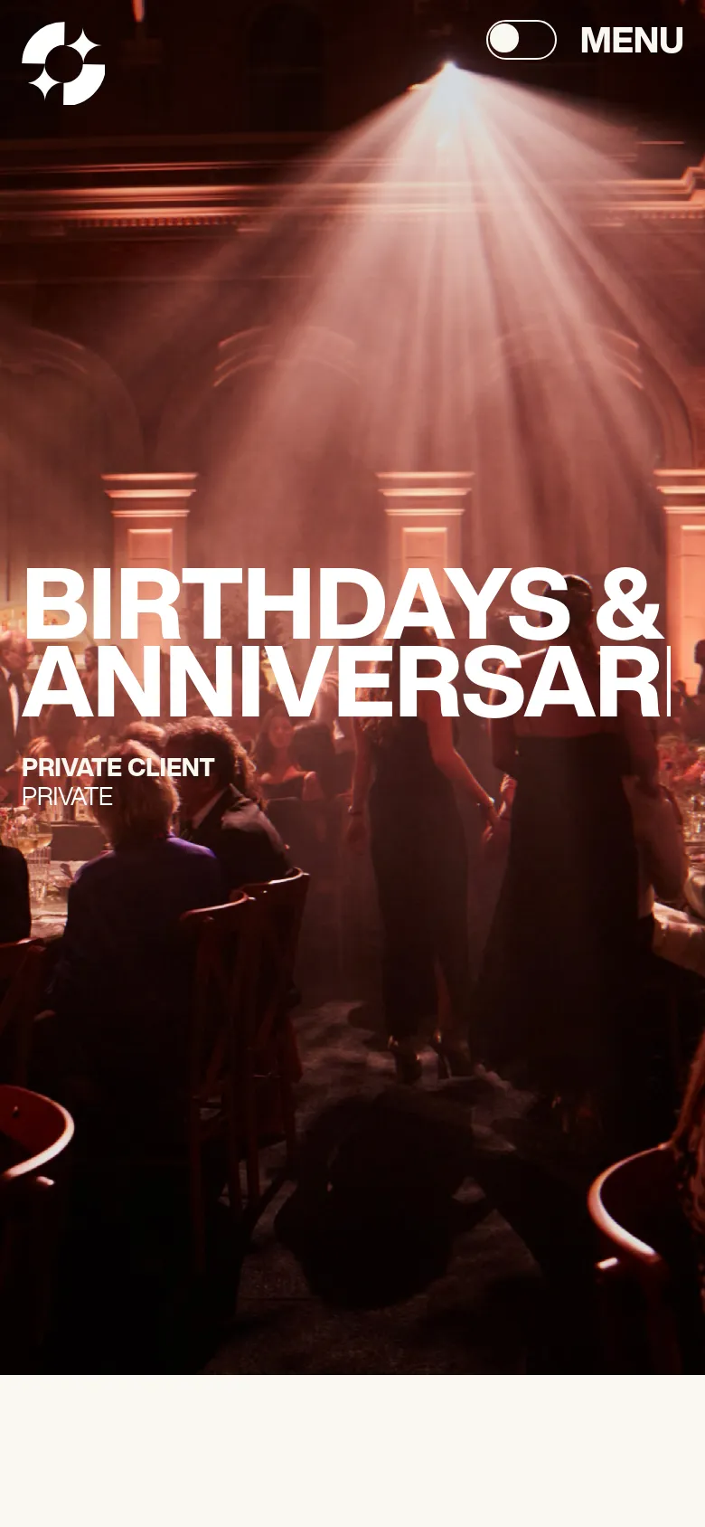
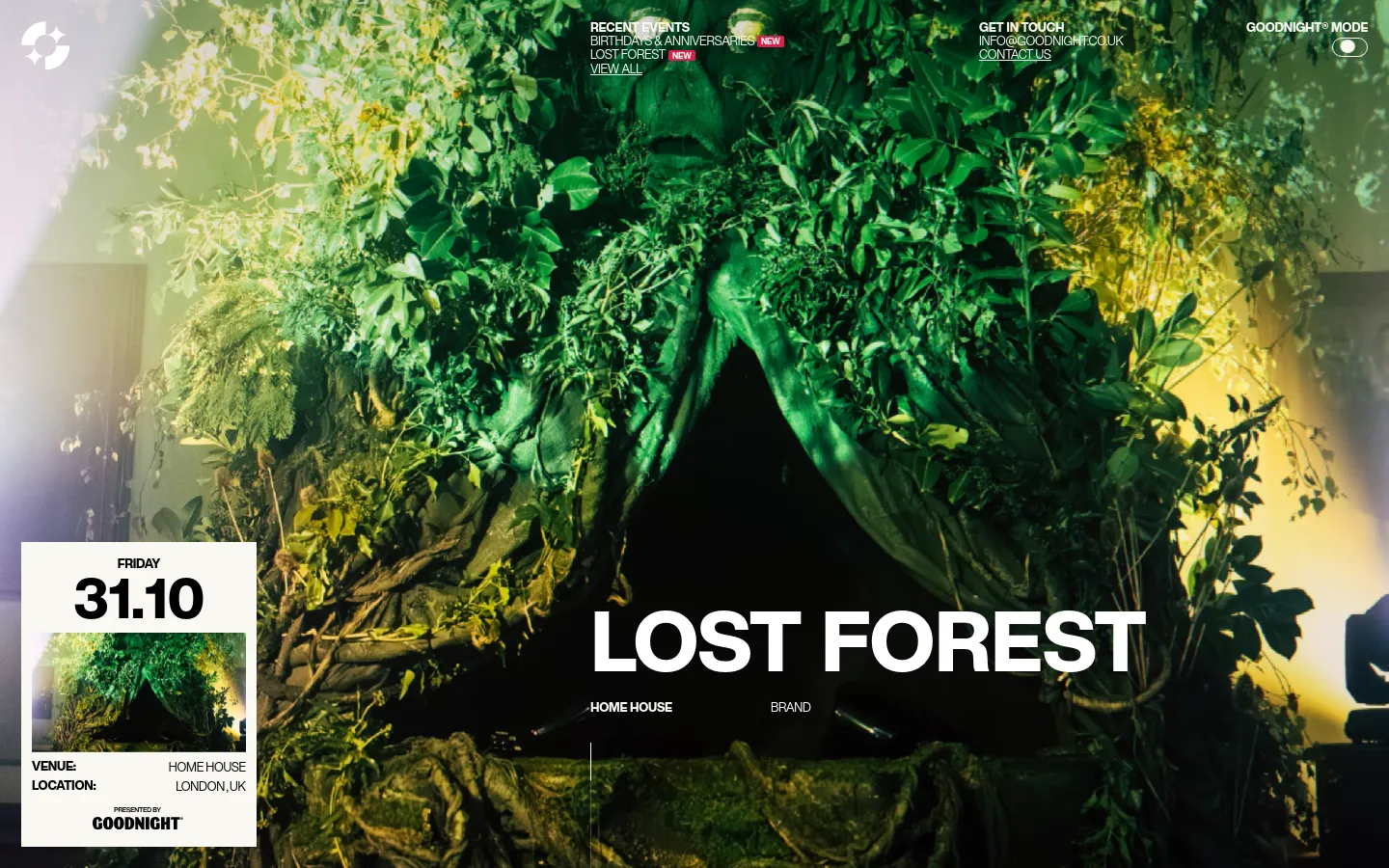
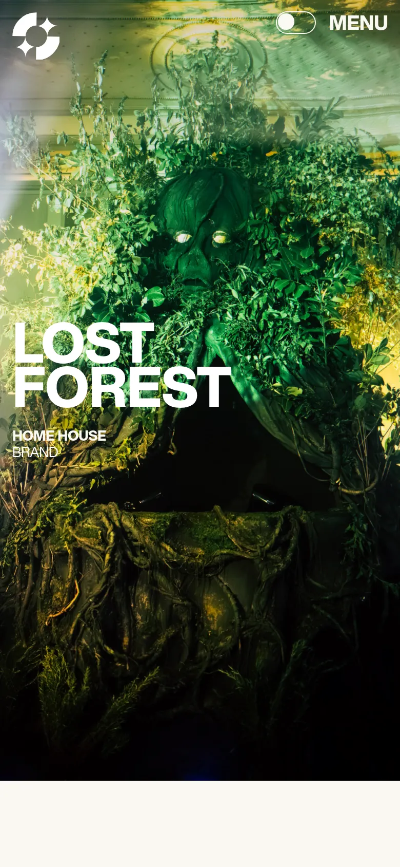
Goodnight establishes an immediate sense of high-octane celebration through a bold, typographic-first approach. The agency positions itself as a creator of immersive experiences, using massive, heavy-weight lettering to mirror the scale of the luxury parties they produce. By leading with a stark, monochromatic hero section that prioritizes the brand name and a singular, confident mission statement, the site captures the energy of a high-end event before a single photograph is even shown. Large-scale sans-serif type dominates the layout, creating a rhythmic pacing that alternates between expansive negative space and dense, high-contrast imagery. The grid shifts from wide, cinematic photography of event highlights to a layered, card-based testimonial section that feels tactile and editorial. This movement from massive type to intimate, human-centric reviews creates a sophisticated flow. The choice to use a muted, off-white palette allows the vibrant, saturated colors of the event photography to pop with intense clarity.
- Somefolk — designer
Design
- Helvetica Now
- Webflow Icons
Technology
- Google Analytics
- Cloudflare
- jsDelivr
- Unpkg
- HTTP/3
- HSTS


