Kolibri
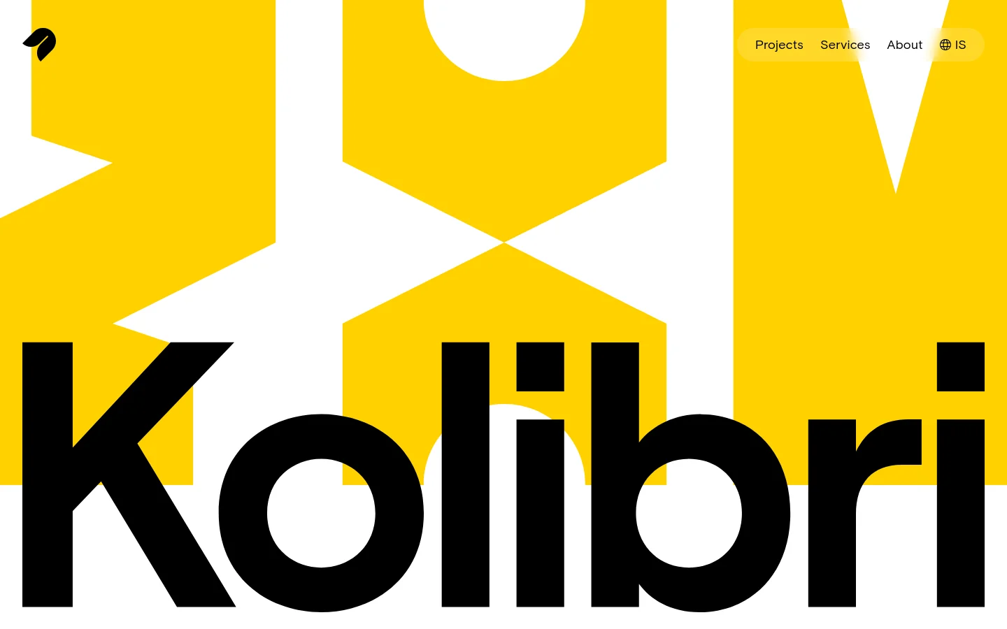
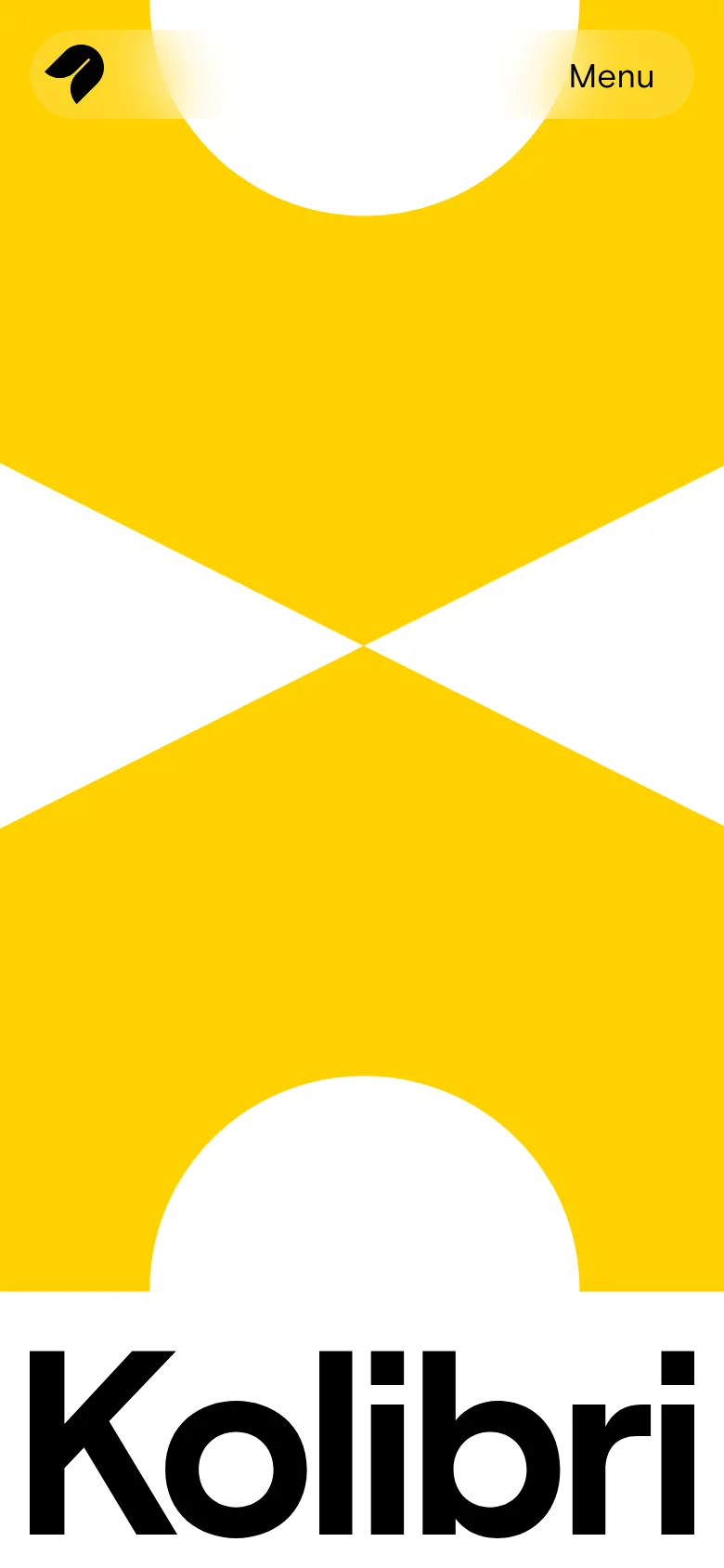
Kolibri leads with a high-energy, graphic-heavy approach that immediately signals a studio rooted in bold creative direction. The site uses massive, heavy-weight typography and a saturated yellow palette to establish a confident presence, framing their digital design services as something both impactful and intentional. Rather than relying on standard corporate imagery, the landing page uses abstract shapes and large-scale letterforms to create a rhythmic, almost poster-like experience that carries through the entire scroll. Large-scale sans-serif type dominates the layout, paired with a playful use of color and organic, illustrative elements. The grid feels loose and expressive, utilizing rounded containers and soft-edged cards to house project previews and information. A notable choice is the way the brand uses extreme scale—oversized headlines sit alongside compact, pill-shaped navigation elements—to create a sense of depth and hierarchy without traditional structural cues. The mix of high-contrast color blocks and tactile, paper-like textures gives the interface a distinct, physical personality.
Design
- Basis Grotesque
- Webflow Icons


