Landor
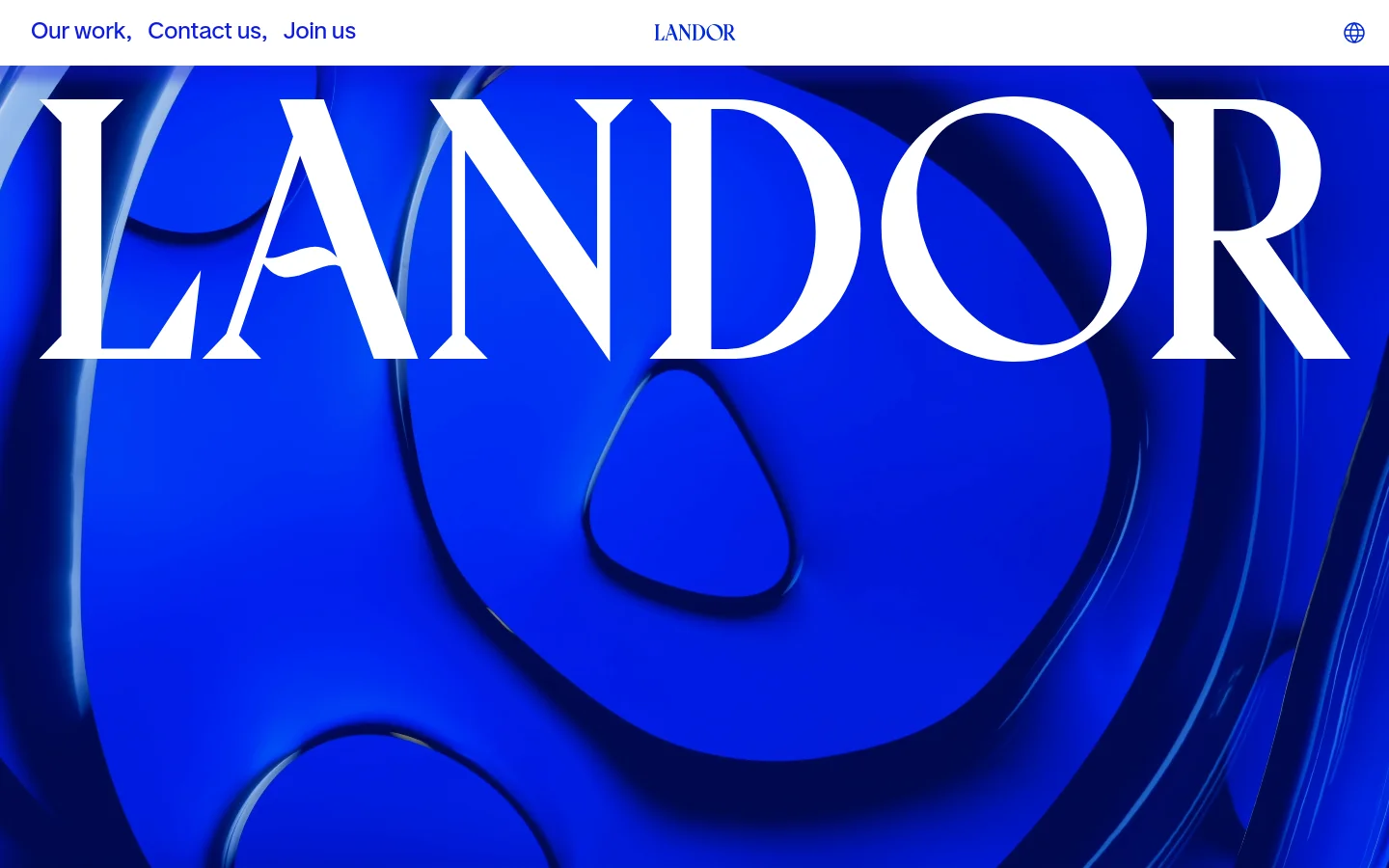

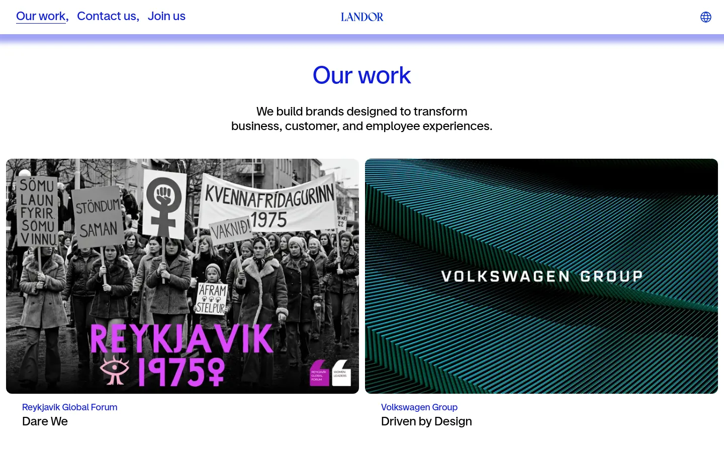
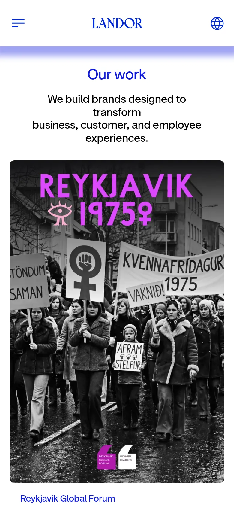
Landor commands authority through a high-impact visual language that mirrors its status as a global brand specialist. The site uses massive, serif typography to anchor its identity, immediately signaling a sense of heritage and scale. Rather than relying on standard corporate imagery, the landing page utilizes abstract, sculptural 3D forms and deep blue gradients to create a sense of depth and movement, framing the agency as a transformative force in the creative sector. Bold color blocking defines the scrolling experience, shifting from saturated blues to high-contrast red and white sections. The layout favors oversized type and generous whitespace, allowing individual brand names and case studies to breathe. A striking use of primary colors and heavy-weight fonts creates a rhythmic pace that feels both deliberate and energetic. The decision to lead with abstract textures rather than literal photography suggests a focus on the conceptual essence of branding.
Design
- Google Sans
- Roboto
- Swiper Icons


Technology
- Cloudflare
- jsDelivr
- OneTrust
- HTTP/3
- Cloudflare Bot Management
- HSTS


