Quentin Hocdé


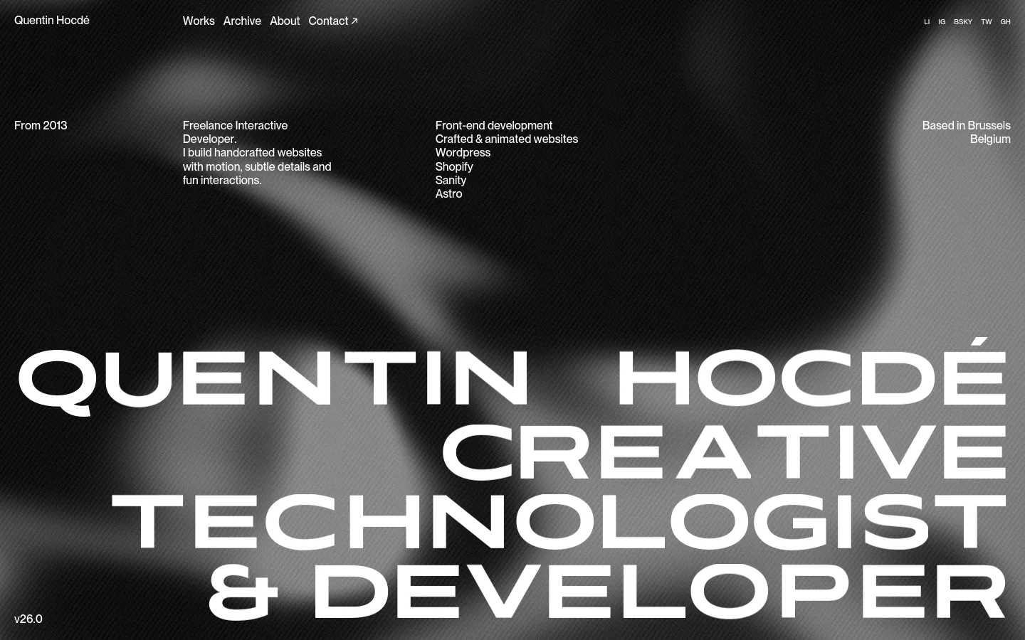
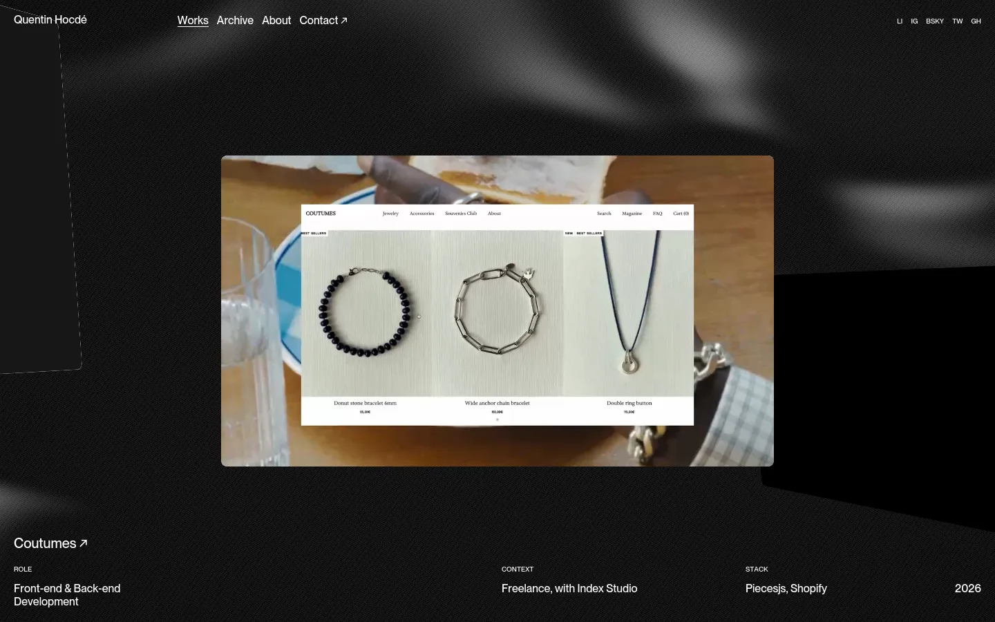
Oversized, heavy-weight typography dominates the landscape, immediately establishing a high-impact presence for this creative developer. The site functions as a digital calling card, using a high-contrast grayscale palette to prioritize legibility and structural rhythm. By anchoring the composition with massive letterforms that bleed across the frame, the design communicates a sense of technical confidence and bold creative direction. Monochromatic textures and a blurred, atmospheric background provide depth without distracting from the core information. The layout utilizes a sparse, grid-based approach where information is distributed with intentional breathing room, allowing the typography to act as both content and primary graphic element. A subtle use of motion and high-density text clusters in the subpages creates a sophisticated pacing that rewards closer inspection of the developer's specific technical stack.
- Quentin Hocdé — designer, developer
Design
Technology
- Cloudflare Browser Insights
- Cloudflare
- jsDelivr
- HTTP/3
- Cloudflare Browser Insights


