Stephanie Jeong
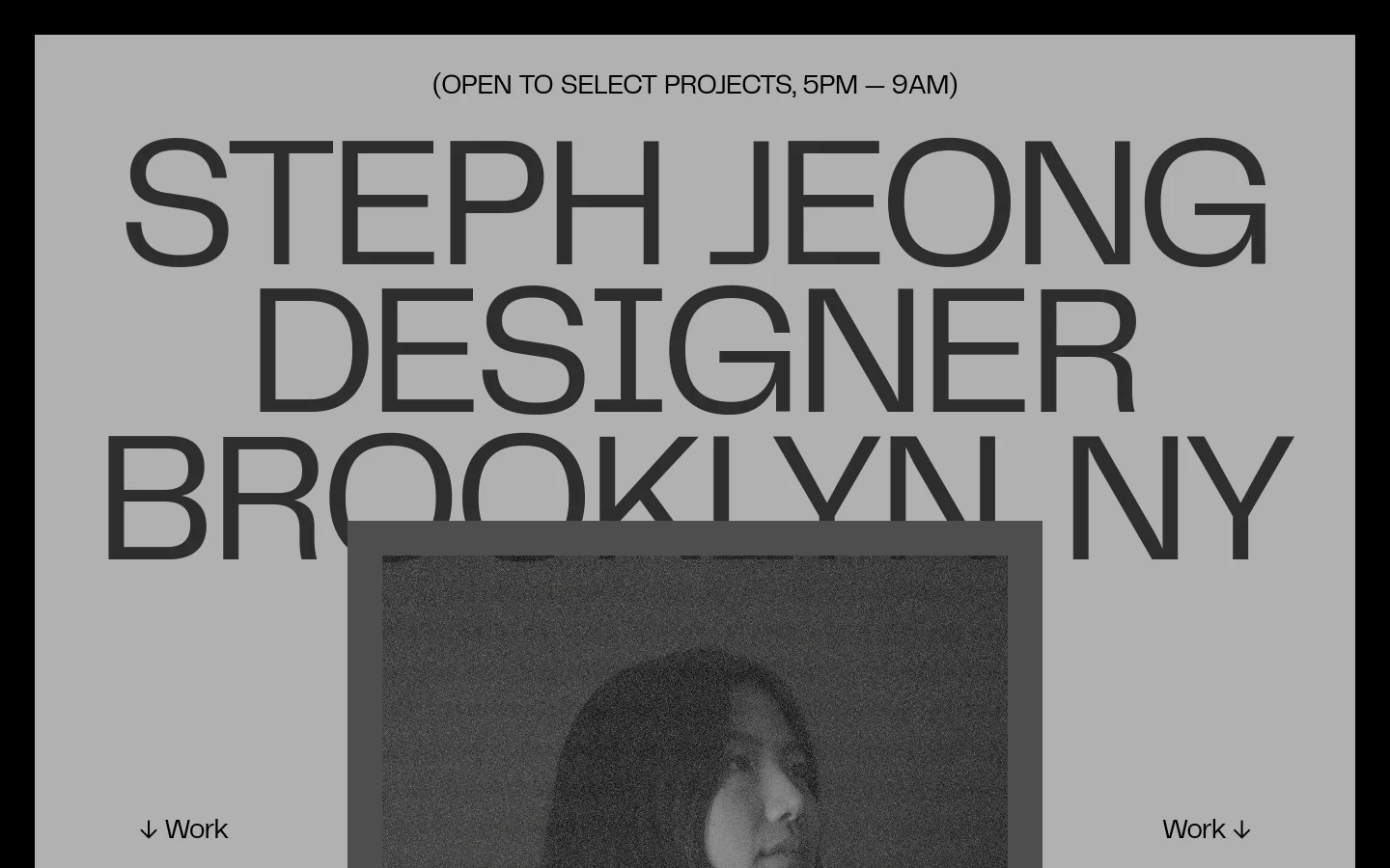
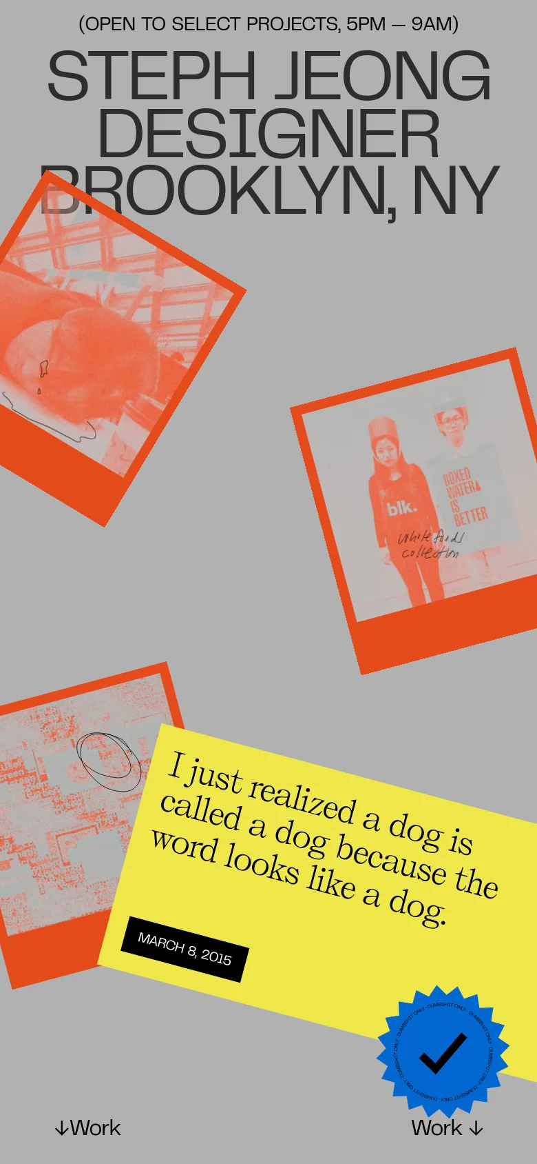
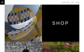
Stephanie Jeong's portfolio is a masterclass in high-impact, typographic-driven design. Serving as a digital showcase for a Brooklyn-based designer, the site utilizes a bold, editorial layout that prioritizes massive, expressive typefaces and a dynamic, collage-like arrangement of visual assets. It is clearly aimed at creative directors, agencies, and brands looking for a designer with a strong, distinct, and contemporary visual voice. The visual identity is defined by a sophisticated interplay of brutalist elements and playful, lo-fi aesthetics. By combining a muted, grayscale foundation with sudden bursts of high-saturation orange and yellow, the site creates a sense of rhythmic energy. The use of grainy textures, overlapping imagery, and unconventional spatial arrangements positions the brand as avant-garde, confident, and deeply rooted in modern digital culture.
- Steph Jeong — designer
- Kelly — developer
Design
Technology
- Google Analytics
- jsDelivr
- Netlify
- Netlify
- HSTS