throxy
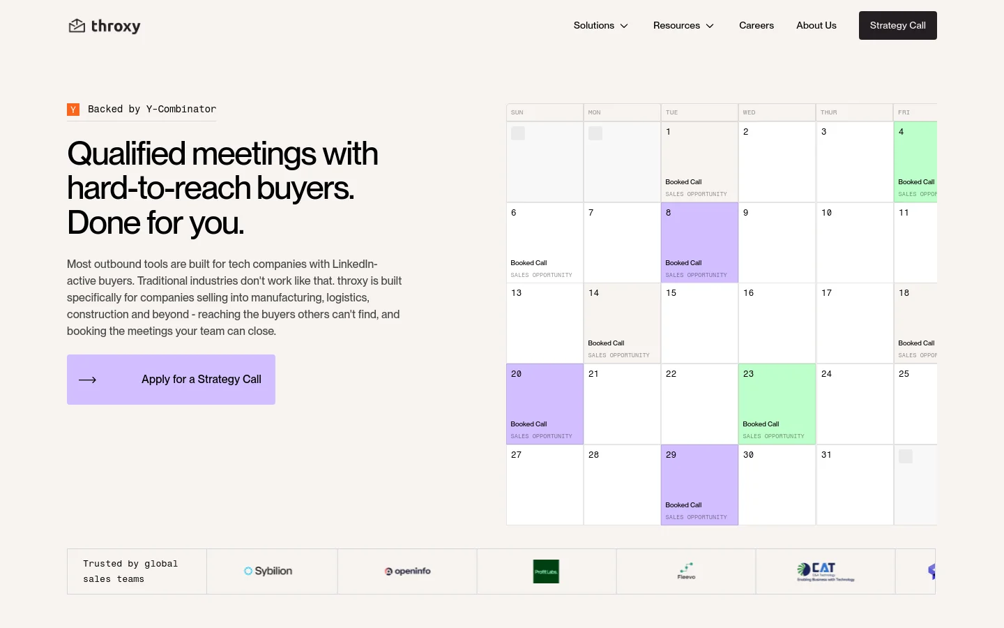
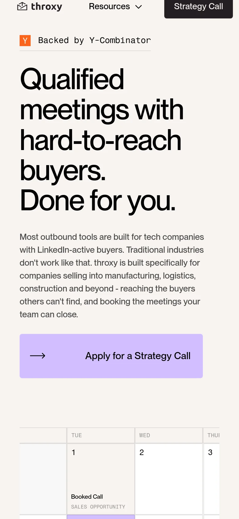
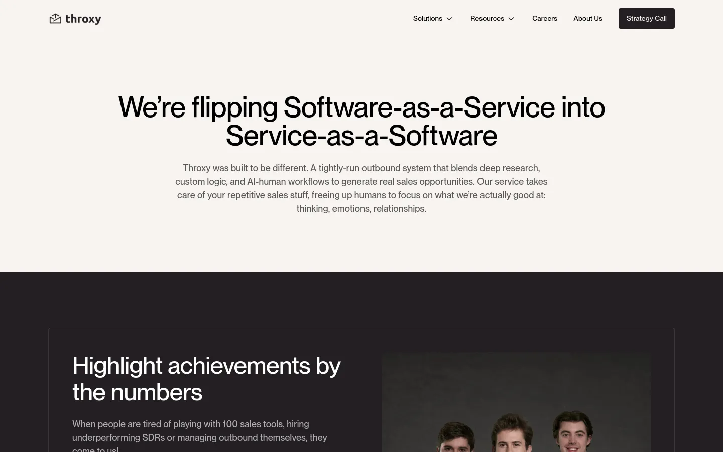
Throxy establishes a high-authority presence for a service-led outbound model, targeting industries that operate outside the standard tech bubble. The site uses a direct, confident tone to communicate its value proposition of booking meetings in complex sectors like manufacturing and healthcare. By leading with a bold, oversized headline and a clear call to action, the landing page rhythm moves quickly from problem identification to a tangible solution, supported by social proof from established global sales teams. Large, heavy typography anchors the layout, creating a sense of stability and importance. The interface utilizes a soft, pastel-inflected color palette—lavender, mint, and pale grey—which softens the professional intensity of the sales-focused messaging. A structured grid system organizes content into clean, modular blocks, including a distinctive calendar UI that visualizes success through color-coded event markers. The use of generous whitespace and a simplified navigation bar ensures that the focus remains on the primary conversion path.
Design

About UsAbout Us
ServicesSolutions
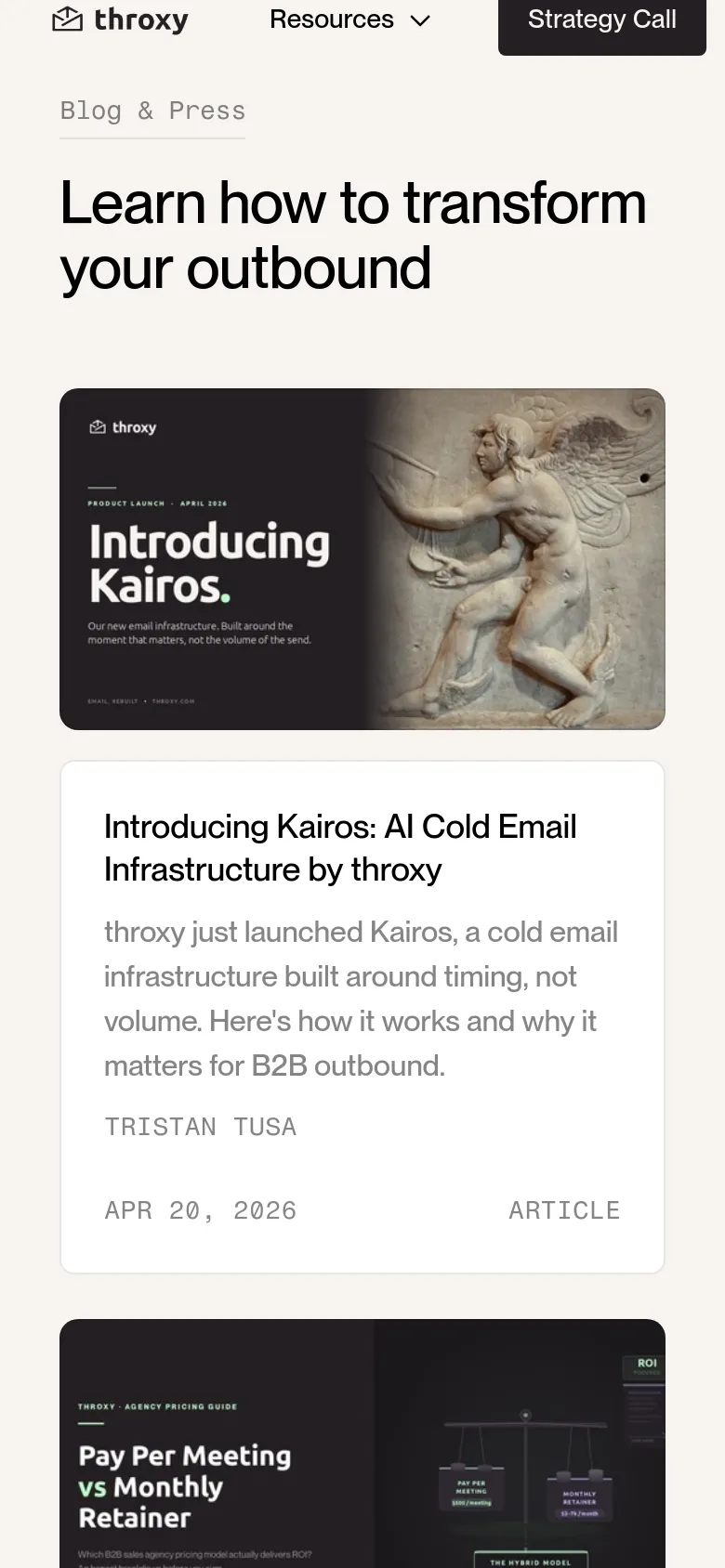
Blog / ArticleBlog
Technology
- Google Analytics
- Linkedin Insight Tag
- Amazon S3
- HTTP/3
- HSTS
- Google Tag Manager


