Tim Grover
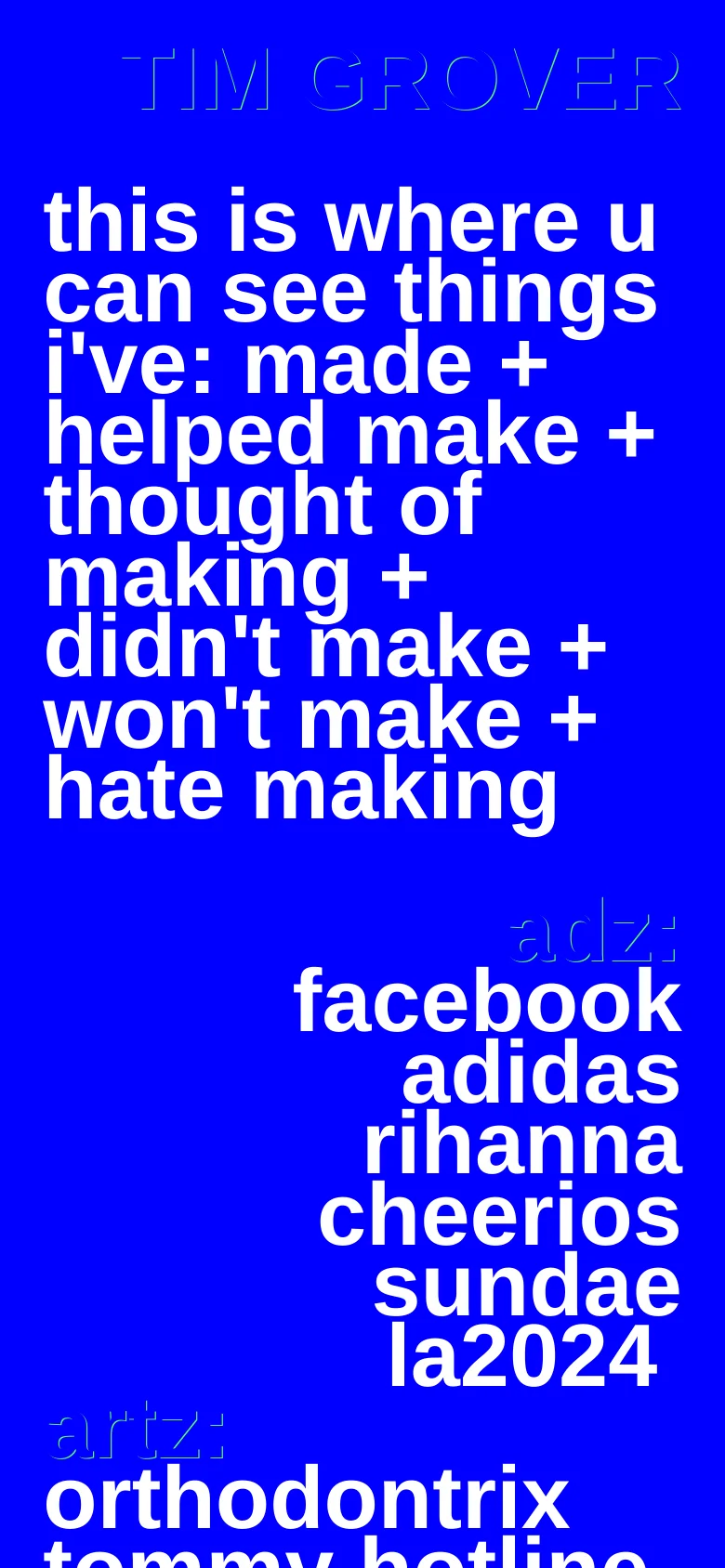
Bold, unapologetic typography defines this digital archive, mirroring a raw and unfiltered approach to creative output. The site functions as a sprawling, non-linear catalog of ideas, ranging from realized projects to discarded concepts. By stripping away traditional navigation and imagery, the design forces a direct confrontation with the text, establishing an editorial tone that feels more like a personal manifesto than a professional portfolio. High-contrast color blocking drives the visual rhythm, utilizing a saturated blue backdrop that makes the heavy sans-serif type vibrate. The layout relies on massive, lowercase type scales and a loose, asymmetrical grid that prioritizes information density over whitespace. This preference for extreme scale and a lack of conventional UI elements creates a distinctive, lo-fi aesthetic that favors raw communication over polished presentation.
Design
Technology
- Google Analytics
- jsDelivr
- Nginx
- Ruffle
- Nginx


