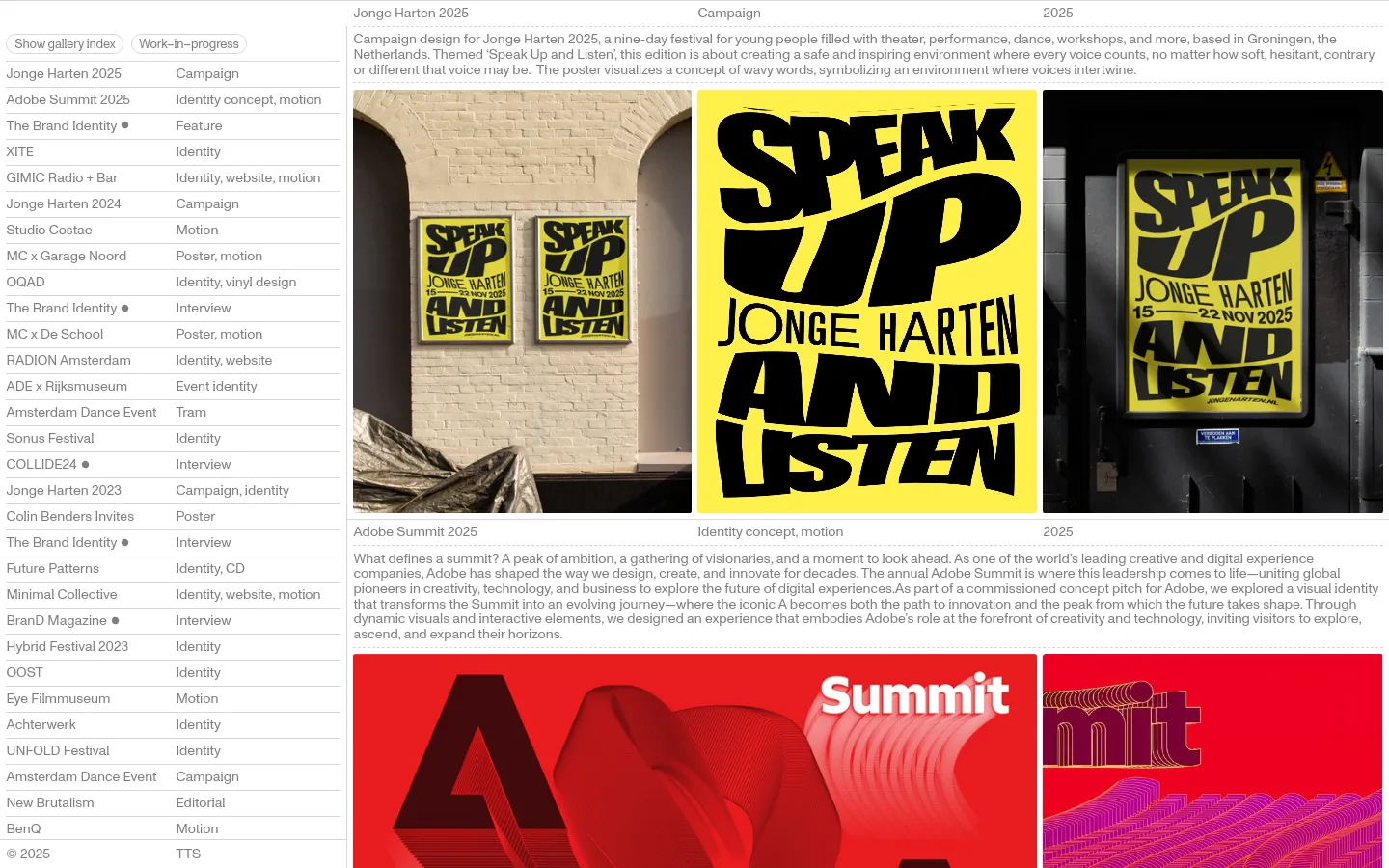
Tim Tijink


Tim Tijink presents a portfolio that functions as a high-energy visual archive, showcasing a heavy emphasis on art direction and campaign identity. The site uses a rhythmic, grid-based layout to present diverse projects, from large-scale festival identities to motion-driven brand work. By prioritizing large-scale imagery and bold, contextual mockups, the design immediately establishes the designer's ability to scale visual concepts across physical and digital environments. Typography acts as the primary structural element, with oversized sans-serif headers and a clean, list-based navigation that feels both functional and editorial. The color palette is driven by the work itself, allowing the vibrant hues of the campaign posters and motion graphics to dictate the site's energy. A structured, multi-column grid organizes project metadata, creating a dense but legible information hierarchy that rewards scanning. The use of high-contrast imagery against a neutral backdrop ensures the creative output remains the undisputed focal point.
Design


Technology
- Google Analytics
- jsDelivr


