Toga Apartments
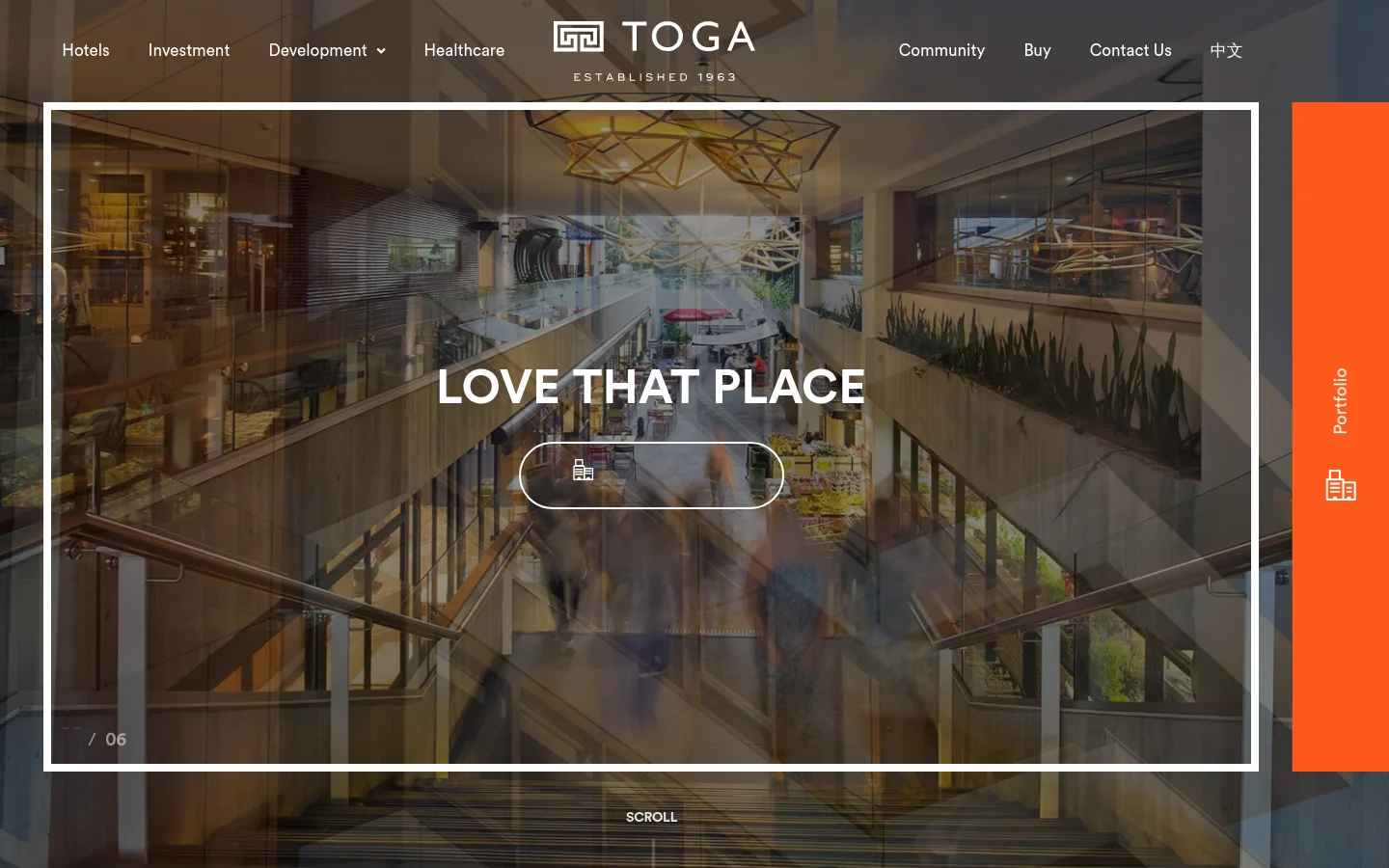
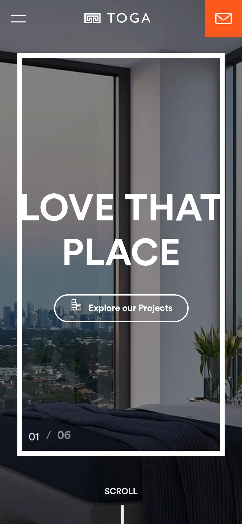
TOGA Group’s digital presence is a masterclass in high-end real estate branding, utilizing cinematic imagery and bold, expansive layouts to convey a sense of prestige and permanence. The website serves as a sophisticated gateway for potential investors and residents, showcasing a diverse portfolio that spans luxury residential apartments, hotels, and commercial developments. By centering the narrative on the emotional resonance of space—encapsulated by the evocative 'Love That Place' headline—the brand transcends mere property listing to sell a curated lifestyle. The visual identity is defined by a striking contrast between high-resolution architectural photography and a bold, modern typographic hierarchy. The use of a vibrant orange accent sidebar provides a rhythmic, editorial feel that breaks the traditional corporate mold, injecting energy into an otherwise polished and professional aesthetic. The design language is clean and immersive, employing large-scale imagery and generous whitespace to allow the scale of their developments to speak for themselves, effectively targeting an affluent, discerning audience.
Design
- Circular
- Font Awesome
- Inter
- Roboto
- Roboto Slab
Technology
- 33Across
- AdRoll
- Google Analytics
- Cloudflare
- jsDelivr
- MySQL
- jQuery
- jQuery Migrate
- HTTP/3
- AdRoll
- HSTS
- reCAPTCHA
- Yoast SEO
- Google Tag Manager
- Elementor
- Yoast SEO


