Variety Coffee
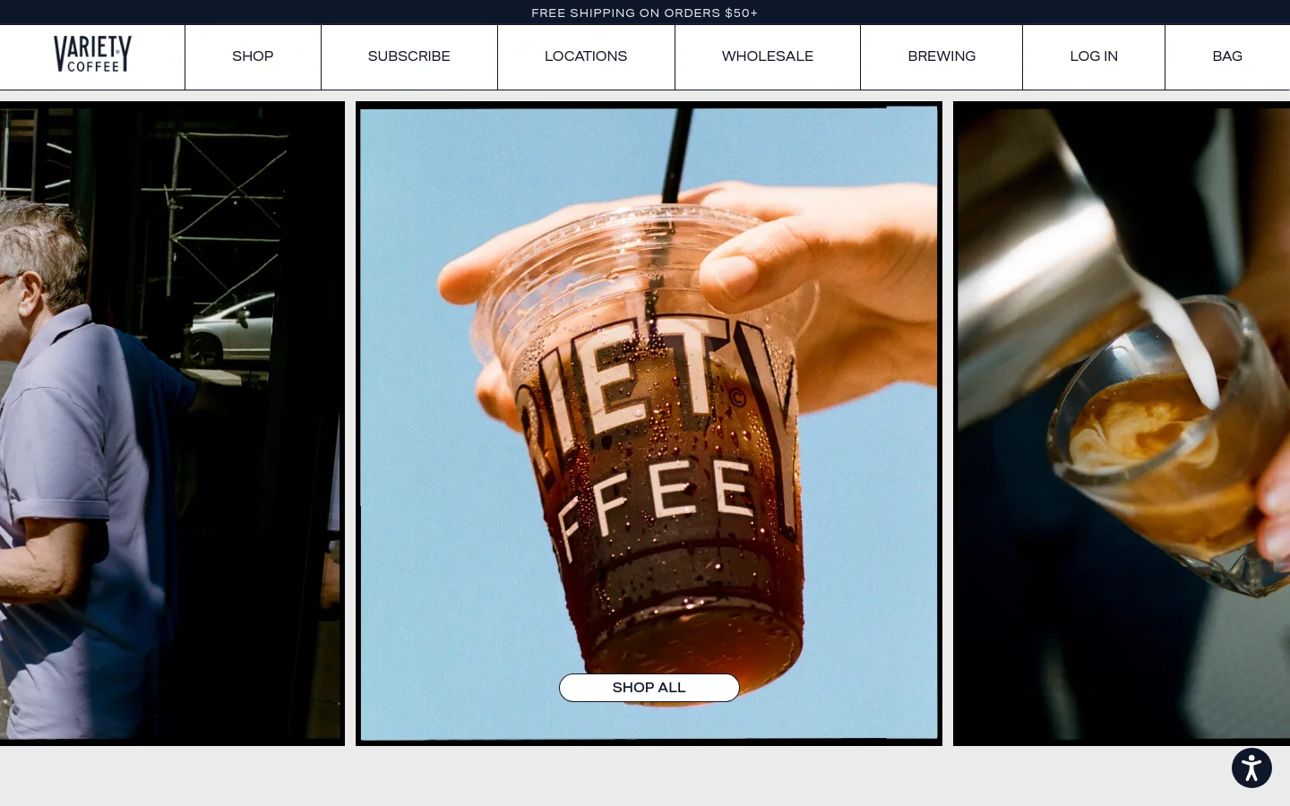
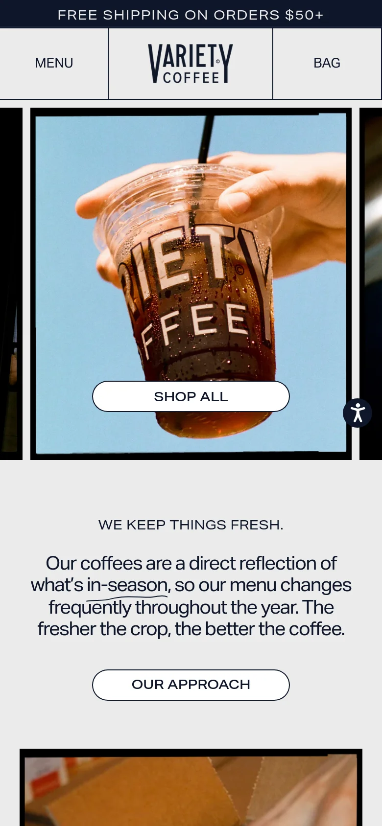
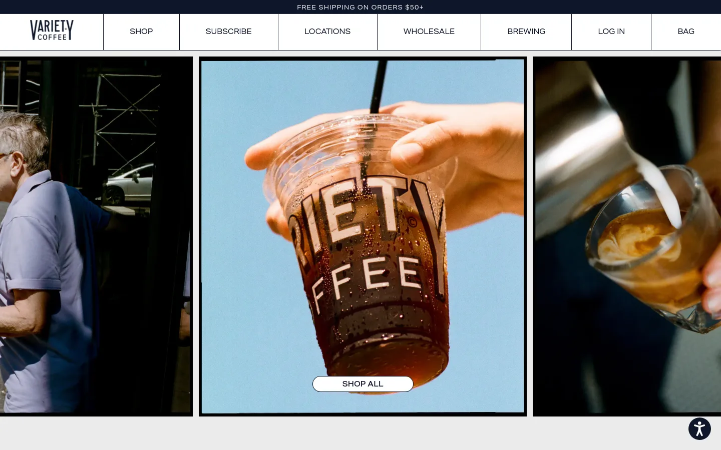
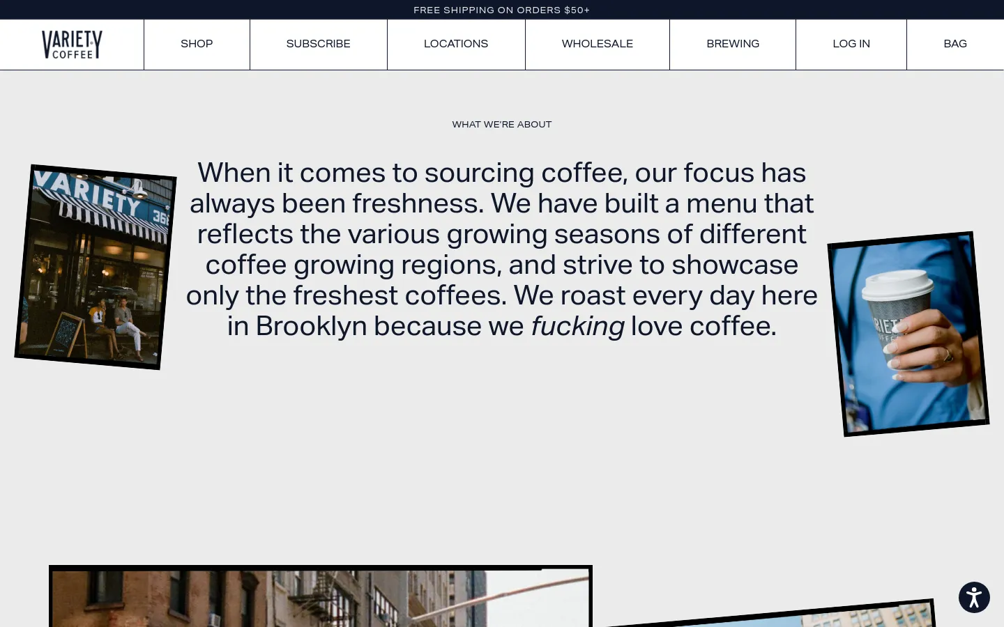
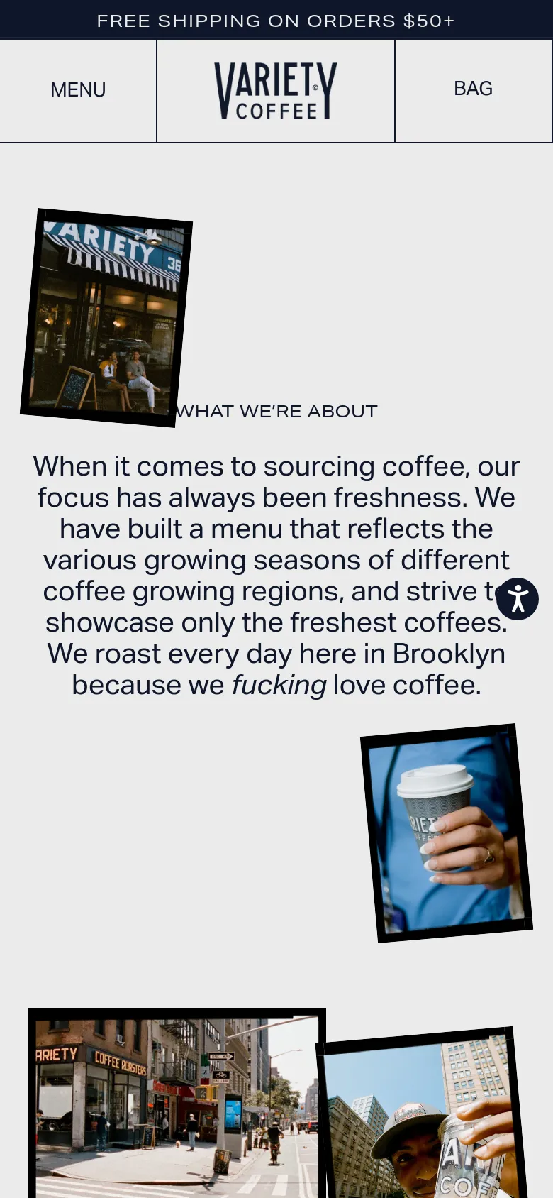
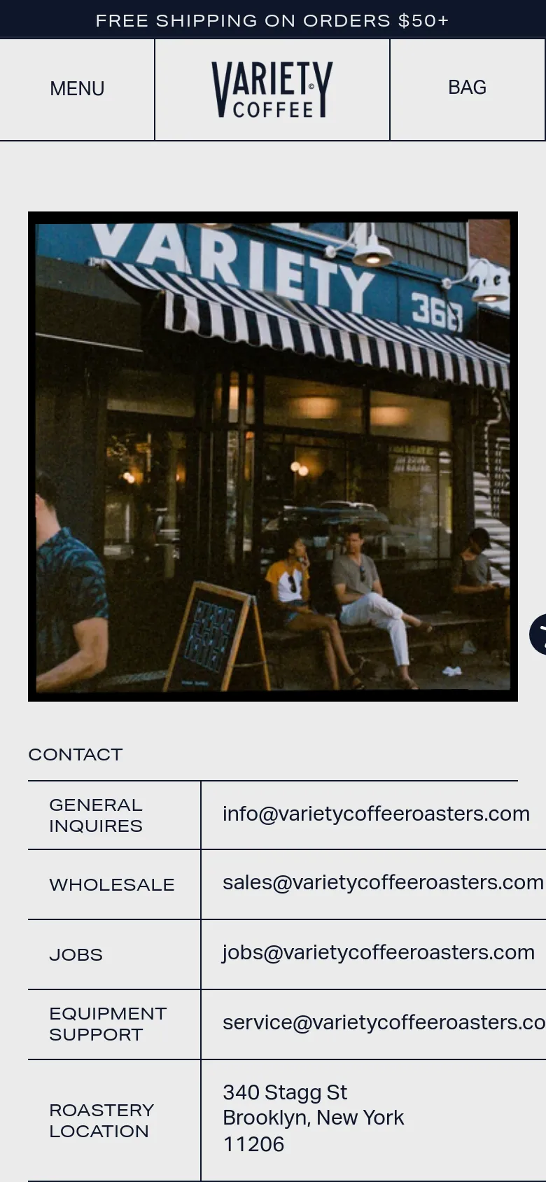
Variety Coffee uses a high-impact, image-led layout to ground its brand in the tactile reality of New York City coffee culture. The design prioritizes large-scale photography that captures the movement of pouring milk and the condensation on a cold brew cup, immediately establishing a sense of freshness and locality. By utilizing a full-bleed, masonry-style grid for its visual storytelling, the site moves away from standard e-commerce templates to feel more like a lifestyle editorial. Bold, sans-serif typography anchors the composition, providing clear navigational signposts against a backdrop of rich, naturalistic imagery. The interface employs a spacious grid that allows each photograph to breathe, punctuated by pill-shaped buttons that offer a soft, approachable touch to the structured layout. The use of a dark footer creates a definitive visual anchor, grounding the bright, airy product shots and providing a clean space for essential links and subscription prompts.
Design

Technology
- Cloudflare
- jsDelivr
- HTTP/3
- HSTS


