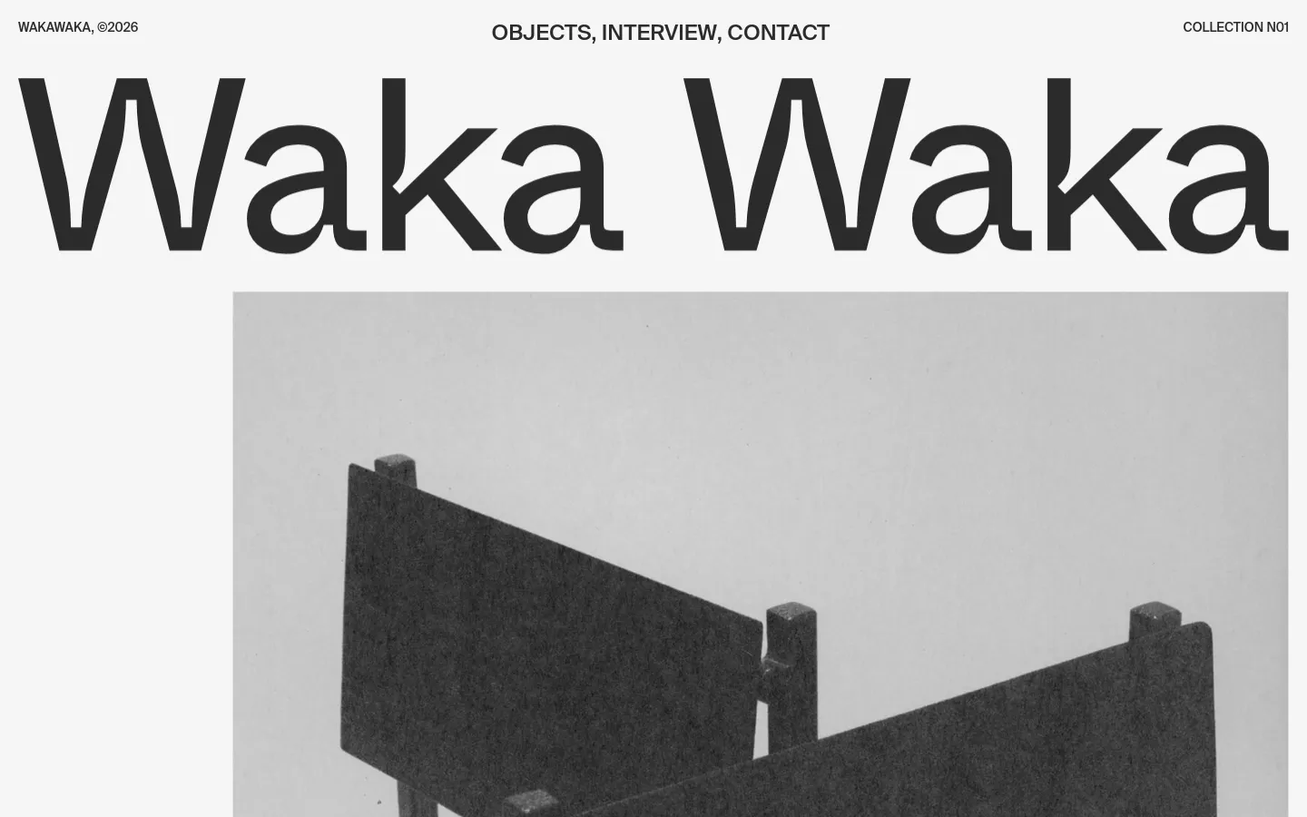
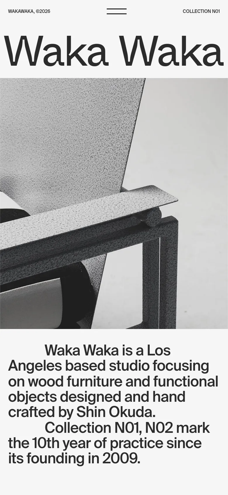
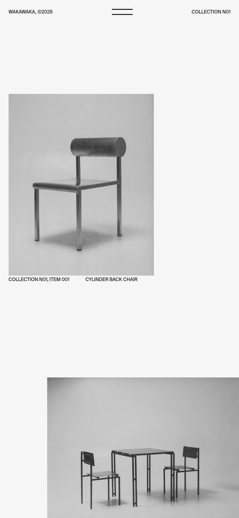
Waka Waka Collection N01

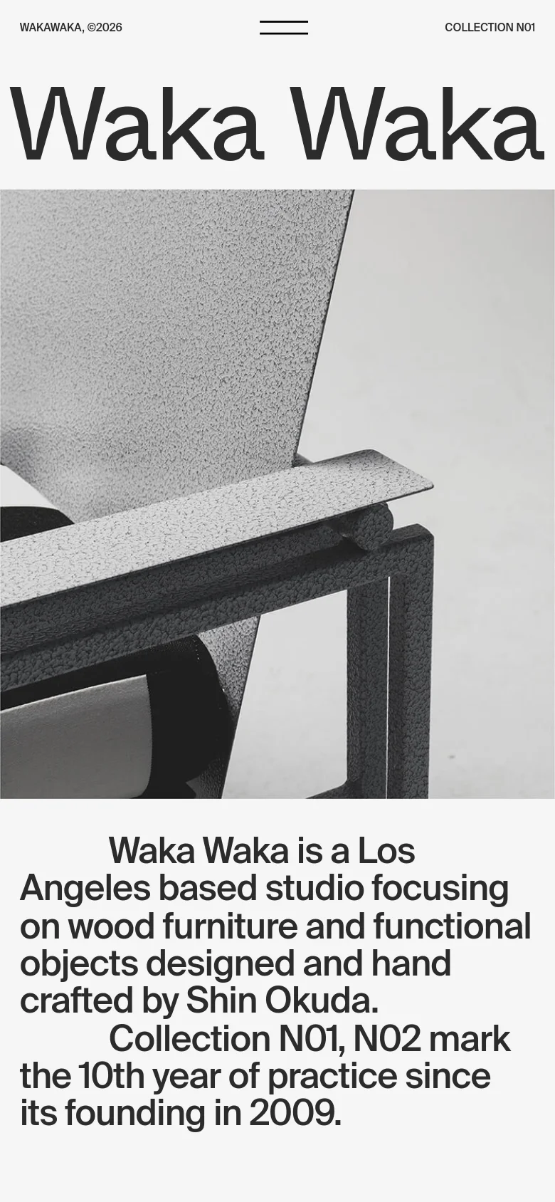
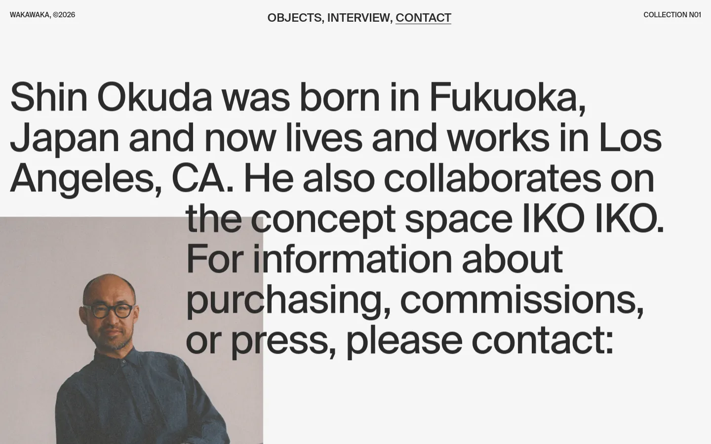
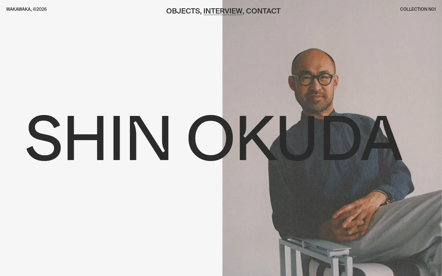
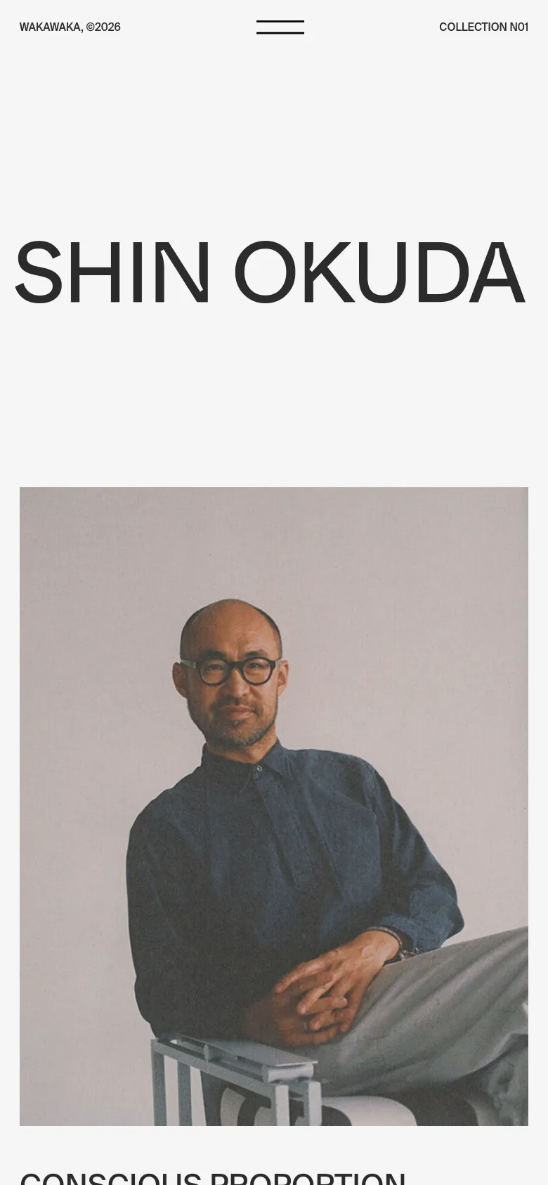
Oversized, heavy-weight typography immediately establishes the studio's presence, acting as both a brand identifier and a structural anchor. Waka Waka presents a curated look into Shin Okuda’s furniture and functional object practice, using a layout that mirrors the intentionality of the physical pieces. The site functions as a digital archive, where the rhythm of the scroll allows the high-contrast imagery to breathe alongside significant blocks of text. Monochrome tones and a strict grid define the interface, emphasizing the material textures of the metal and wood objects. The use of massive sans-serif typefaces creates a hierarchy that feels architectural rather than decorative. A notable choice is the way the typography interacts with the photography, often overlapping or framing the subject to create a sense of depth. The sparse use of color ensures that the focus remains entirely on the form and proportion of the collection.
- Ben Mingo — designer
- Aristide Benoist — developer
Design
PortfolioObjects

Blog / ArticleInterview
ContactContact