Asahi Pharmacy
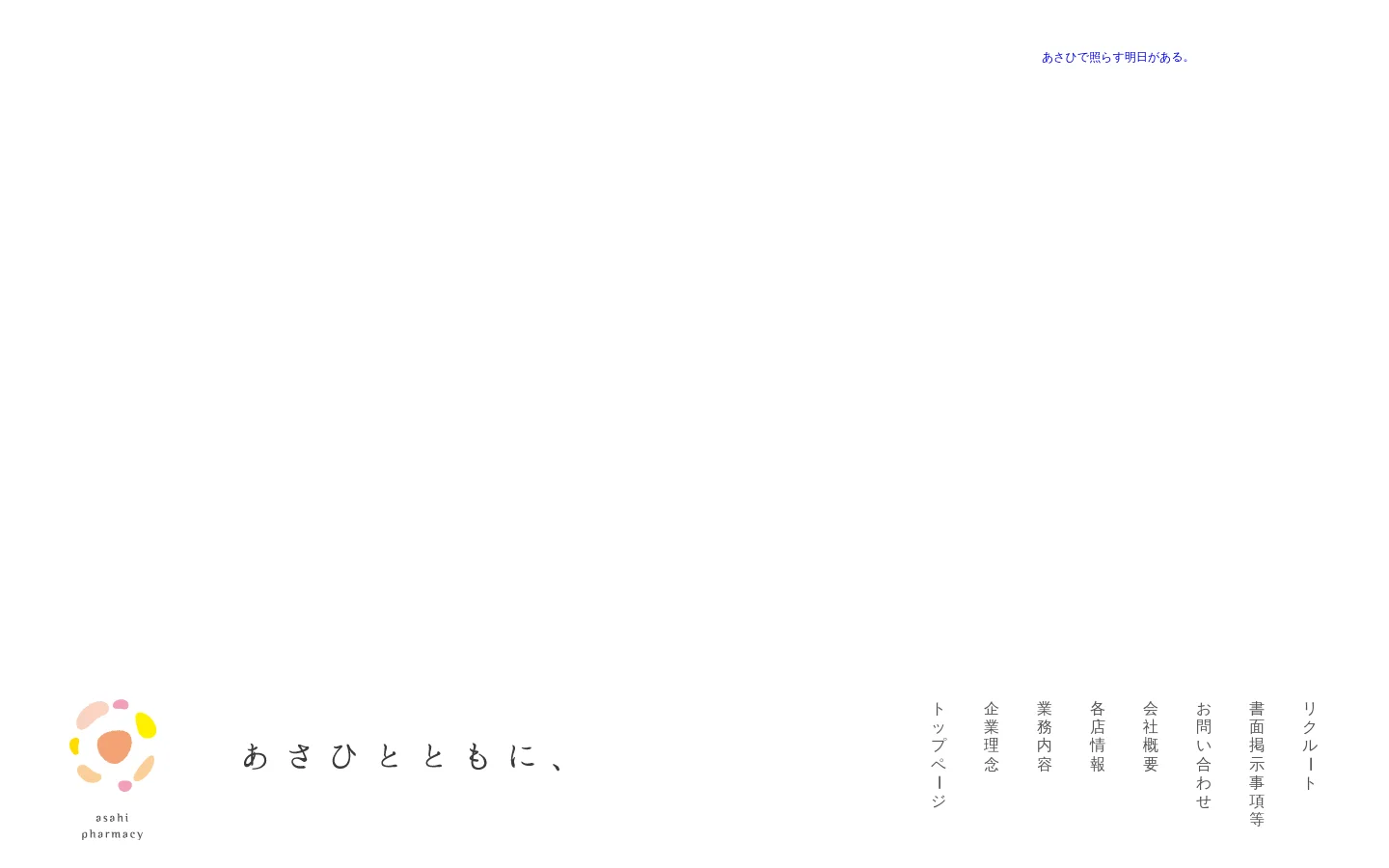

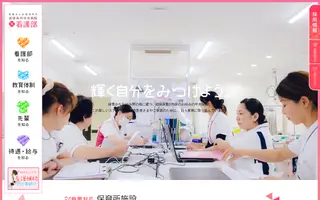
Asahi Pharmacy's digital presence is a masterclass in empathetic, human-centric design for the healthcare sector. Moving away from the sterile and intimidating aesthetics typical of medical institutions, the website utilizes soft, organic shapes and a warm, pastel color palette to foster a sense of trust and approachability. The use of high-quality, lifestyle-oriented photography—featuring smiling families and gentle professional interactions—immediately communicates a mission of community care and wellness. The visual identity is defined by a playful yet sophisticated brand mark composed of soft, colorful blobs, which sets a welcoming tone for the local Matsuyama community. The layout is airy and spacious, employing generous white space and elegant Japanese typography to ensure readability and a calm browsing experience. It successfully targets families and elderly residents by projecting an image of a pharmacy that is not just a place for medicine, but a partner in daily health and happiness.
Design
Technology
- Google Analytics
- jsDelivr
- MySQL
- jQuery
- jQuery Migrate
- Nginx
- Yoast SEO
- Nginx
- AddToAny Share Buttons
- Contact Form 7
- Yoast SEO