And / Or


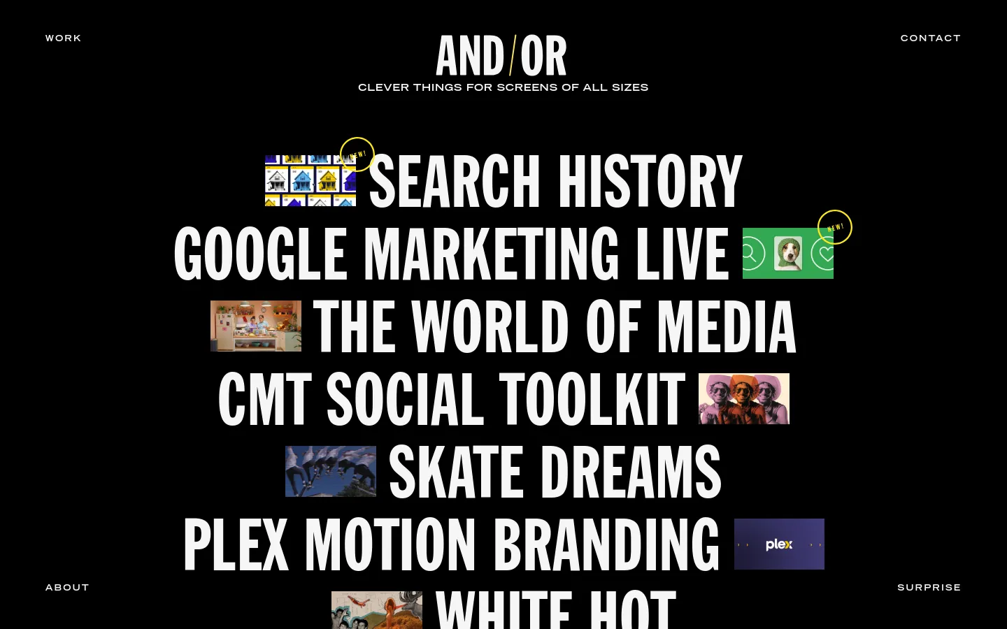
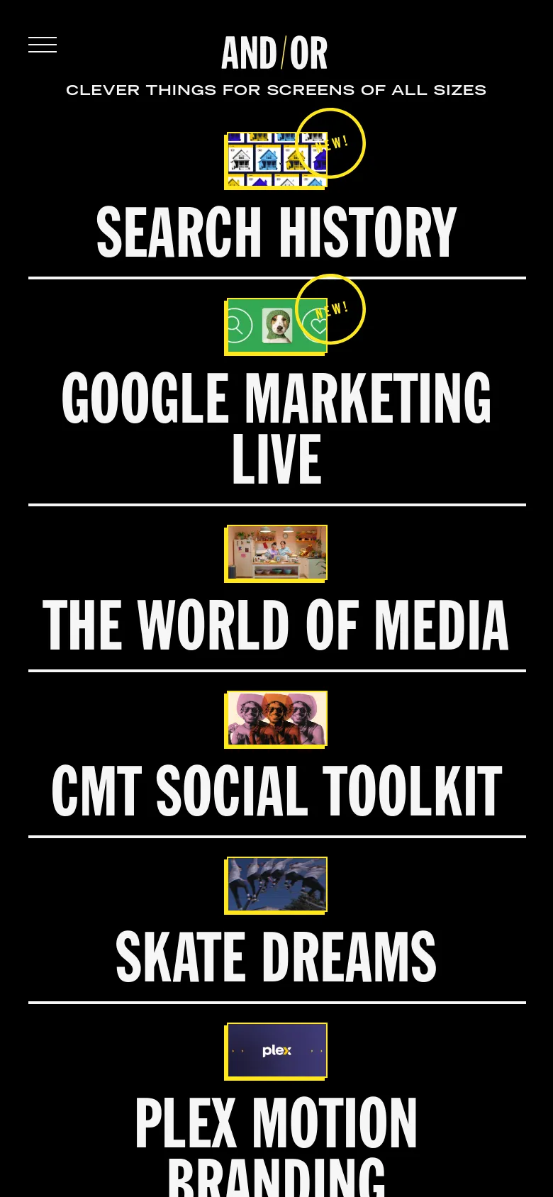
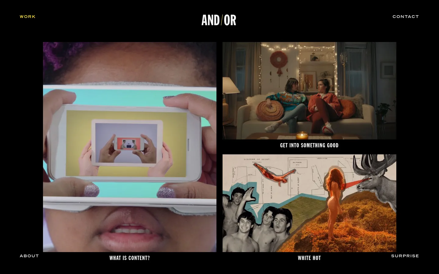
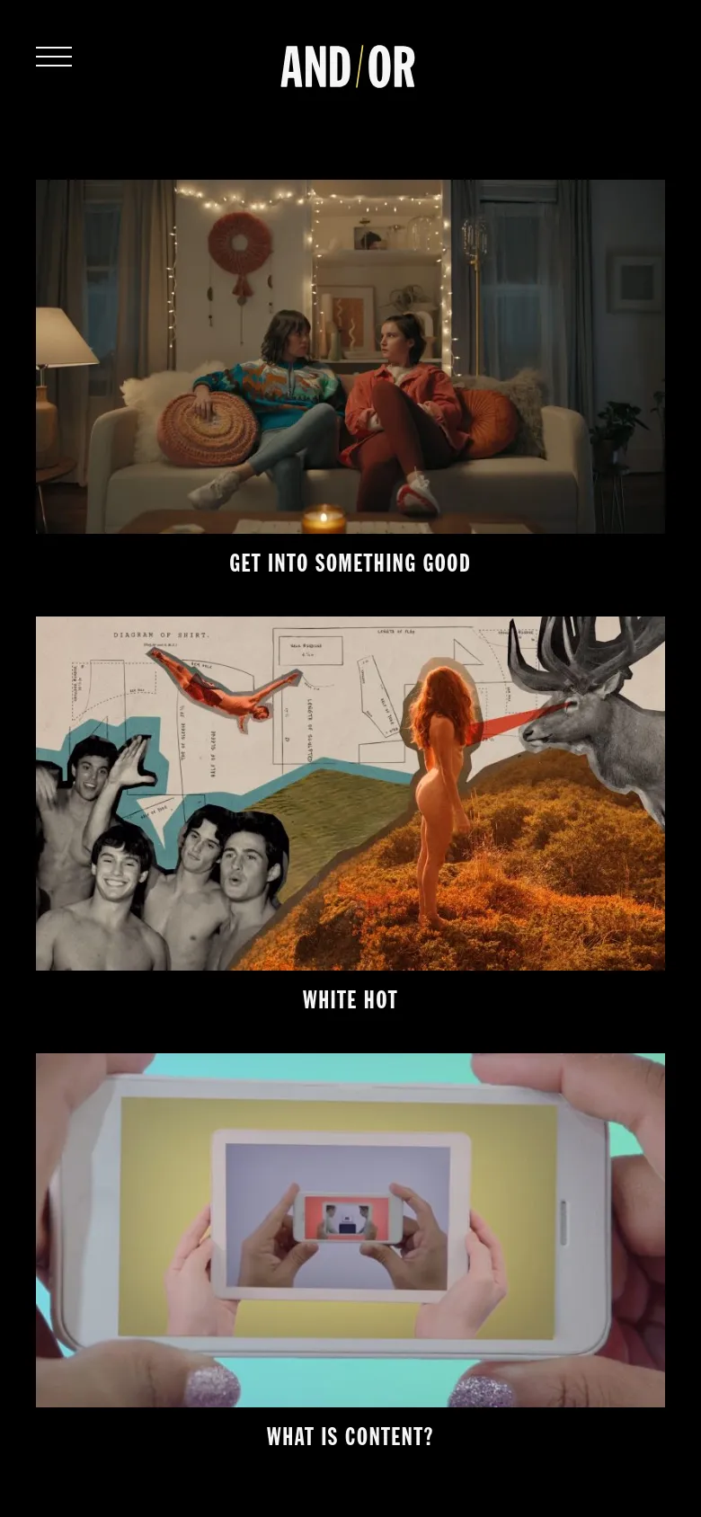
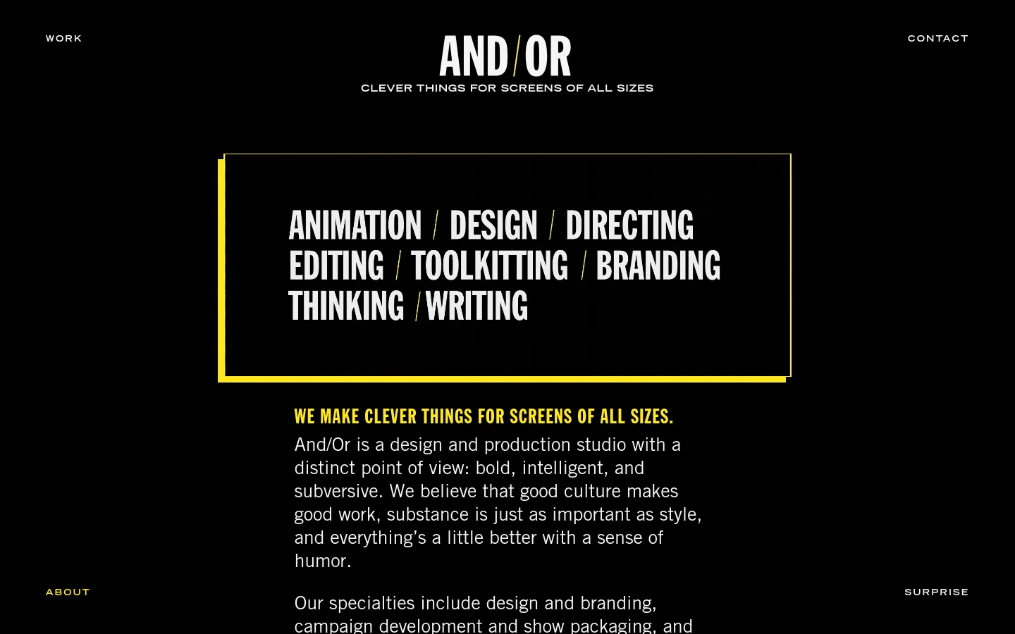
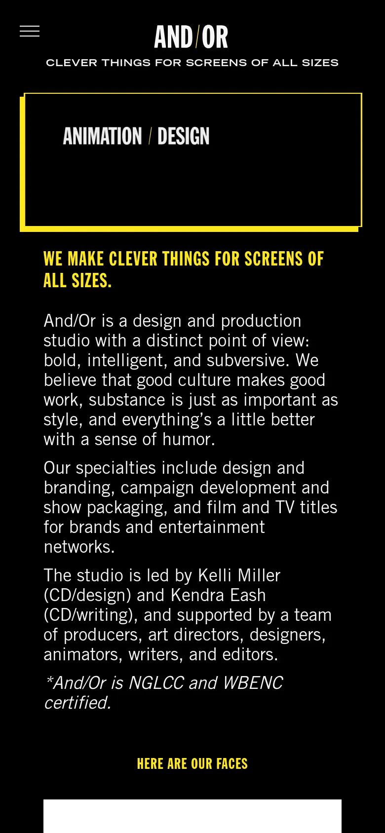
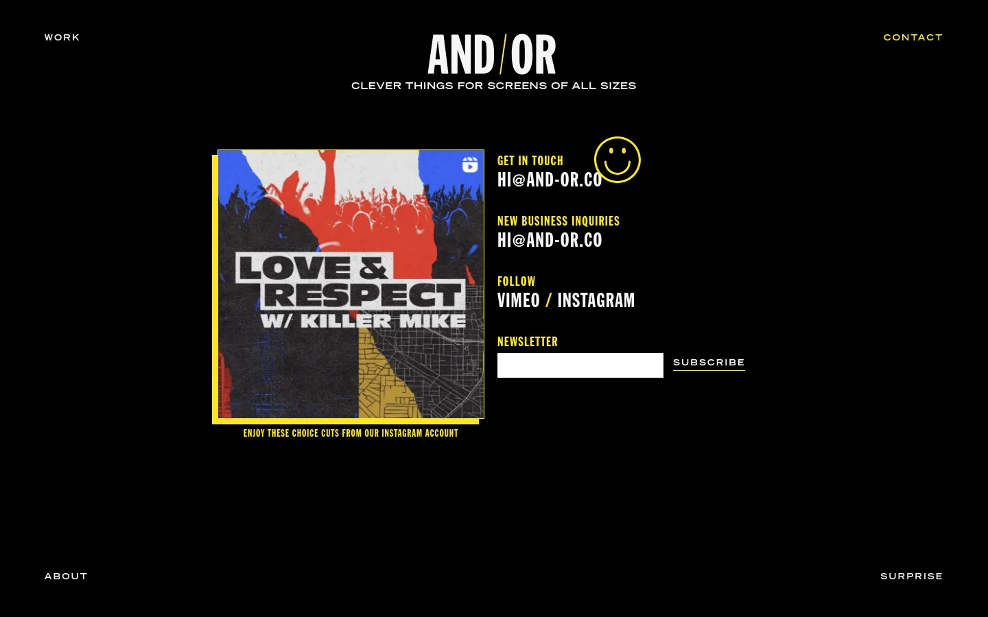
Oversized, condensed typography dominates the landscape of And / Or, immediately signaling a studio that prioritizes impact and motion. The site functions as a high-energy portfolio, using a vertical rhythm that forces the viewer to engage with each project through a rapid-fire sequence of text and imagery. By treating headlines as the primary visual element rather than secondary information, the design mirrors the studio's focus on clever, screen-ready content. Black backgrounds provide a high-contrast stage for the massive white lettering and small, framed video thumbnails. The layout relies on a strict horizontal rule system to separate project entries, creating a structured yet kinetic scrolling experience. Small, colorful thumbnail inserts break up the monochrome density, offering tactile glimpses of the motion work. The decision to use such extreme scale for the typography creates a rhythmic, almost musical pace to the navigation.
Design

Technology
- Google Analytics
- Google Hosted Libraries
- jsDelivr
- MySQL
- Nginx
- Yoast SEO
- Nginx
- Yoast SEO


