Blue Yonder
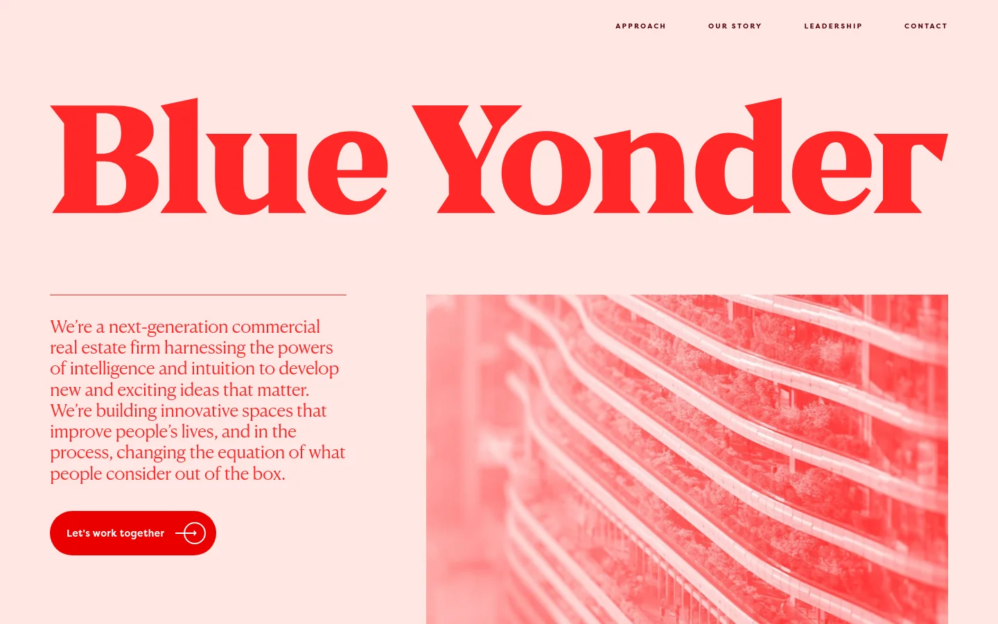
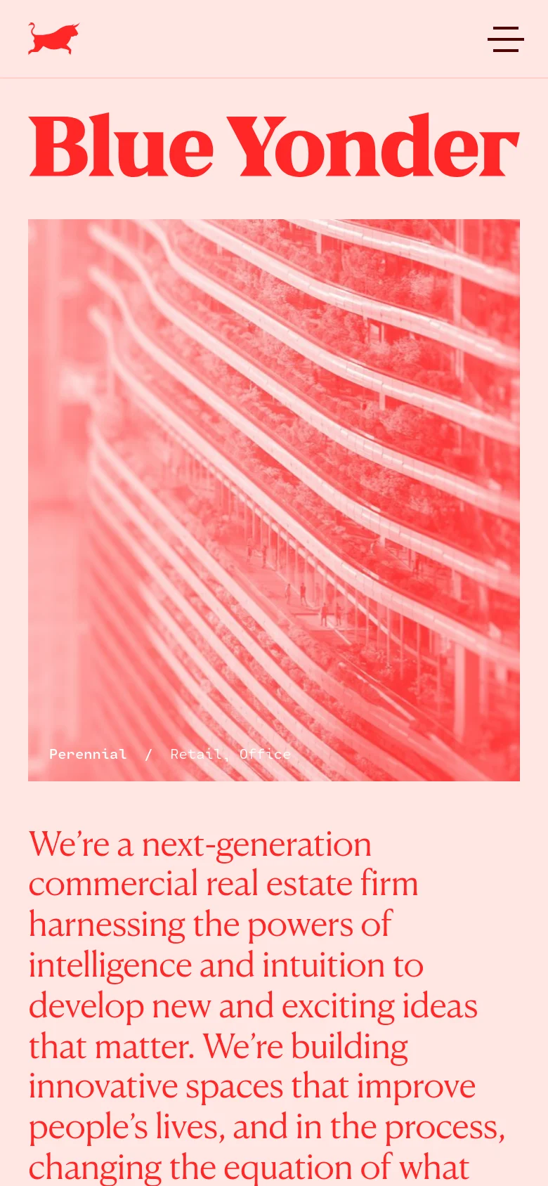
Blue Yonder Property Group breaks the mold of traditional commercial real estate through a bold, high-impact digital presence. The website serves as a manifesto for a next-generation firm, positioning itself not just as a developer, but as a creative force that blends intelligence with intuition. The layout is unapologetically confident, utilizing massive scale and a striking duotone color palette to command attention from high-level investors and urban developers. The visual identity is defined by a sophisticated interplay of heavy, expressive serif typography and a high-contrast red and cream color scheme. By eschewing the sterile, blue-toned aesthetics typical of the real estate industry, BYPG establishes a brand that feels more like a design studio or a modern agency. The use of large-scale imagery and oversized numeric counters creates a sense of momentum and scale, effectively communicating their track record of 50+ projects with editorial flair.
Design
- Webflow Icons
Technology
- Google Analytics
- cdnjs
- Cloudflare
- jsDelivr
- HTTP/3
- HSTS