Christine Koschel
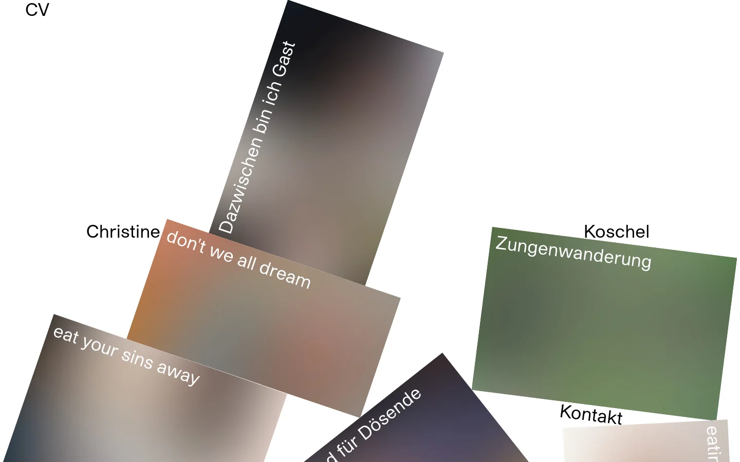
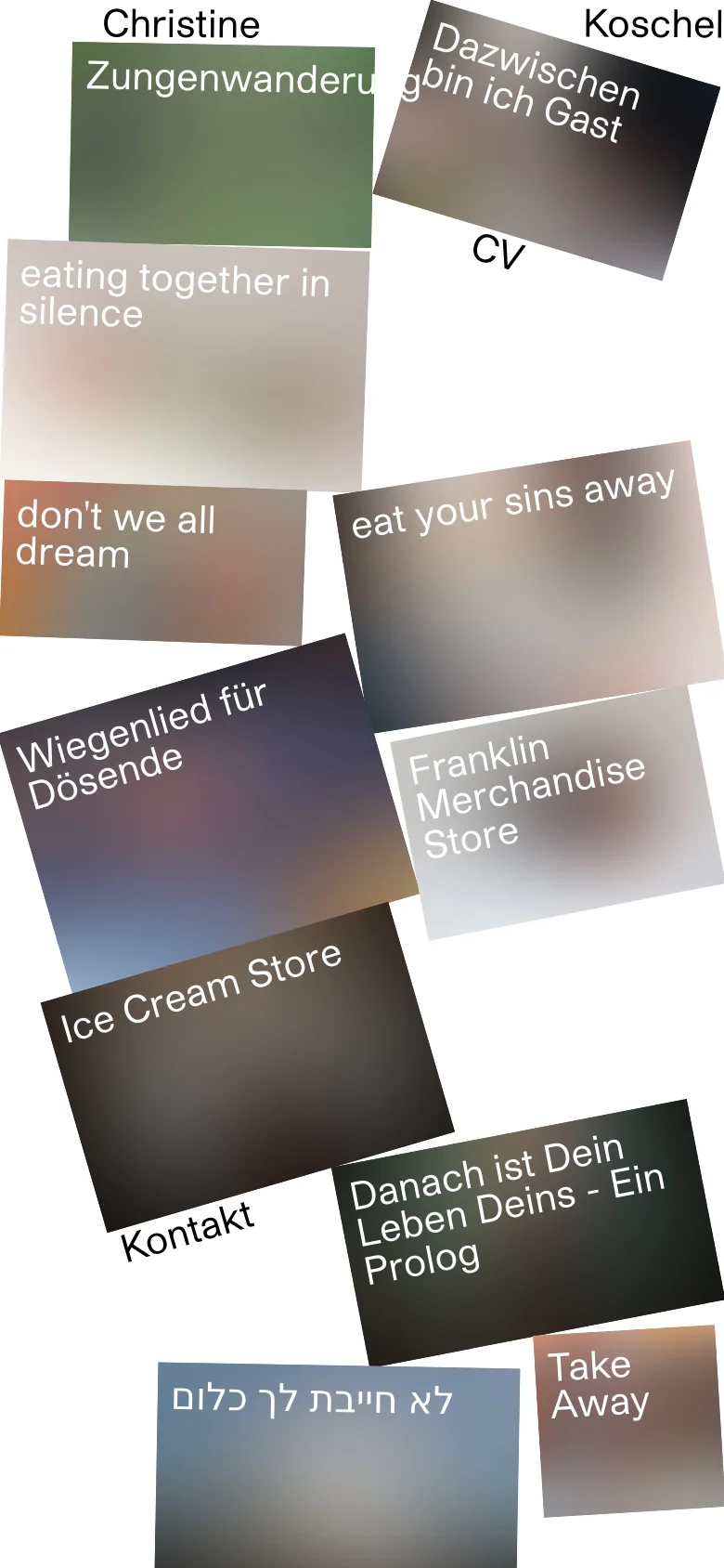
Christine Koschel’s website serves as a highly experimental digital portfolio for an artist or multidisciplinary creator. Eschewing traditional grid layouts, the site utilizes a chaotic, collage-like arrangement of tilted, textured tiles that evoke a sense of tactile, analog abstraction. The purpose is clearly to showcase a body of work that is conceptual, poetic, and perhaps multimedia in nature, inviting the viewer into a dreamlike, non-linear narrative experience. The visual identity is defined by a sophisticated use of soft gradients, grainy textures, and a muted, earthy color palette. The typography is clean and understated, acting as a quiet anchor amidst the swirling, overlapping geometric shapes. This design language targets a niche audience of curators, art enthusiasts, and creative professionals who value avant-garde aesthetics and emotional resonance over functional clarity. It is a bold statement of artistic autonomy and digital expressionism.
Design
- Font Awesome