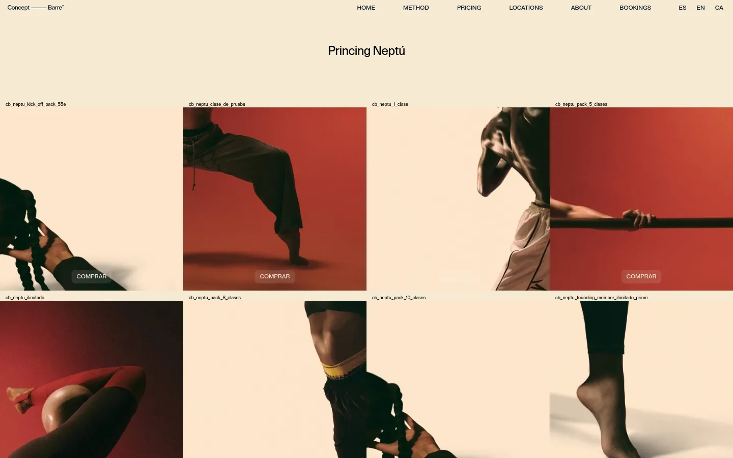
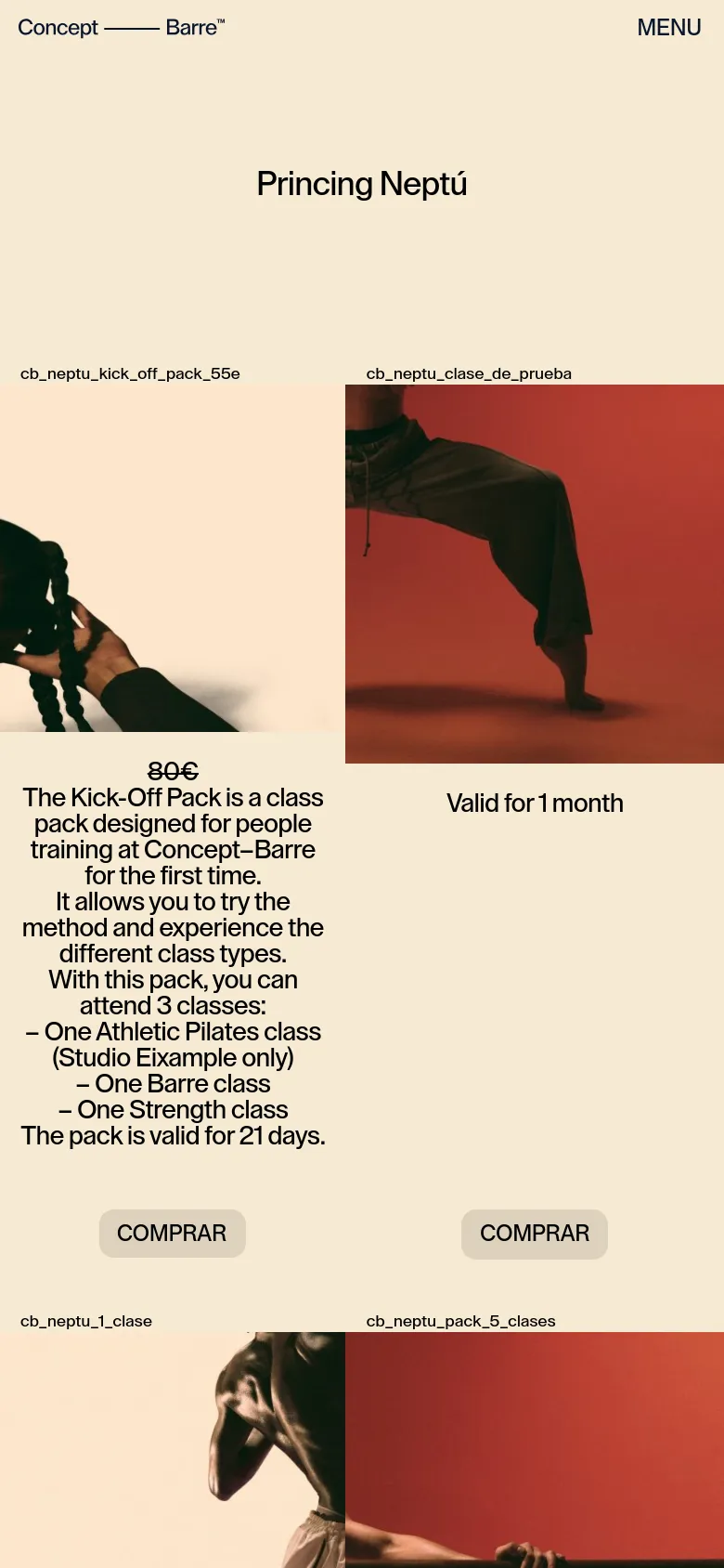
Concept Barre
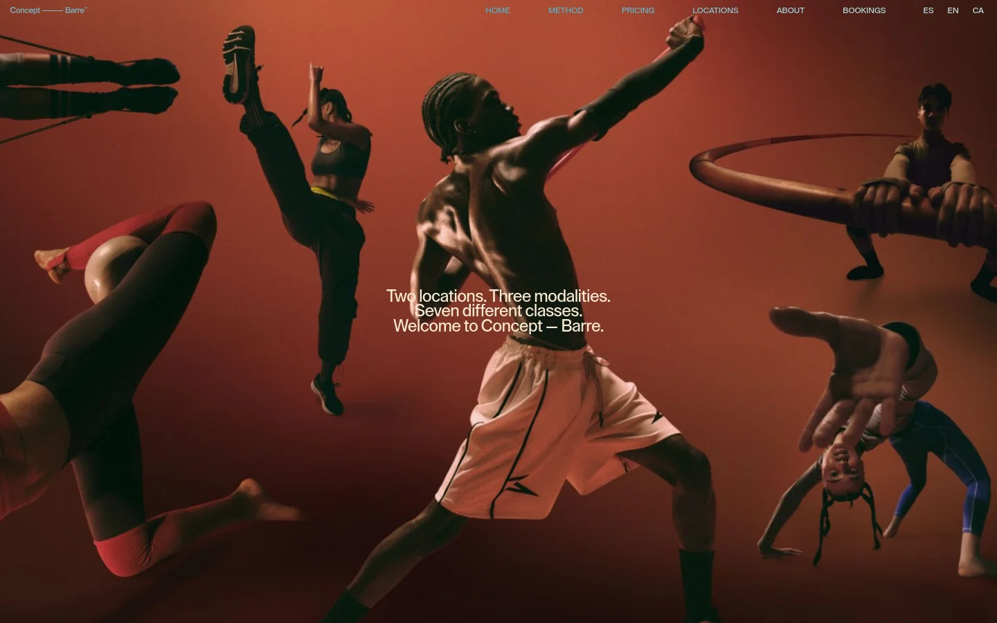

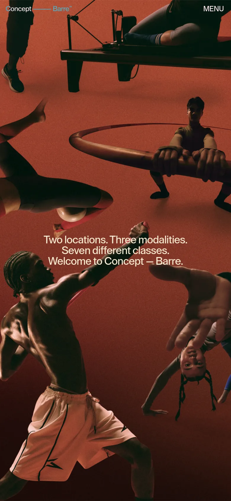
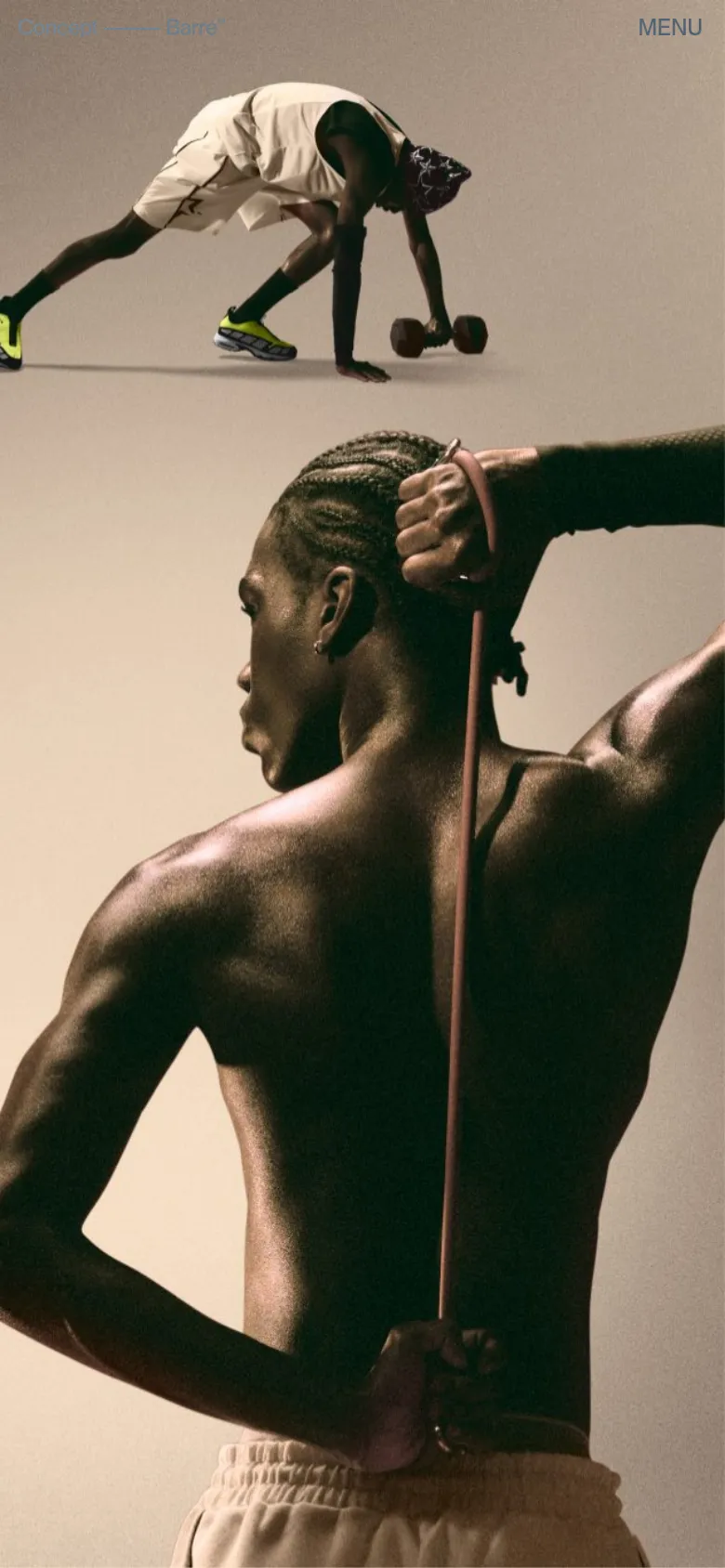
Concept Barre uses high-energy, editorial photography to redefine the fitness experience in Barcelona. The site leans into a bold, rhythmic landing page that mirrors the physical intensity of its classes, utilizing large-scale imagery of movement to establish an immediate sense of community and athleticism. By centering the narrative on specific modalities and locations, the design moves away from generic wellness tropes to present a specialized, high-performance studio environment. Oversized, sans-serif typography dominates the layout, creating a strong hierarchy against a warm, terracotta-toned backdrop. The interface employs a spacious grid that allows the dynamic human forms to breathe, punctuated by clean, functional navigation and stark black-and-white call-to-action elements. The use of high-contrast color blocking between the deep earthy tones and the cream-colored sections provides a structured, rhythmic flow that guides the viewer through the brand's offerings without clutter.
Design
- Font Awesome
- Supreme
- Swiper Icons
- Times New Roman

Technology
- jQuery CDN
- jsDelivr
- MySQL
- Apache HTTP Server


