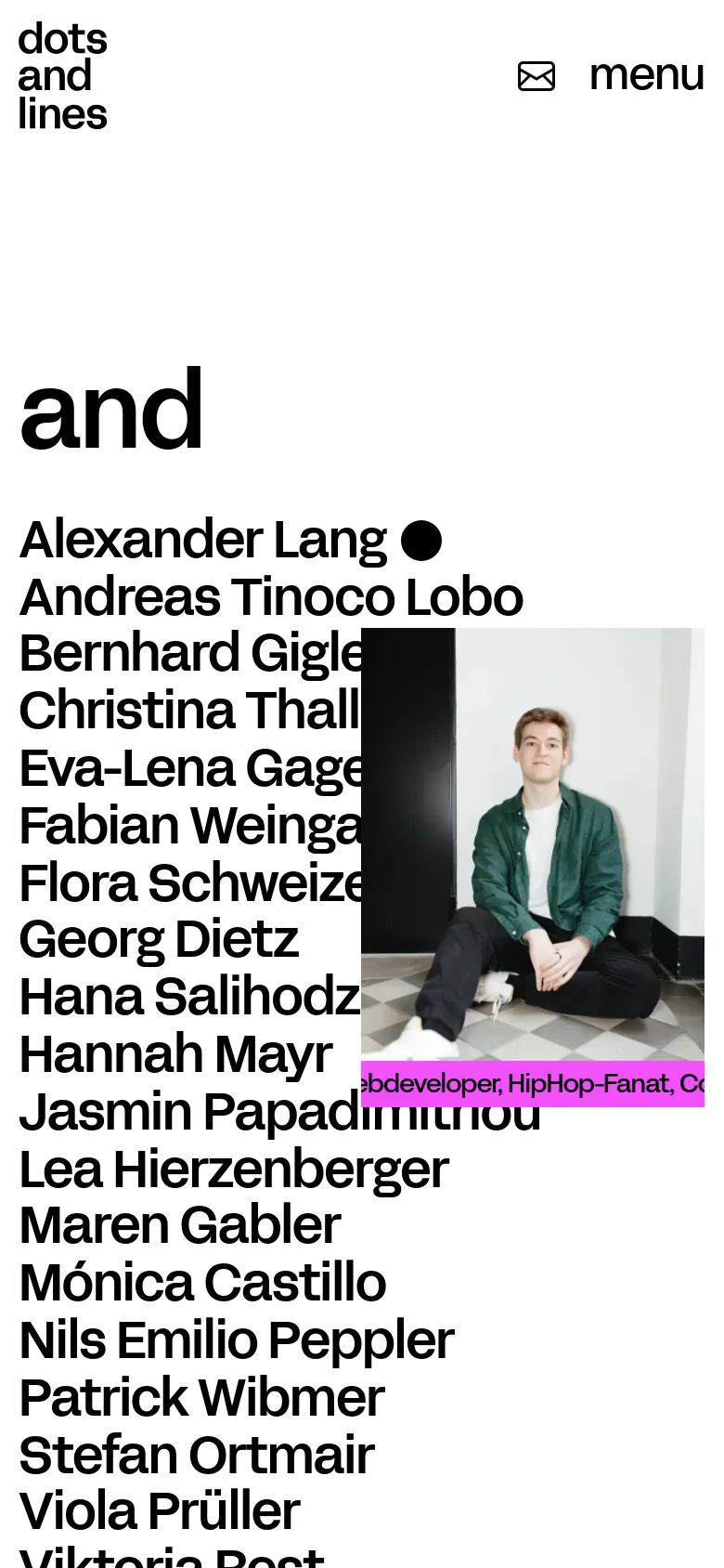
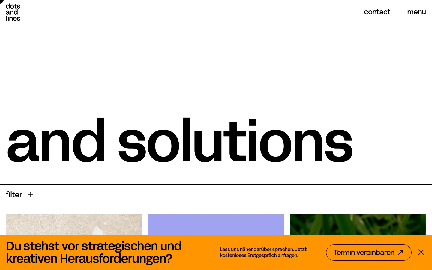
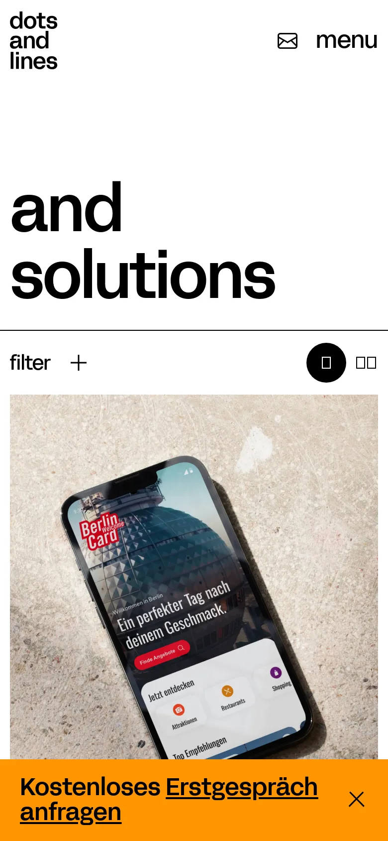
Dots and Lines


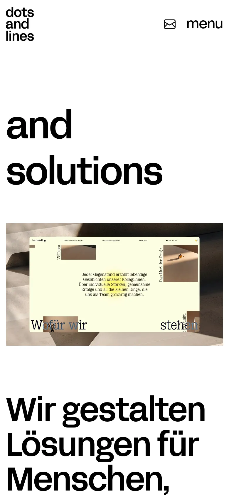
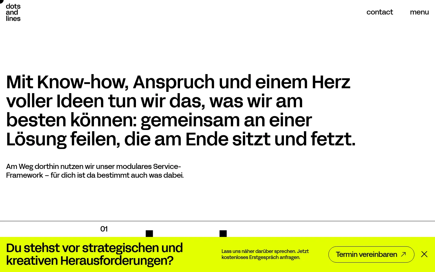
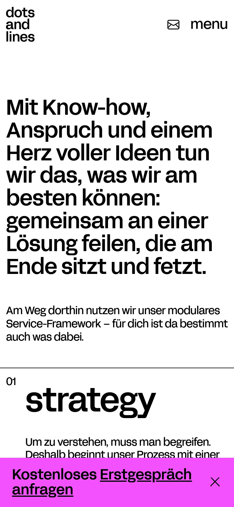
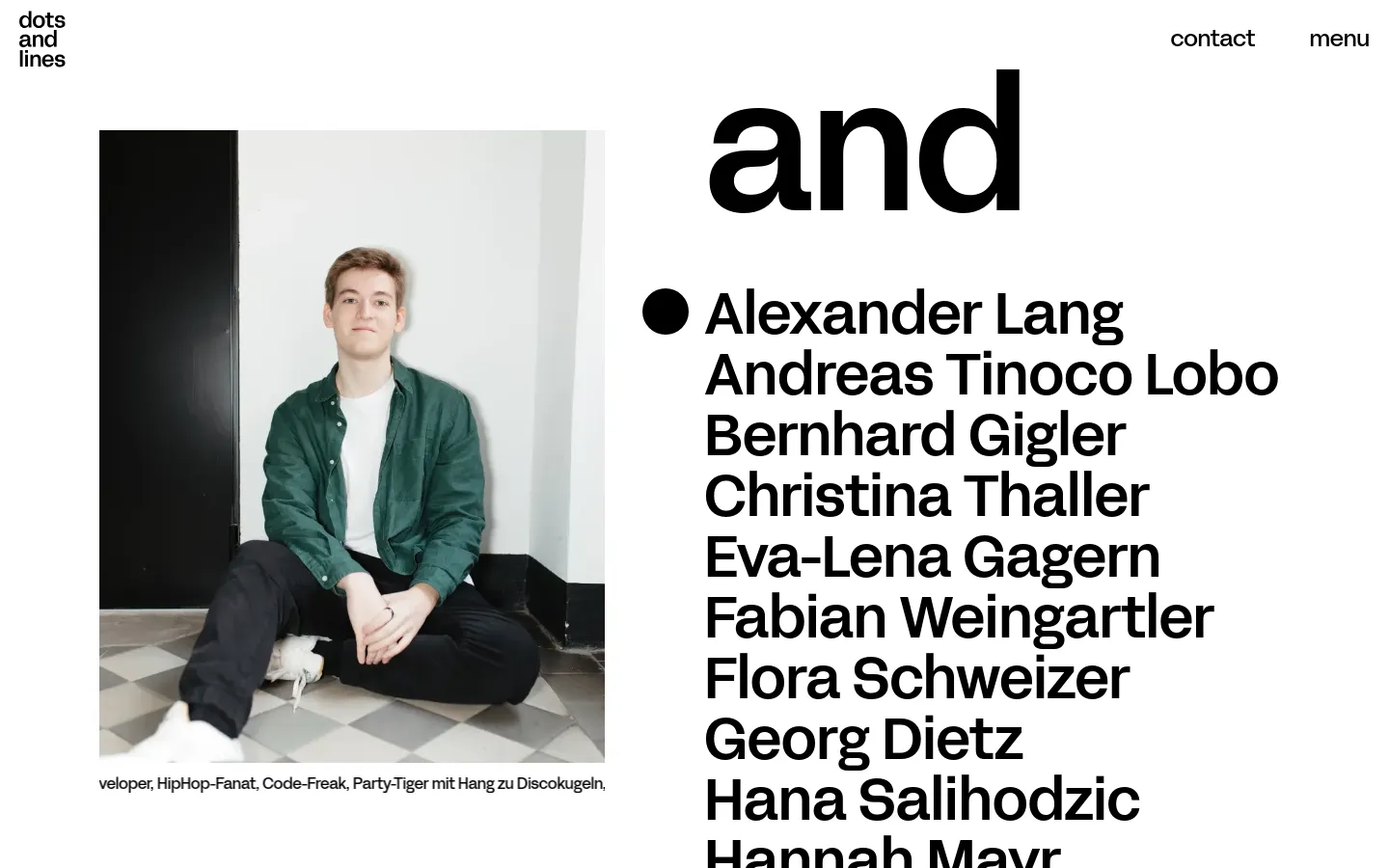
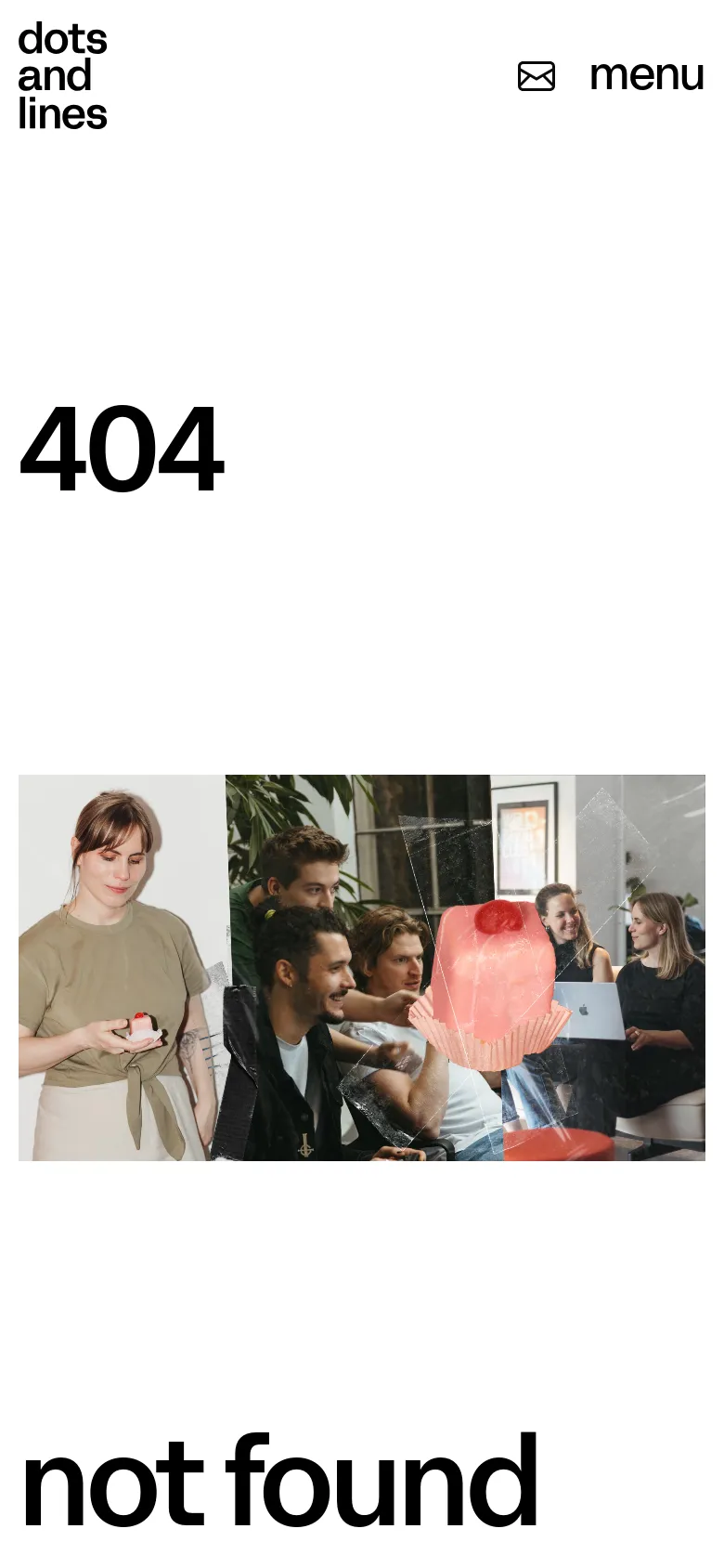
Oversized typography immediately establishes a commanding presence, framing Dots and Lines as a strategic partner rather than just a service provider. The landing page uses massive, black sans-serif headlines to anchor the user's attention, creating a rhythmic flow that alternates between high-impact text and high-quality, lifestyle-oriented photography. This editorial approach communicates a sense of confidence and clarity, suggesting that their design solutions are as much about structural strategy as they are about visual aesthetics. Large-scale type pairings dominate the layout, working alongside a high-contrast palette of stark black, crisp white, and a punchy, acidic yellow. The grid is spacious and breathable, utilizing generous whitespace to prevent the heavy type from feeling overwhelming. Section transitions are marked by bold color blocks and clean horizontal rules that organize information into digestible, high-density modules. The use of a bright yellow call-to-action bar provides a sharp, functional anchor that cuts through the minimalist grayscale elements.
Design
- Swiper Icons

Technology
- Google Analytics
- Cloudflare
- HTTP/3
- Webpack
- Cloudflare Bot Management
- Google Tag Manager
- Kiprotect


