Front
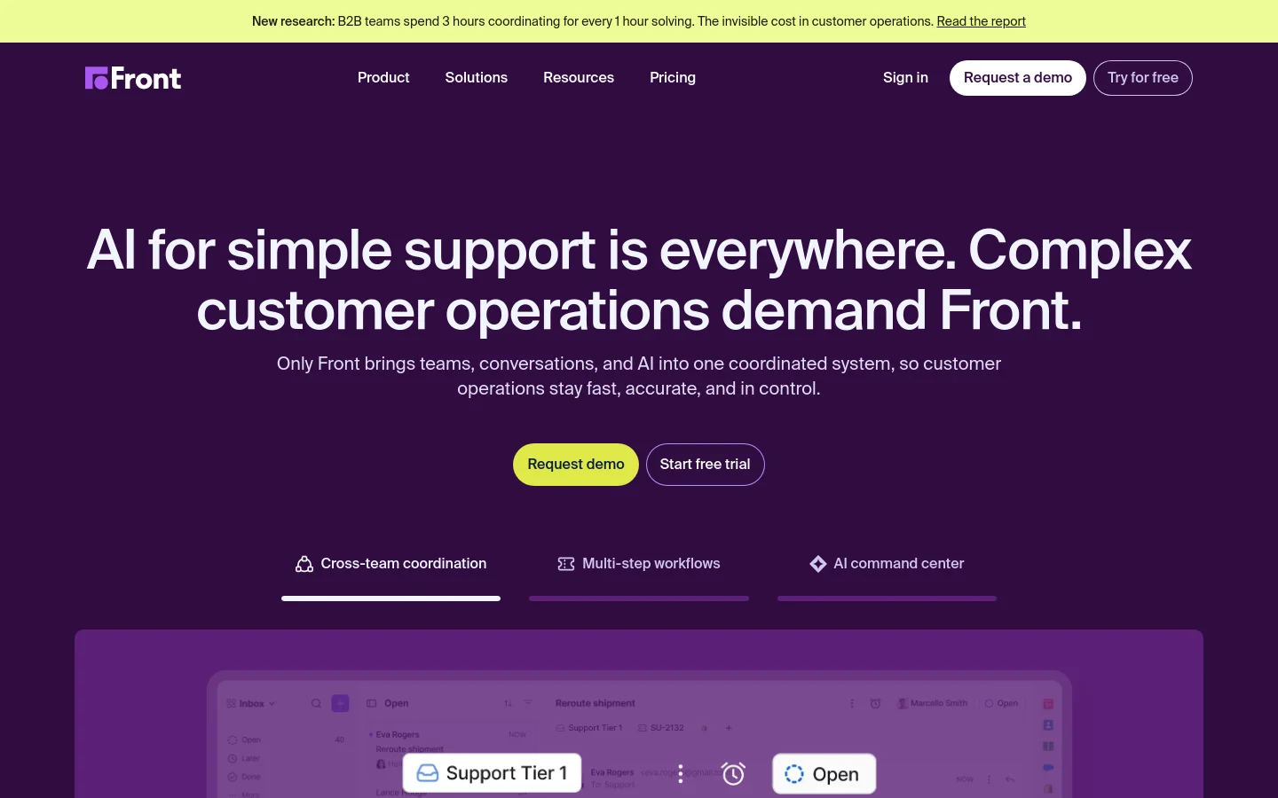
Front establishes a commanding presence for its customer operations platform through a high-impact, dark-themed aesthetic. The design uses a deep purple backdrop to frame its core value proposition, utilizing massive, centered typography that immediately communicates authority and scale. By integrating product UI snapshots directly into the landing page rhythm, the site provides a tangible look at how AI and human collaboration coexist within their interface, moving from high-level messaging to functional proof without losing momentum. Oversized sans-serif typefaces dominate the hierarchy, creating a sense of urgency and importance. The layout utilizes a structured approach to feature presentation, employing clean cards and subtle depth through soft shadows and layered UI elements. A bright, high-contrast yellow is used sparingly for primary calls to action, ensuring the user's path is unmistakable against the dark canvas. The rhythmic pacing between expansive hero sections and detailed feature modules creates a sophisticated flow that feels both expansive and highly organized.
Design
- Suisse Intl
- Suisse Intl Mono
- Suisse Works
- Swiper Icons


