Gaile Pranckunaite
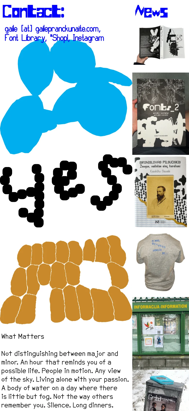
Gaile Pranckunaite's website serves as a highly experimental digital portfolio and creative hub, functioning as both a personal showcase and a boutique font library. The site rejects traditional web conventions in favor of a raw, expressive aesthetic that prioritizes artistic intuition and typographic exploration. It acts as a bridge between fine art and functional design, offering a curated space for news, shop access, and direct contact. The visual identity is defined by a bold, neo-brutalist approach, utilizing oversized, distorted typography and high-contrast, abstract graphic elements. The use of vibrant cyan and ochre shapes against a stark white background creates a sense of kinetic energy and playful chaos. This design language targets a niche audience of avant-garde designers, typographers, and creative professionals who value unconventional, boundary-pushing visual communication.


