Granola
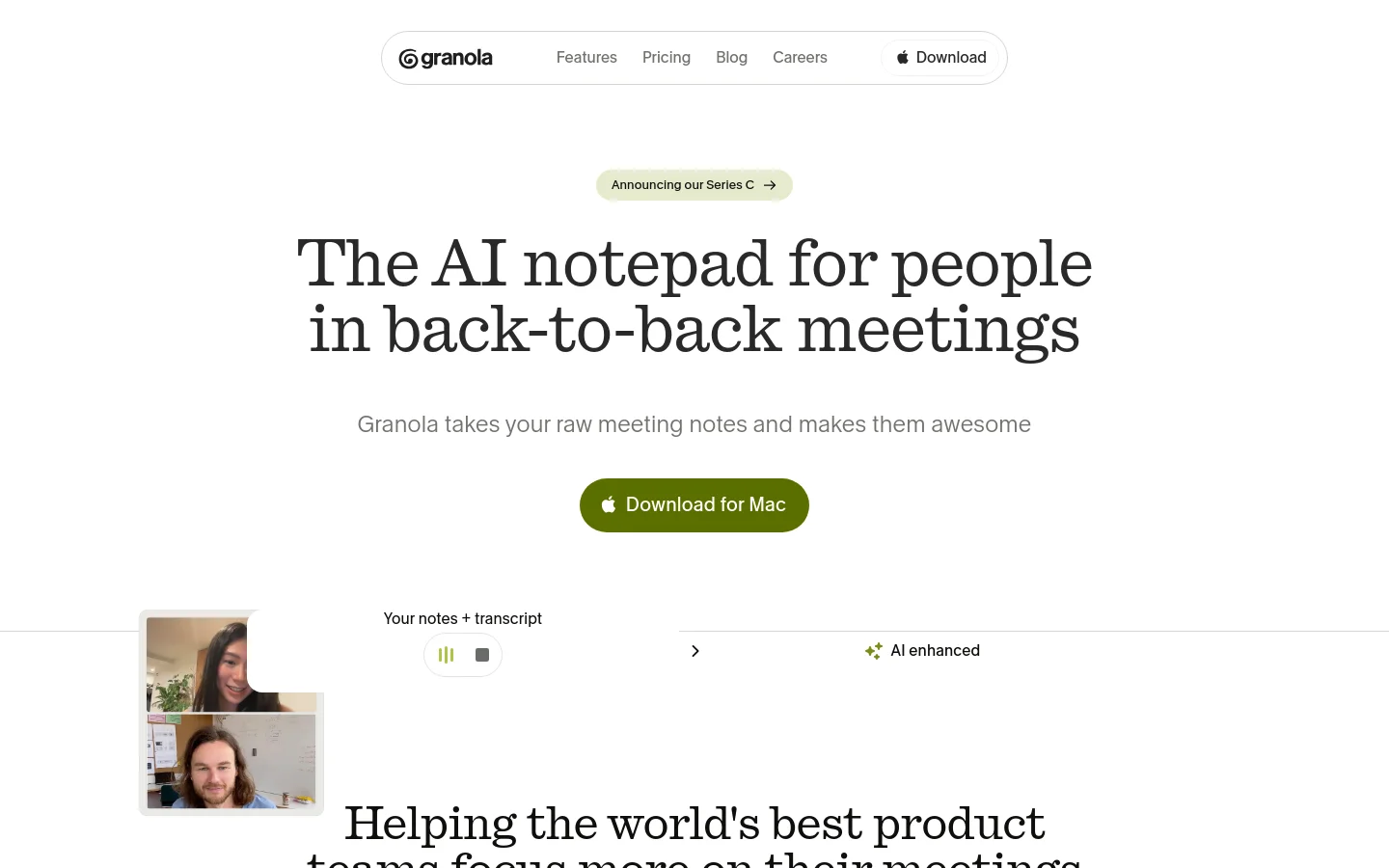
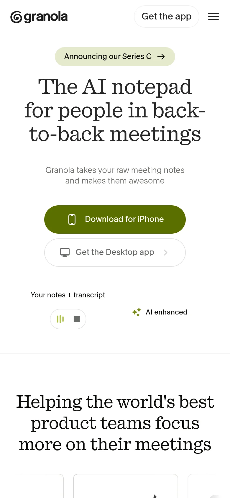
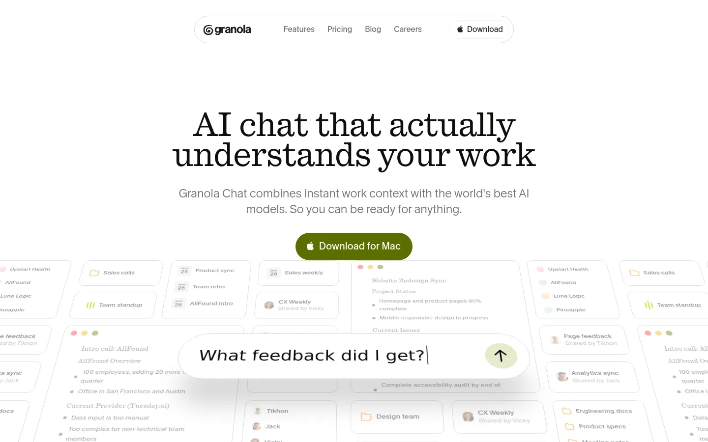
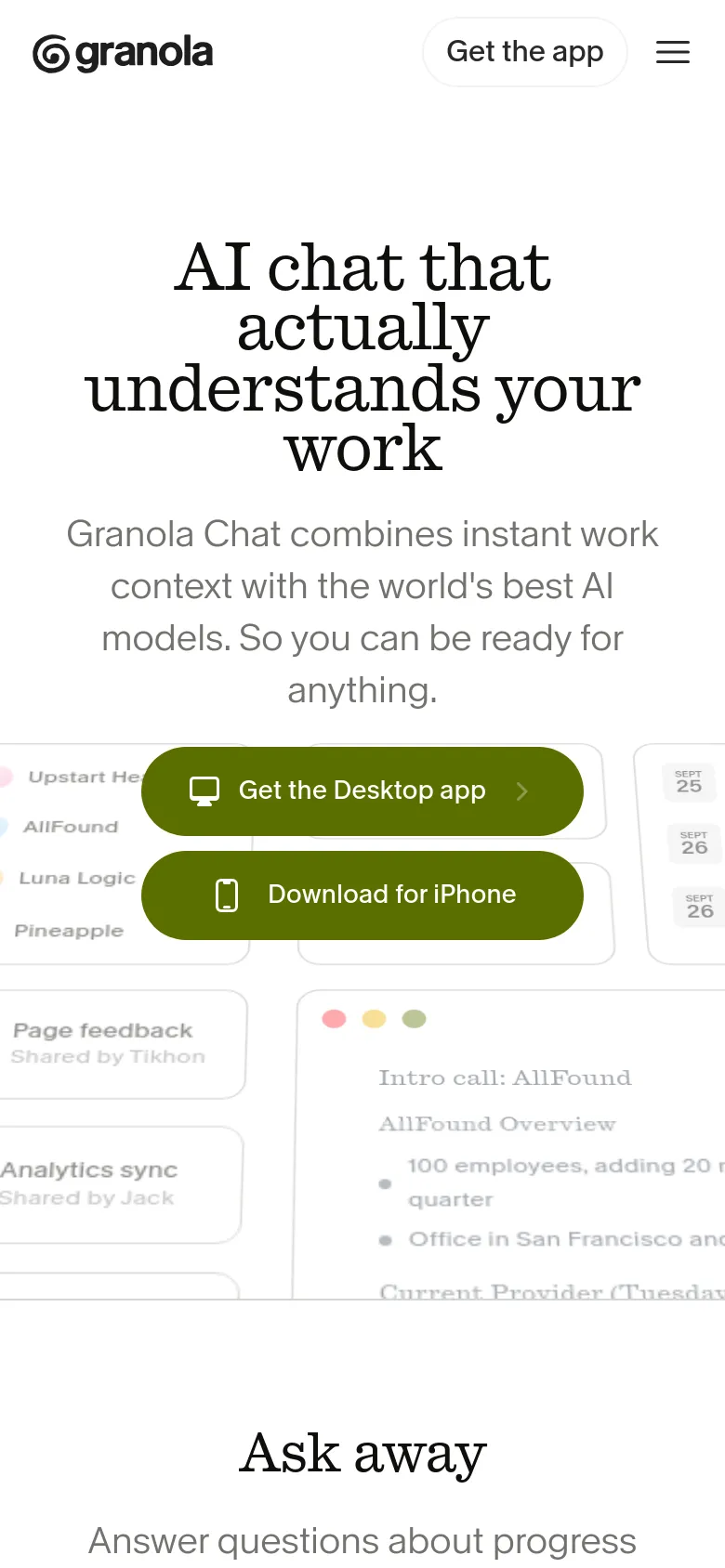
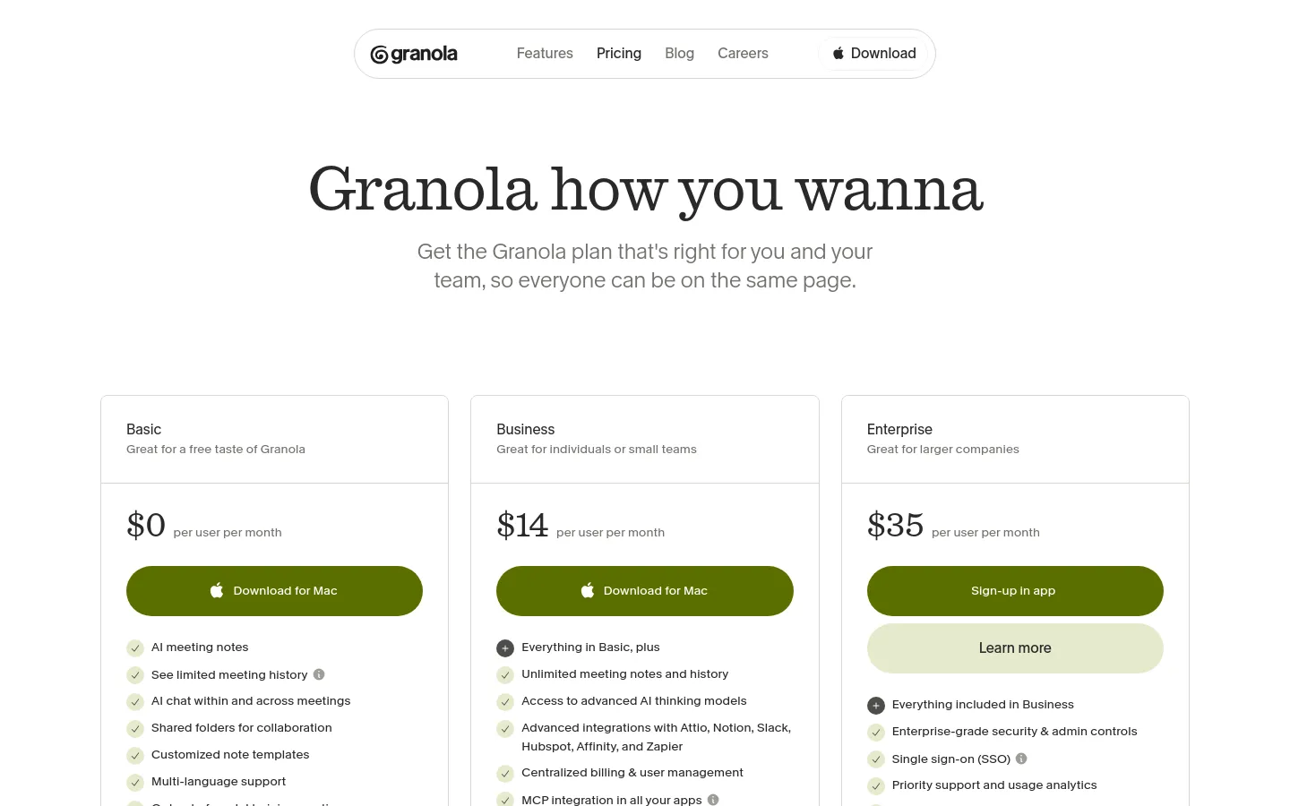
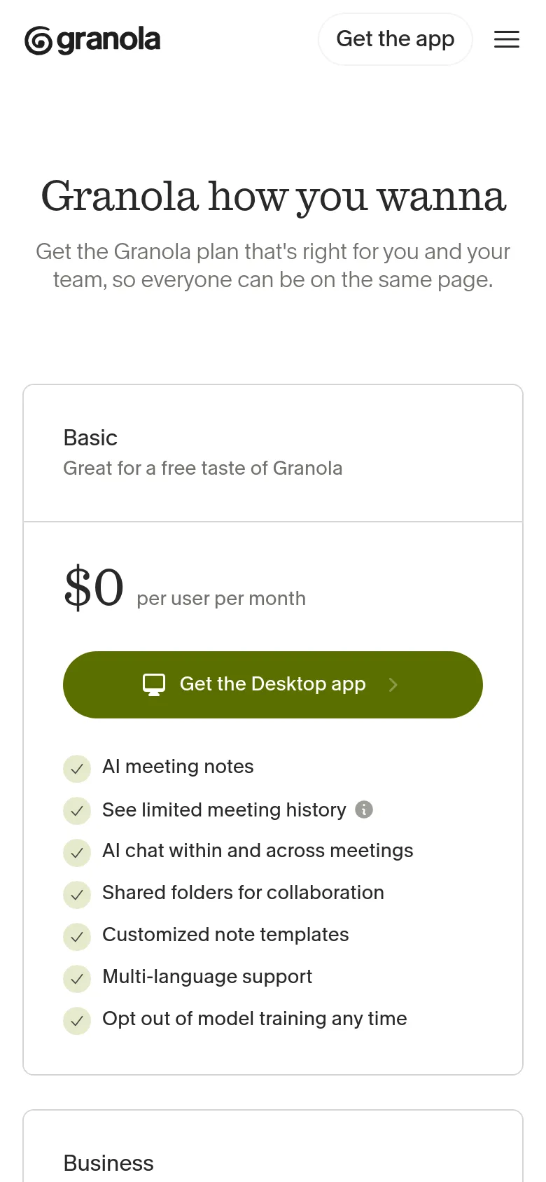
Granola approaches the productivity space with a calm, editorial sensibility that prioritizes clarity over hype. Instead of the typical high-energy tech aesthetic, the site uses a sophisticated serif typeface and a muted, organic color palette to signal a tool built for thoughtful reflection rather than frantic multitasking. The landing page rhythm moves from a bold, centered hero statement into structured sections that demonstrate how raw conversation transforms into organized intelligence, mirroring the product's core utility. Large-scale typography anchors the layout, creating a sense of authority and permanence. The interface utilizes generous whitespace and soft, rounded containers to organize information, avoiding the cluttered density common in SaaS platforms. A notable design choice is the integration of social proof through a grid of conversational, Twitter-style cards that feel tactile and human. This layout choice breaks the rigid structure of the page, injecting a sense of community and real-world validation into the technical product narrative.
Design

Home / LandingChat
PricingPricing
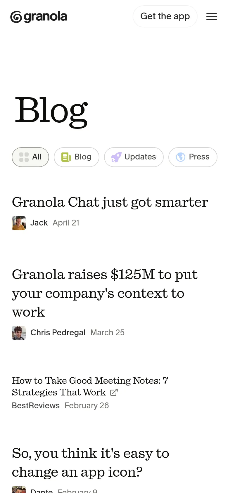
Blog / ArticleBlog
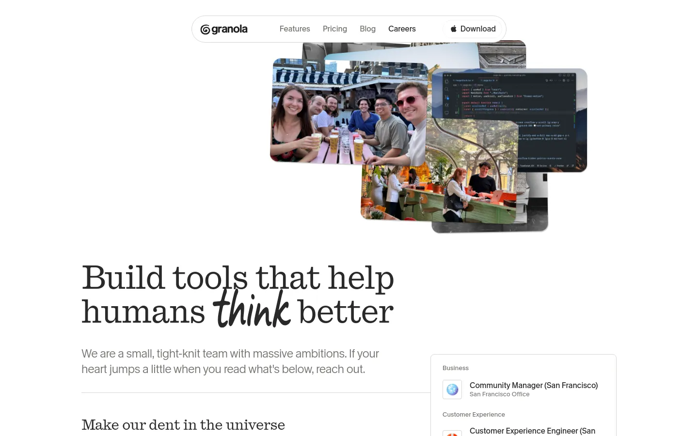
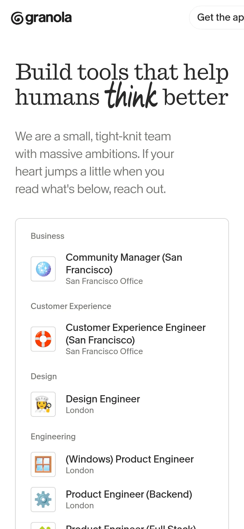
CareersCareers
Technology
- Vercel Analytics
- Vercel Speed Insights
- Amazon S3
- jsDelivr
- iubenda
- Webpack
- HSTS


