Kelly Shield
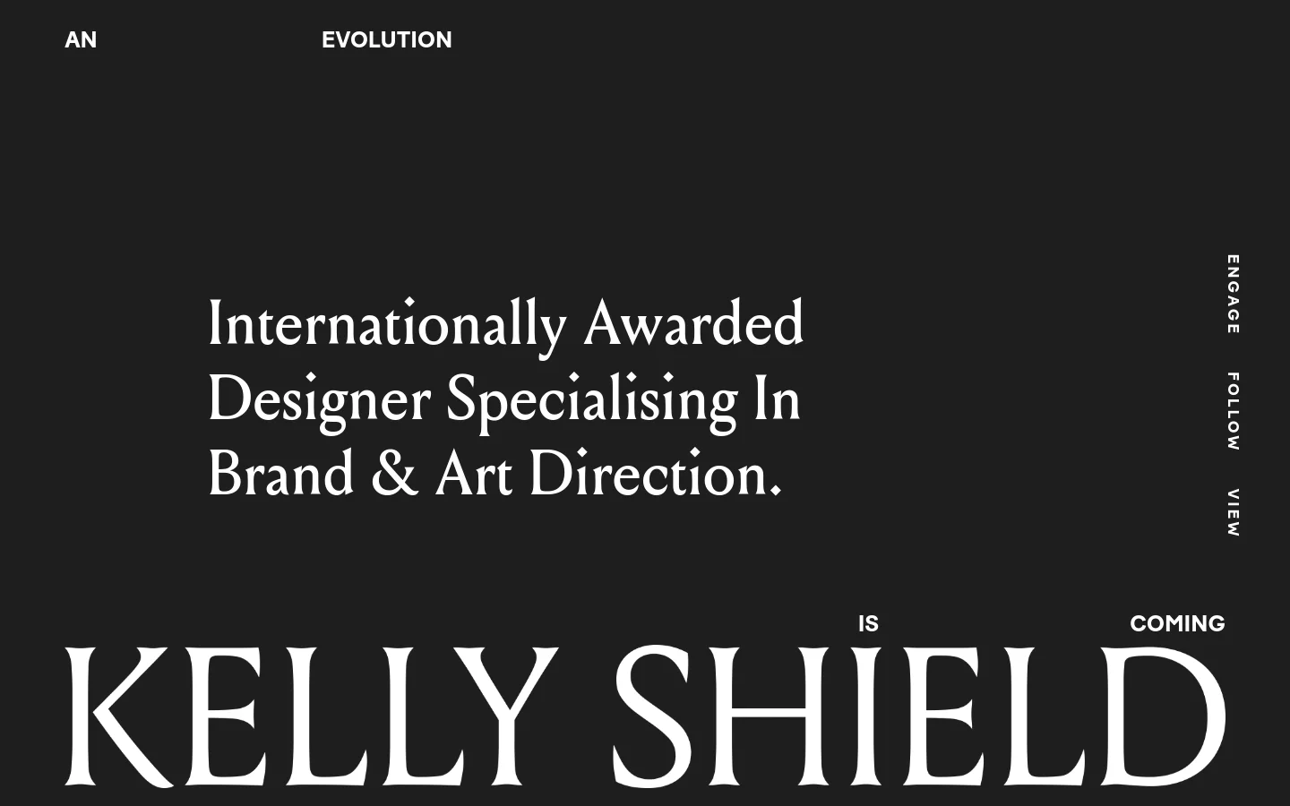
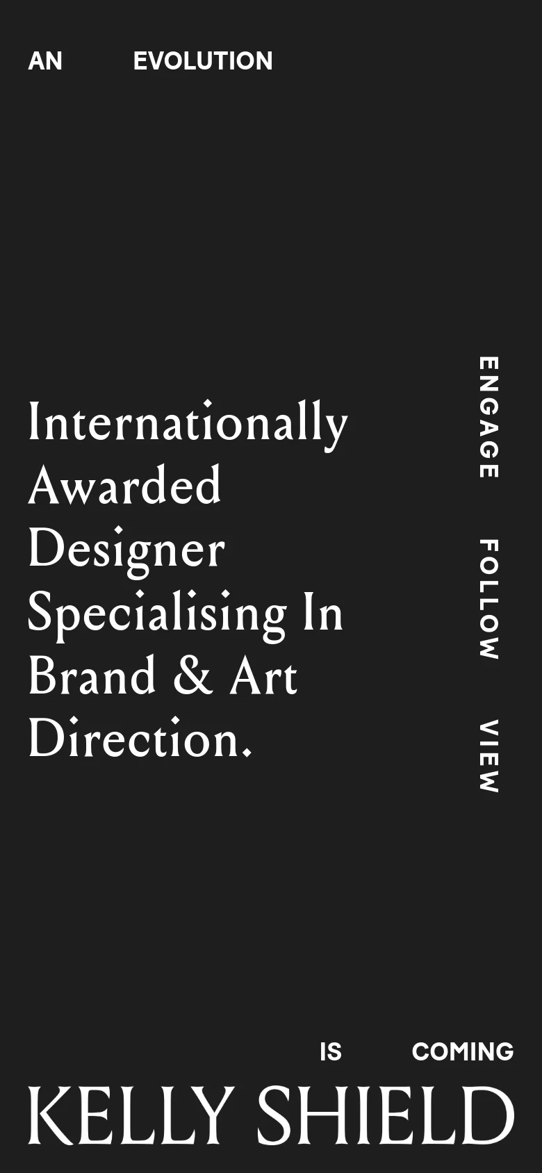
Kelly Shield’s digital presence is a masterclass in high-end typographic minimalism. The website serves as a sophisticated landing page for an internationally awarded designer specializing in brand and art direction. By utilizing a dark, moody palette and expansive negative space, the design immediately communicates a sense of premium authority and creative maturity, positioning the designer as a high-tier professional for luxury or lifestyle brands. The visual identity is defined by its bold, editorial use of serif and sans-serif typography. The interplay between the massive, elegant serif typeface used for the brand name and the clean, utilitarian sans-serif used for navigation creates a striking tension. This typographic-first approach eschews unnecessary imagery in favor of pure, structural impact, targeting a discerning audience of creative directors and brand owners who value conceptual depth and refined aesthetics.