Michael Kent Allen

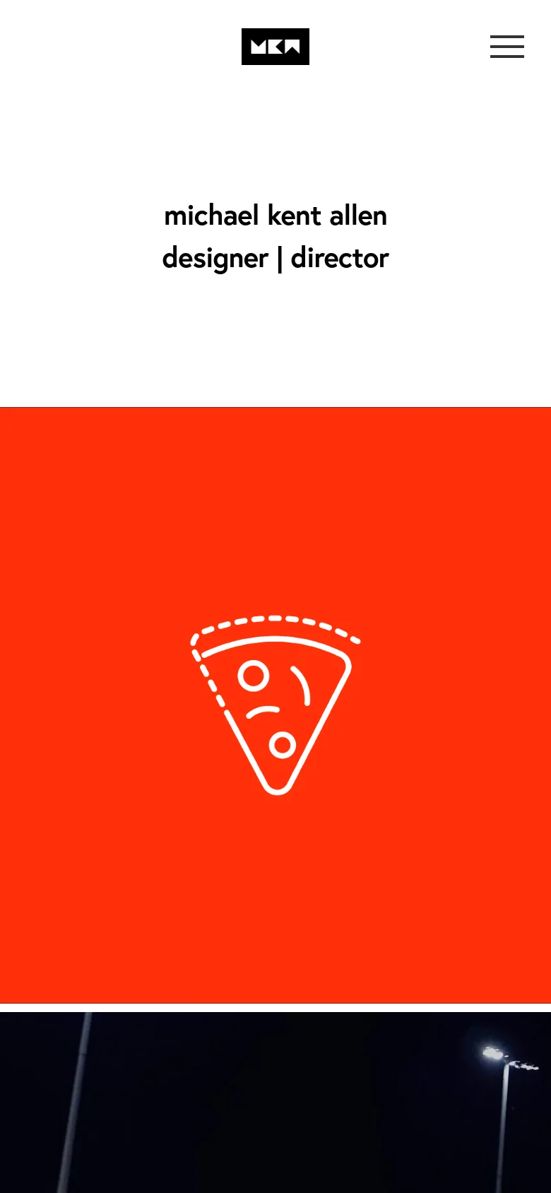
Michael Kent Allen's portfolio serves as a high-impact showcase for a multidisciplinary designer and director. The site is designed to highlight large-scale creative direction and brand identity work, utilizing a bold, high-contrast layout that allows massive visual assets to command attention. It functions primarily as a professional calling card for high-tier clients in the commercial and branding sectors. The visual identity is defined by a striking use of primary colors—most notably a vibrant, saturated red—juxtaposed against stark white and deep black. The design employs a sophisticated typographic hierarchy and a minimalist structure that leans into a modern, editorial aesthetic. By stripping away unnecessary UI elements, the site directs all focus toward the caliber of the work, projecting an image of confidence, clarity, and creative authority.
Design
- Social Icons
- Squarespace UI Font
Technology
- jsDelivr
- HSTS
- Adobe Fonts