The Responsive
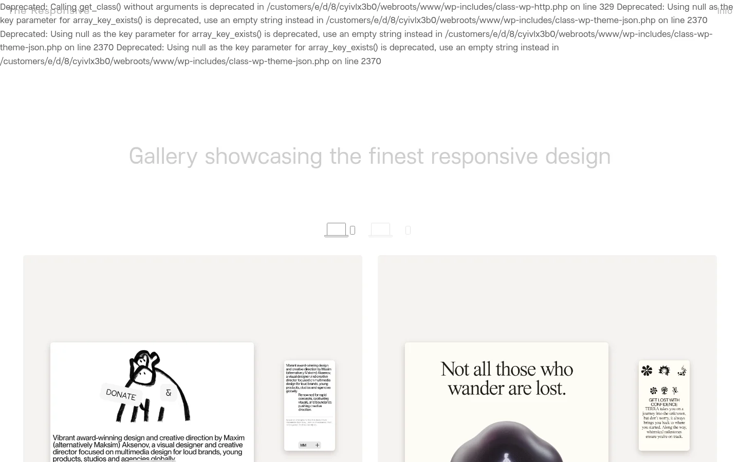
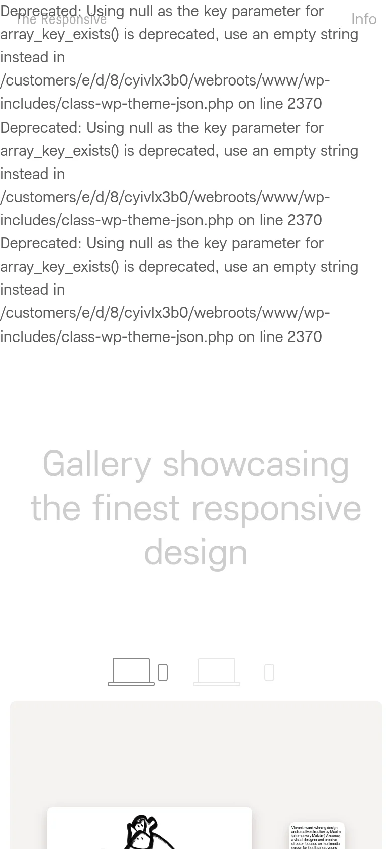
The Responsive serves as a curated digital exhibition space, dedicated to showcasing high-caliber examples of responsive web design. It functions as both an inspiration engine for designers and a benchmark for agencies, presenting a sophisticated gallery of layouts that demonstrate seamless adaptability across various device breakpoints. The visual identity is rooted in a clean, minimalist aesthetic that prioritizes content and layout over decorative elements. Utilizing a soft, neutral color palette and generous whitespace, the site employs a structured grid system that mirrors its core subject matter. The typography is understated yet legible, ensuring that the focus remains entirely on the showcased design works, creating a professional and high-end atmosphere for the design community.