VetteLetters
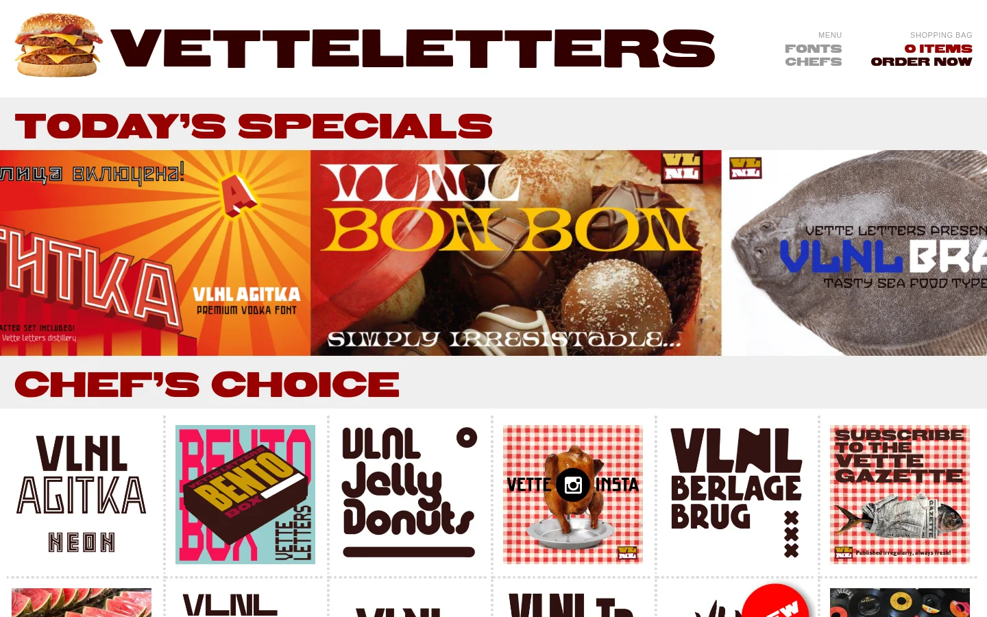

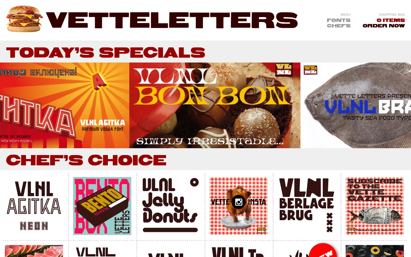
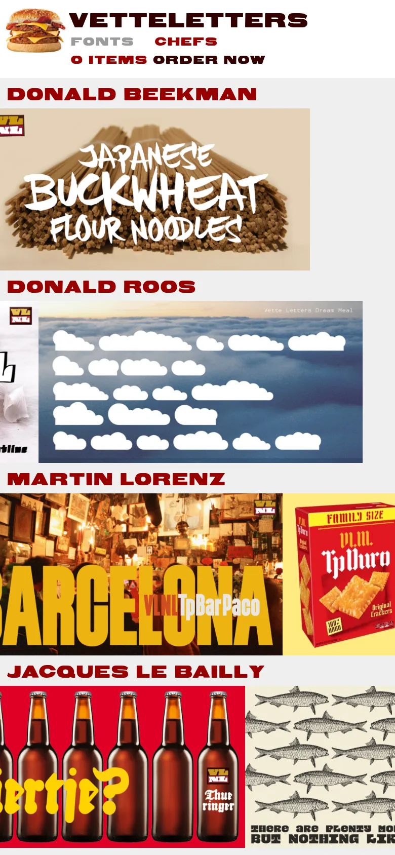
VetteLetters is a highly conceptual and avant-garde digital storefront that blurs the line between a gourmet deli and a type foundry. By adopting a culinary metaphor, the site presents typography as 'food,' utilizing a menu-driven interface where fonts are 'dishes' and designers are 'chefs.' This playful, high-concept approach transforms the often clinical process of font browsing into a sensory, thematic experience. The visual identity is unapologetically loud and maximalist, characterized by heavy, expressive display type and a high-contrast color palette of deep reds, blacks, and bright yellows. The design utilizes a grid-based layout reminiscent of a digital menu or a grocery flyer, blending pop-art sensibilities with a retro, almost kitsch aesthetic. It targets creative professionals, graphic designers, and art directors who seek distinctive, character-driven typefaces with a strong personality.
Design


Technology
- Google Analytics
- jsDelivr
- MySQL
- HTTP/3
- LiteSpeed