Wait Wait Graphs
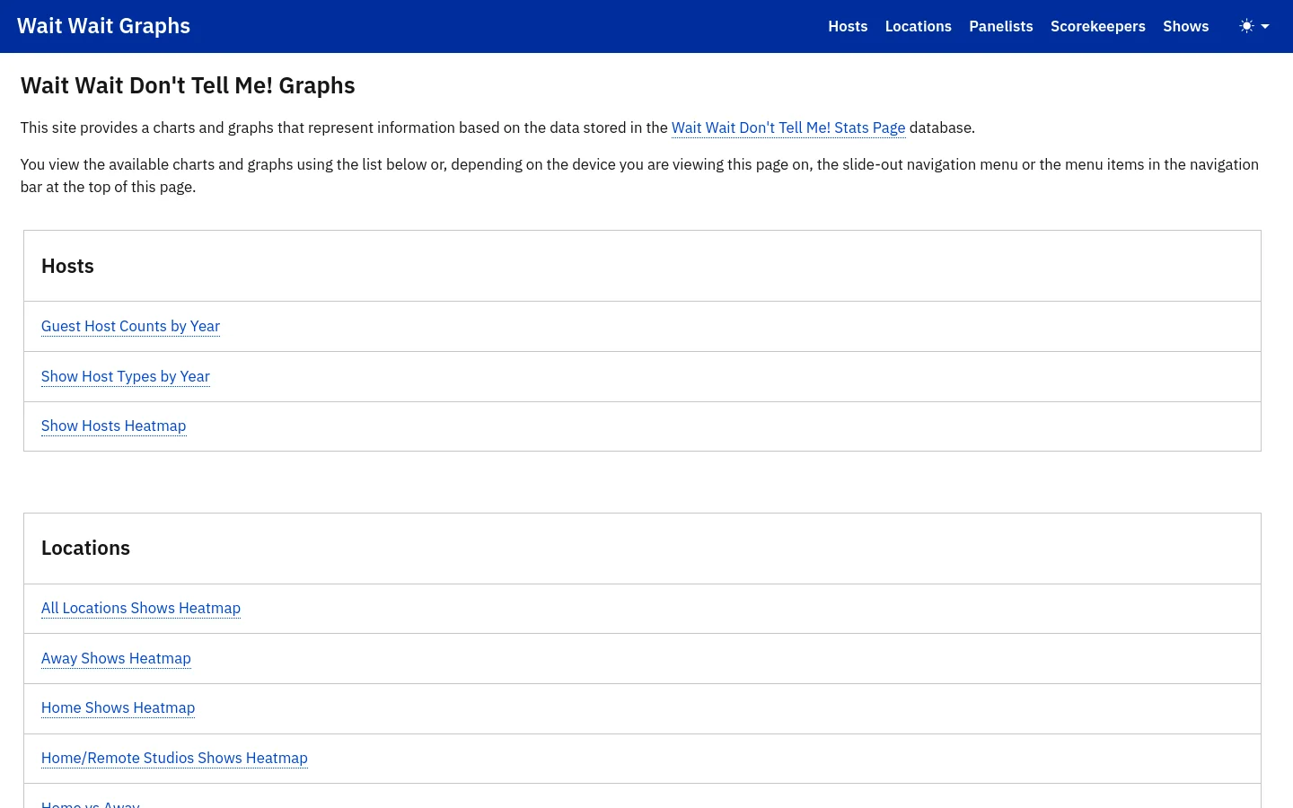
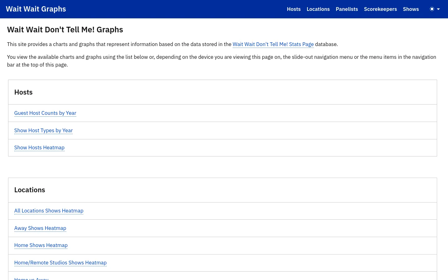
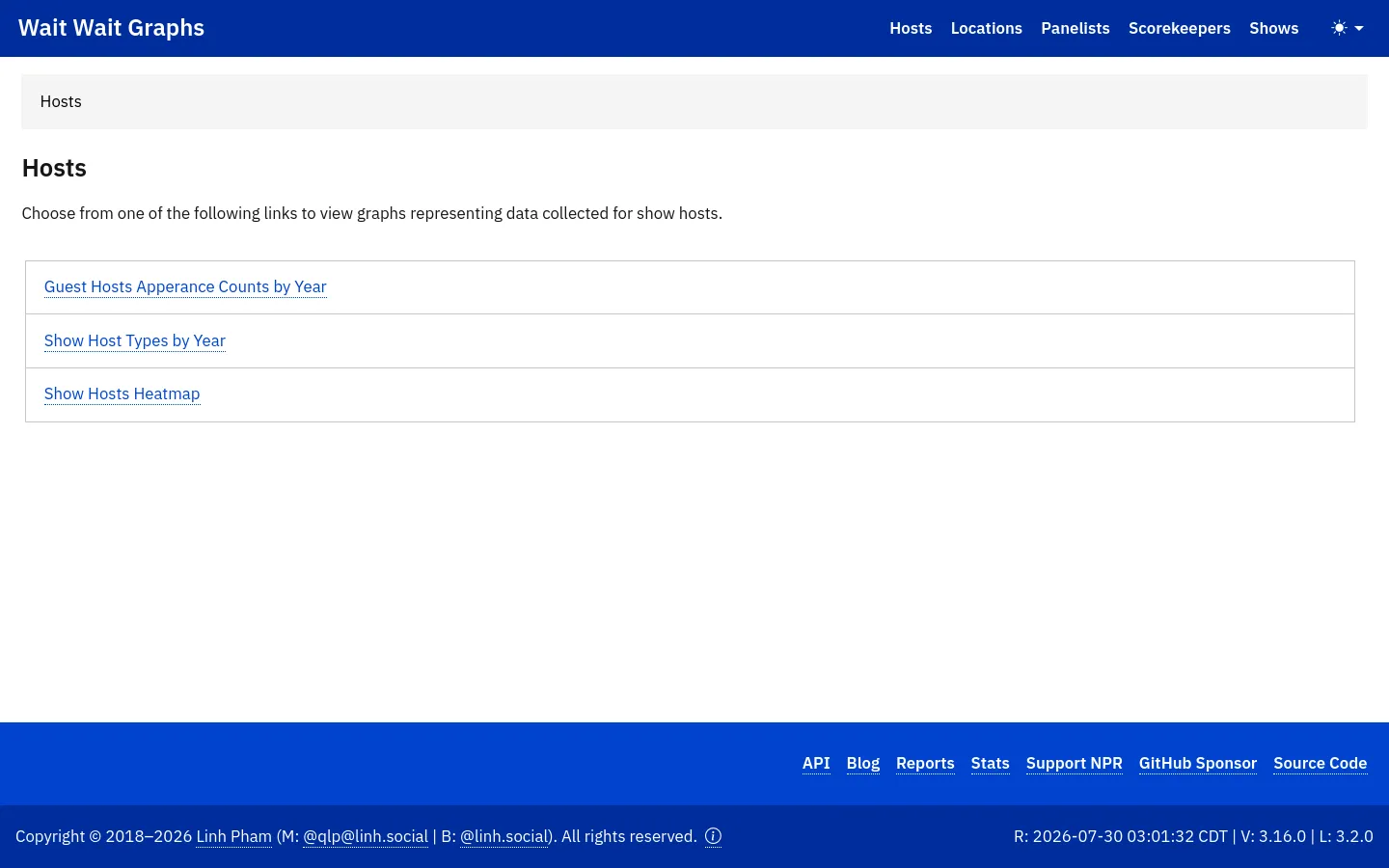
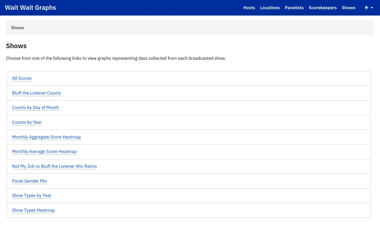
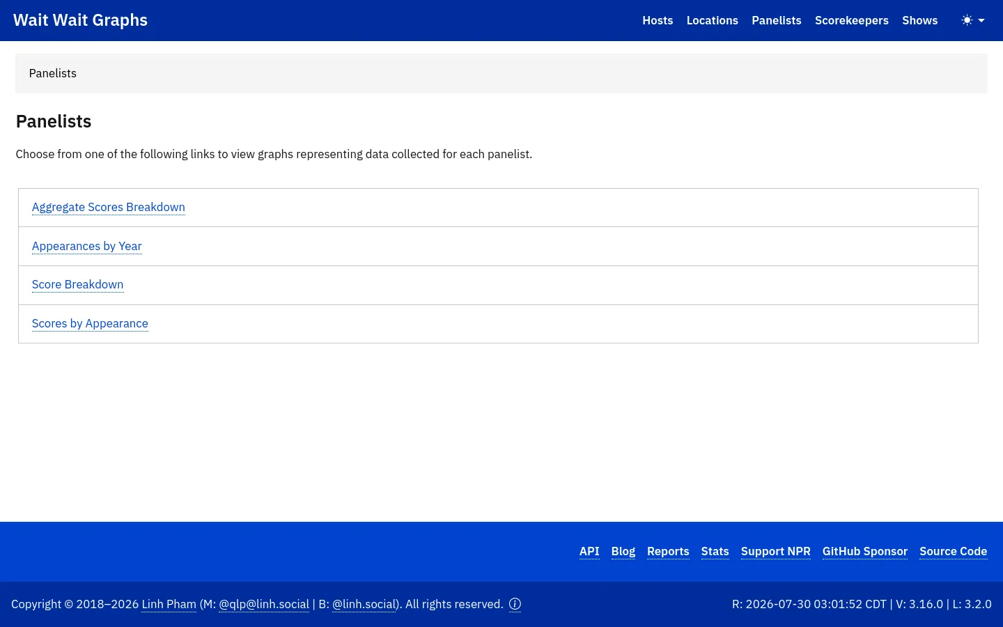
Wait Wait Graphs serves as a specialized data visualization hub for fans and researchers of the NPR radio program *Wait Wait... Don't Tell Me!*. The platform transforms complex database entries into digestible, interactive charts and heatmaps, categorizing information by hosts, locations, panelists, scorekeepers, and show metrics. It functions as an analytical companion to the media property, offering deep dives into the show's historical patterns and participant statistics. The visual identity is defined by a high-contrast, utilitarian aesthetic that prioritizes information hierarchy and ease of navigation. Utilizing a bold royal blue header against a clean, white background, the design leans into a minimalist, functionalist approach. The typography is clear and sans-serif, ensuring that the data-driven links remain the primary focus, catering to an audience of data enthusiasts and dedicated listeners who value clarity over decorative flair.